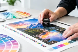
A blue that looks sharp on a laptop can print too purple. A bright red can come off dull. A photo with deep detail on screen can lose shadow detail on a postcard or trade show panel. When your materials represent a business, an event, or a convention booth, those differences are not minor. They affect how polished and recognizable your brand looks. Knowing how to proof print colors helps prevent surprises before a job reaches the press.
For Las Vegas businesses working toward a launch date, trade show opening, grand opening, or direct mail deadline, proofing is also a time-saving step. It gives you a clear approval point before full production, when changes are still manageable and reprints are still avoidable.
Start With the Right Color Expectations
A monitor creates color with light. A printer creates color with ink, toner, or a combination of inks on a physical surface. That means a screen can display colors that a standard commercial printing process cannot reproduce exactly. The goal is not to expect the impossible. The goal is to define the most accurate, consistent result for the print method and material you selected.
Most full-color commercial printing uses CMYK – cyan, magenta, yellow, and black. Files designed in RGB, the color mode used by screens, may shift when converted to CMYK. Bright neon greens, electric blues, and highly saturated oranges are common examples. If a specific brand color must remain tightly controlled across business cards, brochures, banners, and signage, a Pantone spot color or a carefully defined CMYK build may be the better choice.
Before reviewing any proof, identify what matters most. Is it the logo color? A product photograph? Skin tones? A dark background that needs to remain rich without plugging up? Giving priority to the colors that carry the most business value makes proof approval faster and more useful.
Prepare the File Before You Request a Proof
A proof can only show what the supplied file is set up to print. Convert images and design files to CMYK when the project will be printed in CMYK. Use high-resolution images, generally 300 dpi at final size for smaller printed pieces. For large-format graphics viewed from a distance, the required resolution may be lower, but images still need to be appropriate for the final output size.
Avoid relying on screenshots, social media graphics, or images pulled from a website as a color reference. Those assets may be compressed, built in RGB, or viewed through different screen settings. If you have official brand standards, provide the Pantone numbers, CMYK values, and any approved logo files with the order.
For black text and fine line art, use 100% black rather than a four-color black build. Small type made from multiple inks can show registration issues, especially on fast-moving production jobs. Large black backgrounds are different. A rich black can provide a deeper appearance, but it should be built correctly for the print process and stock.
How to Proof Print Colors in the Right Order
The best proofing process moves from broad approval to close inspection. First, confirm the file is correct: dimensions, bleed, trim marks when required, page count, folds, copy, phone numbers, QR codes, and image placement. Color review matters, but it cannot compensate for an incorrect event date or a logo placed too close to a trim edge.
Next, review the proof on a calibrated display if possible. Turn off night mode, blue-light reduction, and automatic brightness adjustments. These settings can make a proof look warmer, cooler, or darker than the file actually is. A laptop in a dim hotel room and a desktop monitor in a bright office can show the same PDF very differently.
Then request the appropriate proof type. A digital PDF proof is useful for checking layout, content, and general color relationships. It is fast and practical for many rush projects. However, it is not a contract-level prediction of the final printed color, particularly when paper, finish, production device, or spot colors are critical.
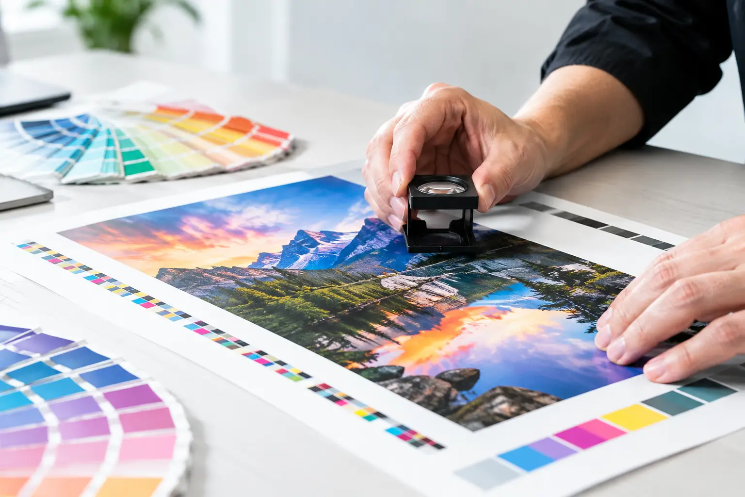
For color-sensitive work, ask for a hard proof, press proof, or printed sample when schedule and production method allow. A physical proof lets you evaluate ink on an actual or comparable substrate. This is especially valuable for premium brochures, packaging, brand launch pieces, fine-art-heavy projects, and large-format displays where a photo or corporate color needs close review.
Evaluate the Proof Under Useful Lighting
Do not approve a printed proof under only one light source. Office fluorescents, warm restaurant lighting, daylight, and convention hall lighting can all change how colors appear. This effect, called metamerism, is why two colors may look like a match in one location and noticeably different somewhere else.
Review the proof in neutral daylight or under standardized lighting whenever possible. Then think about where the finished piece will live. A retail counter card may be seen under warm interior lighting. A trade show backdrop may be viewed under bright exhibition fixtures. A restaurant menu or hospitality flyer may move between daylight and indoor lighting throughout the day.
Look closely at gradients, neutral grays, flesh tones, and dark photographic areas. These regions often reveal issues before a bold headline color does. Check whether a gray has picked up a color cast, whether a smooth gradient has banding, and whether important detail disappears in the shadows.
Paper, Coating, and Material Change Color
The same file can print differently on uncoated paper, gloss paper, matte stock, vinyl, fabric, foam board, acrylic, or corrugated signage. Paper whiteness alone changes the perceived color. An uncoated sheet absorbs more ink and often produces a softer, less saturated look than a coated stock. Gloss stocks can make images appear brighter, while matte finishes can reduce glare and give a more understated result.
Large-format materials introduce additional variables. A banner designed for indoor use may need different color handling than a window graphic or outdoor sign. Backlit graphics require special attention because illumination changes contrast and perceived density. If the final product is a trade show display, proof on a comparable material whenever the brand color or hero image is central to the design.
There is always a trade-off between speed, cost, and precision. A fast PDF approval may be the practical choice for a same-day flyer with flexible color needs. For a major convention wall, executive presentation kit, or high-volume direct mail campaign, investing time in a physical proof is usually the smarter business decision.
Compare Against a Real Color Standard
A memory is not a reliable color standard. Neither is a logo viewed on a phone. If color consistency matters, compare the proof to an approved Pantone book, a previously approved printed sample, or documented brand specifications.
Be cautious when using an older printed piece as the only reference. It may have been produced on a different press, stock, finish, or production run. It may also have faded from sunlight or handling. A prior piece is helpful context, but the best reference is a current, controlled brand standard.
When using Pantone colors, specify whether the color is intended as a spot ink or as a CMYK simulation. A CMYK process job can approximate many Pantone colors, but not every Pantone shade will match perfectly. Fluorescent, metallic, and highly saturated colors are especially difficult to reproduce with standard CMYK inks.
Approve Clearly and Avoid Last-Minute Assumptions
Once you approve a proof, make sure the approval is tied to the final version of the file. If a phone number, logo, photo, or color value changes afterward, that is a new file and should be reviewed again. Small edits can create unexpected shifts, particularly when images are replaced or transparency effects are altered.
Give clear feedback when something is wrong. Instead of saying a color “looks off,” identify the issue: “The blue logo prints too purple compared with our approved sample,” or “The dark suit in the photo is losing detail.” Specific comments help the production team determine whether the solution is a file adjustment, color conversion, material change, or a different proof method.
For urgent Las Vegas print jobs, send final artwork and brand references as early as possible. Design One Printing can help review production-ready files and flag concerns before the job moves forward, but proofing time needs to be planned into the deadline. A few minutes spent confirming the right proof can protect the look of every brochure, banner, sign, and handout your audience sees.
When the piece matters, approve the color you can live with on the material you are actually printing – not the color you hoped your screen was showing.