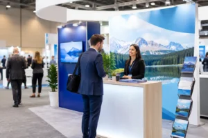
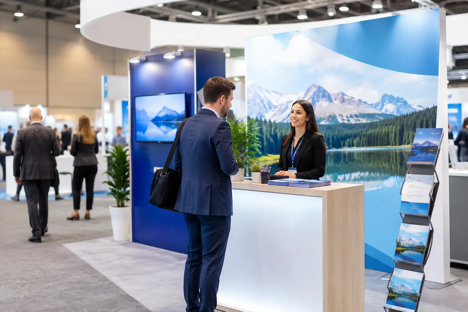
A crowded convention floor gives attendees seconds to decide whether your booth deserves a stop. The best convention booth signage makes that decision easy: it identifies your brand, states the value you offer, and gives people a reason to walk over before they move on to the next aisle.
For Las Vegas exhibitors, signage also has to work under real event conditions. It must travel well, install quickly, hold up under bright convention-center lighting, and still look sharp when the booth opens at 9 a.m. after a late setup. Choosing the right mix starts with understanding what each sign needs to accomplish.
What Makes the Best Convention Booth Signage Work
Good booth signage is not simply large-format printing with a logo added to it. It is a visual system built around viewing distance. A person walking down an aisle may only absorb your company name, a short headline, and one strong image. Someone standing at the edge of your booth can take in product benefits, a demonstration schedule, or a QR code.
That difference matters. Your main backdrop should answer the broadest question: who are you and why should attendees care? Secondary signs can handle the details. When every sign tries to say everything, visitors read nothing.
The strongest booth graphics usually share a few traits. They use high-contrast colors, readable type, limited copy, and imagery that supports the message rather than competing with it. They also keep important content away from the bottom edge, where tables, sample cases, and attendees may block it.
Start With the Job Each Sign Needs to Do
Before ordering, map signage to the visitor experience. The goal is not to fill every open surface. It is to make the booth easy to recognize from a distance and easy to navigate once visitors arrive.
Backdrops and step-and-repeat walls create the visual anchor
A fabric backdrop, tension display, pop-up wall, or large vinyl graphic is typically the main branding piece. It should be visible across the aisle and communicate one clear promise. For example, a software company might lead with its biggest outcome, while a food brand may lead with a high-quality product image that makes people want a closer look.
Avoid treating the backdrop like a brochure. A logo, a concise benefit statement, and a focused visual are often enough. If you need more explanation, place it on a counter sign, monitor graphic, or handout where attendees can engage at closer range.
Retractable banners add flexibility where the booth needs it
Retractable banner stands are among the most useful convention tools because they set up quickly, travel easily, and can be repositioned as traffic changes. Use them to feature a product category, promotion, customer proof point, or event-specific offer.
They are especially valuable in smaller 10-by-10 booths, where one large wall may not be possible. In larger spaces, banners can frame an entrance, separate demo areas, or reinforce the main campaign without requiring a custom-built structure.
Counter signs and tabletop displays support conversations
Once someone is in your booth, smaller signs can do more selling than the main wall. A well-placed counter sign can explain a giveaway, show pricing, direct visitors to a demo, or prompt badge scans. Tabletop displays work well when the product needs context, such as a service package, a menu, or a before-and-after example.
Keep these signs practical. If staff members answer the same question repeatedly, a small sign may be able to answer it first and make conversations more productive.
Floor graphics and directional signs manage traffic
Larger booths, hospitality displays, and event activations often need help guiding attendees. Floor decals can lead visitors to a check-in point, photo moment, product station, or meeting area. Directional signs are useful when the booth includes multiple demonstrations or a scheduled presentation.
These elements should be clear but not distracting. Floor graphics need durable material and an appropriate slip-resistant finish. Directional signs should use short commands and arrows that can be understood at a glance.
Design for Distance, Not Your Computer Screen
A common trade-show mistake is approving artwork at full size on a laptop, where every word appears readable. On the show floor, attendees see your graphics from several feet away, often while walking. Large text, simple shapes, and generous spacing are not empty design choices. They are what make the message legible under pressure.
As a practical rule, the farther a sign is meant to be viewed from, the fewer words it should carry. Your logo and headline belong at the top of a backdrop or banner. Product details, testimonials, and calls to action belong lower on the sign or on a separate piece intended for closer viewing.
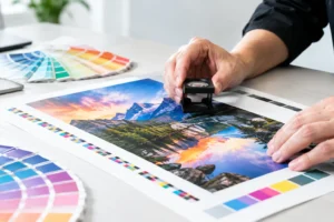
Color contrast matters just as much. Light gray type on a white background may look modern in a design file but disappear under bright exhibit hall lighting. Dark text on a light field, or light text on a dark field, is more reliable. If brand colors have low contrast, use them as accents while letting the key message use the most readable combination.
Choose Materials Based on Setup, Duration, and Reuse
The right material depends on where the sign will be used and how often it will travel. A one-day networking event has different needs than a multi-city convention schedule.
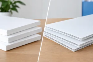
Vinyl banners are durable, economical, and useful for large messages, especially when mounted to a booth frame or wall. Fabric displays offer a polished, low-glare appearance and are popular for branded backdrops and photo areas. Rigid signs, including foam board, PVC, and corrugated plastic, work well for easel displays, counter signage, directional messaging, and temporary promotions.
Retractable banner hardware is a smart investment for exhibitors who attend several shows a year. The graphic may be replaceable depending on the stand, allowing your company to refresh campaign messaging without purchasing an entirely new display. The trade-off is that banner stands require careful packing and should not carry dense, small type that becomes hard to read vertically.
If your team is flying into Las Vegas, portability should influence every decision. Ask whether a display fits in a carry case, how much it weighs, and whether it can be assembled without special tools. A beautiful display that requires an hour of difficult setup can create unnecessary risk on show day.
Keep the Message Specific to the Event
Generic branding can identify your company, but event-specific signage gives attendees a reason to engage now. Consider adding a limited-time offer, an on-site demonstration time, a new product launch, or a clear benefit tailored to the audience attending that convention.
A QR code can help connect print signage to a landing page, catalog, demo booking form, or giveaway entry. It should be large enough to scan easily and placed where attendees can stand without blocking traffic. Always pair it with a short instruction, such as “Scan for show pricing” or “Book a 15-minute demo.” A code by itself does not explain why someone should use it.
The same approach applies to social-photo backdrops. If you are creating a branded photo opportunity, make the logo visible in photos without turning the background into a wall of repeated marks. Give attendees a reason to participate, whether that is a contest, a product moment, or a visually memorable installation.
Plan Early, Then Build a Rush-Ready Backup
The best time to finalize booth signage is before the rest of the event details start shifting. Confirm booth dimensions, display restrictions, electrical placement, furniture, and whether your booth has walls or open sides. These details affect sign size, mounting options, and where messages remain visible.
Still, conventions are known for last-minute changes. A product launch moves up, a shipment is delayed, a sponsor logo is added, or a banner arrives damaged in transit. Smart exhibitors bring a small reserve of adaptable printed pieces: extra tabletop signs, a few promotional flyers, replacement decals, and files ready for fast production.
For exhibitors near the Strip and major convention centers, Design One Printing can help turn approved artwork into professional banners, posters, rigid signs, booth graphics, and event collateral on a tight schedule. Fast turnaround is most useful when it is paired with a production partner who can flag sizing, file, and material issues before they reach the show floor.
Your booth does not need more signs to get noticed. It needs the right signs, carrying the right message, in the places attendees naturally look. Build around one clear promise, make every word earn its space, and leave enough time for a final proof before the doors open.