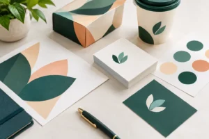
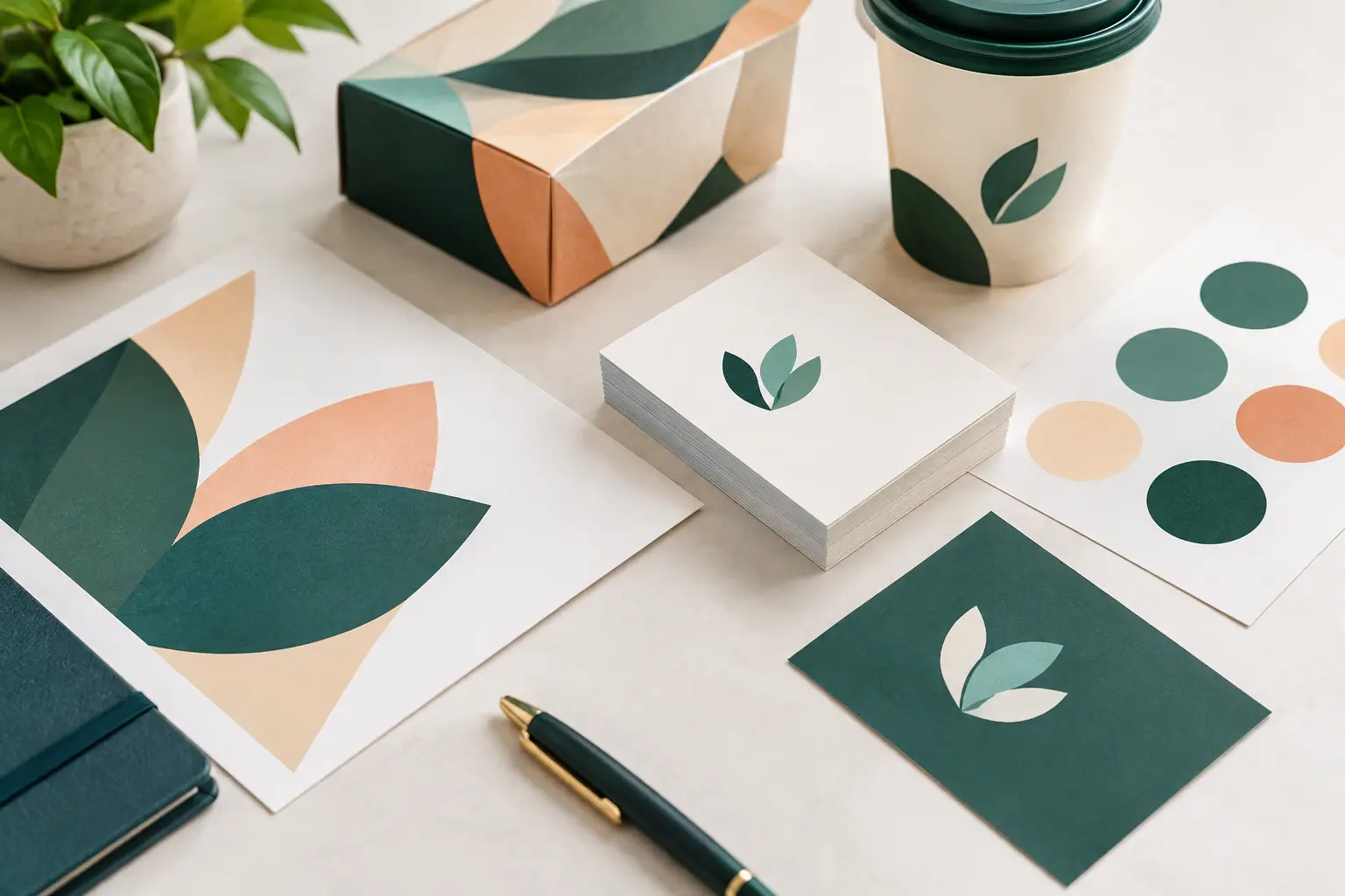
A brand can look polished on a laptop and still fall apart at a convention booth, on a takeaway menu, or in a stack of business cards. The most useful brand identity trends for 2026 are not just about a new logo style or color palette. They are about building visual systems that hold up across the materials customers actually see, touch, photograph, and take home.
For Las Vegas businesses, exhibitors, and event teams, that matters. Your identity may need to work on a 3.5-inch business card in the morning, a 10-foot banner by the afternoon, and a last-minute sales sheet before the show floor opens. The goal is not to chase every design trend. It is to choose the ones that make your brand easier to recognize and easier to produce consistently under real deadline pressure.
Brand Identity Trends Moving From Screen to Print
Flexible logo systems replace one-size-fits-all marks
A single logo is no longer enough for most businesses. Brands are increasingly using a primary logo, a simplified horizontal version, an icon or monogram, and a one-color mark. Each serves a different purpose without changing the brand’s core identity.
This is especially practical for print. A detailed logo may look strong on a brochure cover but become hard to read on stickers, branded pens, name badges, social graphics, or small promotional cards. A simplified version gives you a clean option for limited space, while a one-color version keeps costs and production options manageable for stamps, vinyl, embroidery, and certain specialty print applications.
The trade-off is discipline. More logo variations should create flexibility, not confusion. Establish clear rules for where each version belongs, including minimum size, clear space, and approved background colors. That keeps an event banner, postcard, and direct mail piece looking like they came from the same business.
Strong typography does more of the brand work
Typography is taking a larger role in brand identity. Rather than relying on decorative graphics everywhere, many businesses are using distinctive type choices, confident headlines, and clean information hierarchy to create a recognizable look.
For a local service company, retailer, hospitality business, or exhibitor, this can be a smart move. Large, readable type gives passersby a faster understanding of what you offer. At a trade show, people should be able to identify your company name, primary service, and call to action from a distance. On a flyer, the offer should be clear before the details compete for attention.
Readability should lead every decision. Thin fonts, ultra-condensed lettering, and low-contrast color combinations can look stylish on screen but disappear when printed small or viewed under convention lighting. Choose brand fonts with enough weight and spacing to reproduce cleanly across signage, brochures, and direct mail.
Tactile print makes the identity more memorable
Digital communication is fast, but physical materials still create a different kind of impression. Paper stock, finish, texture, and dimensional details can make a brand feel established before a customer reads a single sentence.
This trend is less about adding premium effects to everything and more about using them strategically. A soft-touch business card can support a refined professional brand. An uncoated postcard may fit a natural, handcrafted, or neighborhood-focused business. Spot gloss can draw attention to a product name or logo, while thick stock can make a networking card feel more substantial.
Not every job needs specialty finishing. For high-volume promotions, a standard gloss or matte flyer may be the right balance of appearance, speed, and budget. Reserve tactile upgrades for materials people are likely to keep, such as business cards, presentation folders, premium invitations, product packaging, and sales kits.
High-contrast color systems improve visibility
Many current identities are using fewer colors with stronger contrast. This approach helps brands stay recognizable in crowded visual spaces, including busy retail environments, packed event halls, and mobile-first marketing.
A focused palette is also easier to manage in print. Instead of using six colors that shift from piece to piece, build a system around one or two core colors, neutrals, and one accent color. The result is often cleaner, faster to review, and easier to apply to future campaigns.
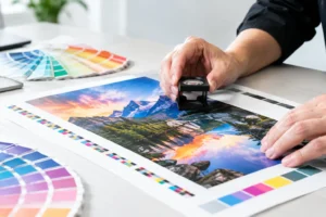
Color still needs production planning. Bright colors on a monitor can print differently depending on stock, coating, lighting, and the printing method. If your identity depends on a specific brand color, discuss it before approving a large run. For repeat materials, establish practical color standards so brochures, banners, postcards, and display graphics stay visually aligned.
Brand Identity Trends for Events and Trade Shows
Modular graphics support changing campaigns
Businesses are moving away from event displays that can only be used once. Modular identity systems make it possible to update a message, product image, seasonal offer, or event-specific call to action without redesigning every graphic from scratch.
For example, a trade show booth can use a consistent backdrop with interchangeable banner panels, tabletop signs, product cards, and handouts. The identity remains recognizable while the campaign stays current. This is useful for exhibitors attending multiple Las Vegas conventions, sales teams with changing promotions, and organizations hosting recurring events.
Design with replacement in mind. Keep essential brand elements – logo, type hierarchy, key colors, and layout structure – consistent. Then create designated areas for dates, offers, product details, QR codes, or customer testimonials. When timing changes, only part of the system needs to be updated.
QR codes become part of the design, not an afterthought
QR codes remain useful when they solve a real next step. On a booth graphic, they can lead to a product catalog, booking page, menu, event registration, or lead form. On direct mail, they can connect a printed offer to a trackable landing page.
The design trend is to integrate the code into the visual layout rather than placing it in a corner with no context. It should have clear space around it, a short instruction, and a reason to scan. “See the full catalog” is more effective than a code with no explanation.
Test every code at final print size before production. A QR code that scans on a PDF may fail after being reduced, placed on a busy background, or printed with insufficient contrast. For banners, make it large enough to scan from the distance where people will realistically stand.
Imperfection is being used with intention
Not every modern brand needs a sleek corporate look. Hand-drawn accents, textured illustrations, irregular shapes, and expressive photography can help certain businesses feel more personal and less generic. This can work well for restaurants, wellness brands, artists, independent retailers, community organizations, and product-based companies.
The key is intention. A casual visual style still needs professional production files, readable text, and consistent use of color. “Handmade” should feel purposeful, not rushed. If your business operates in a high-trust category such as finance, healthcare, legal services, or B2B consulting, a more structured identity may serve you better.
How to Apply These Trends Without Rebranding Every Year
A full rebrand is not always necessary. Often, the best next step is a practical brand refresh: simplify the logo usage, strengthen the type hierarchy, update the color palette, and create templates for the materials your team orders most often.
Start with the items that have the widest reach. For many businesses, that means business cards, flyers, brochures, postcards, presentation materials, storefront signs, vehicle graphics, and trade show displays. Review them side by side. If they do not immediately look connected, identify what is changing from piece to piece: logo placement, colors, font choices, photography style, or messaging.
Then build a short set of production-ready standards. Include approved logo files, print color values, font choices, common paper or finish recommendations, and basic layout rules. A simple guide saves time when a new employee, outside designer, or event coordinator needs to order materials quickly.
It also pays to plan for scale. A design that works on an Instagram graphic may not work on a retractable banner. A photo that looks sharp in a digital ad may be too low resolution for a large-format wall graphic. Before printing, confirm file dimensions, image resolution, bleed, and final viewing distance. These details protect both the appearance of your brand and the delivery timeline.
For rush projects, clarity matters even more. Provide final copy, approved logos, brand colors, quantities, and deadlines as early as possible. If you need design support, explain where the piece will be used and what action you want the customer to take. That gives the production team a better chance to recommend the right format, size, stock, and finish.
The strongest identity is not the one that follows every trend. It is the one your customers can recognize quickly, whether they meet you at a Las Vegas convention, receive your postcard in the mail, or pick up your business card after a conversation. When your visual system is built for real print applications, every piece has a better chance to make that first impression count.