
Introduction: The Impact of High-Visibility Graphics at Las Vegas Trade Shows
In Las Vegas, your booth competes with massive screens, bright LEDs, and packed aisles. Attendees scan visuals in seconds, so large format signage visibility directly affects foot traffic and lead capture. Clean hierarchy, strong contrast, and concise messaging are what stop people at 20–30 feet and draw them into a conversation.
Distance dictates type size more than any other factor. A practical rule: plan roughly 1 inch of letter height for every 10 feet of viewing distance for legibility, and up to 2 inches per 10 feet for fast recognition in busy aisles. Examples that work on the show floor:
- Aisle headers (20–30 ft): 3–6 in letter height
- Hanging banners (50–100 ft): 8–12 in letter height
- Counter signage and offers (3–6 ft): 0.75–1.5 in letter height
This keeps headlines scan-friendly while preserving booth backdrop readability.
Common exhibitor graphic mistakes compound quickly at scale:
- Overloading panels with paragraphs instead of a 5–8 word promise and 2–3 support points
- Low contrast (e.g., medium gray on black) and busy photo backgrounds behind text
- Thin or condensed fonts that disappear under glare or at distance
- Placing key messages below 4 feet, where crowds and counters block lines of sight
- Logos and QR codes printed too small to be recognized or scanned from the aisle
Build your trade show booth design around tiers of communication. Put the primary value proposition high and large for 20–30 feet. Use mid-height panels for product categories or proof points readable at 10–15 feet. Reserve counters for offers, QR codes, and details at arm’s length. Aim for generous negative space; a simple layout with 30–40 character headlines outperforms dense layouts every day in Vegas halls.
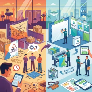
If you discover on site that type is undersized or contrast is off, Design One Printing can step in fast. Located minutes from the Strip, the team provides same-day wide-format reprints, fabric and tension backdrops, rigid signs, and on-the-spot typography tweaks through in-house design. Explore rush options for Las Vegas convention printing to protect your schedule—and your visibility.
The Consequences of Small Text: Why Your Message Isn’t Reaching Attendees
In a fast-moving exhibit hall, small type quietly sabotages large format signage visibility. Attendees scan aisles from 15–30 feet while juggling agendas and conversations; if your headline and call-to-action can’t be decoded within three seconds, the opportunity passes. Overhead lighting, glare from laminates, and motion in the periphery further reduce legibility, punishing designs that rely on fine print or thin, low-contrast fonts.
A common misconception is that “72 pt is huge,” but 72 points is roughly one inch—only comfortable at about 10 feet for quick recognition. Trade show aisles often span 10 feet or more, and many viewers are off-axis, so exhibitor graphic mistakes like 24–48 pt subheads on a 10-foot backdrop make critical details disappear. As a rule of thumb, plan about 1 inch of letter height for every 10 feet of viewing distance, and reserve smaller copy only for close-up panels or handouts when considering the optimal font size for banners.
The hidden costs of undersized copy add up fast:
- Fewer qualified leads because your CTA, URL, or QR prompt can’t be seen from the aisle.
- Weakened brand perception as crowded, tiny type reads as amateur or “budget booth.”
- Staff fatigue from repeating the same information that the graphics should convey.
- Accessibility gaps that alienate older attendees or those with low vision.
- Wasted spend when last-minute reprints are needed to fix booth backdrop readability.
- Lost wayfinding when hanging signs or headers sit higher and shrink apparent letter size.
Smaller text also encourages copy bloat. When every message “must fit,” hierarchy collapses, white space vanishes, and even bold headlines lose punch. Effective trade show booth design prioritizes one core message per panel, supported by a short CTA and high-contrast visuals.
If you’re racing to the show floor, a quick preflight can prevent these issues. Design One Printing’s Las Vegas convention printing team reviews visibility at real-world distances, recommends scale-appropriate typography, and can produce same-day reprints minutes from the Strip if adjustments are needed. For practical sizing and layout guidance before you export, see their large format printing design tips.
Determining Optimal Font Sizes for Distance and Readability
When planning text for a booth wall or hanging banner, start with the distance most attendees will read from. In fast-moving aisles, people decide in seconds, so prioritize large format signage visibility over packing in details. A dependable rule of thumb is roughly 1 inch of letter height for every 10 feet of viewing distance, adjusted for font weight, color contrast, lighting, and motion in the hall.
Use these distance-based targets to size primary and secondary text confidently:

- 10 ft: 1–1.5 in headlines; 0.75–1 in short body copy (counter signs, tabletop displays)
- 20 ft: 2–3 in headlines; 1.5–2 in subheads
- 30 ft: 3–5 in headlines; 2–3 in supporting text
- 50 ft: 6–8 in headlines; 3–4 in secondary callouts
- 75 ft and beyond (overhead banners): 10–12 in for brand/CTA only; avoid body copy
Typeface and finishing choices are as critical as size. Choose bold, open sans-serifs (e.g., Source Sans, Helvetica, Montserrat) over ultra-light or condensed styles that thin out at distance. Favor high-contrast color pairs (dark text on light backgrounds or vice versa) and avoid busy photos behind type. Slightly increase tracking and keep line spacing at 120–140% to preserve letter shapes under glare common in Las Vegas halls; matte or fabric finishes help reduce reflections and improve booth backdrop readability.
Build a clear hierarchy to match real viewing zones in trade show booth design. For a 10×10 back wall viewed at 15–25 ft, set your core message at 4–6 in, a short qualifier at 2–3 in, and move details to a podium sign where 1–1.5 in text is readable at 5–10 ft. For a 3×10 ft overhead banner, treat it like a billboard: brand name at 8–10 in and a 5–6 in directional cue (e.g., “Live Demos”)—no fine print. That’s the optimal font size for banners that must be read on the move.
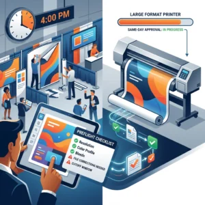
If you’re unsure, Design One Printing can create true-size proofs and quick test prints to validate readability before you commit. As a Las Vegas convention printing partner minutes from the Strip, they help exhibitors avoid common graphic mistakes with same-day large format printing, fabric and tension backdrops, and on-site delivery—so last-minute adjustments don’t cost you visibility.
Contrast and Color: Enhancing Legibility in Crowded Exhibition Halls
In crowded halls, color and contrast can make or break large format signage visibility. Even with the optimal font size for banners, low-contrast color choices erase your message from 30 feet away. Prioritize dark-on-light or light-on-dark schemes and keep backgrounds simple so attendees can decode your headline in a glance during walk-bys.
Aim for strong luminance contrast. As a rule of thumb, follow accessibility-inspired targets: a minimum 4.5:1 contrast ratio for body copy and 3:1 for big headlines. Remember that up to 8% of attendees may have some form of color vision deficiency—so don’t rely on hue alone to create separation.
- Use proven pairs: white on navy, black on yellow, charcoal on cream.
- Avoid risky combos: red on black, blue on red, mid-gray on mid-blue, or text over busy photos.
- Add a subtle text halo (1–2% of letter height) or a solid color block behind type when placing words on imagery.
- Limit the palette to 2–3 brand colors plus one accent to reduce visual noise and improve booth backdrop readability.
Backgrounds with gradients, photos, or patterns are common exhibitor graphic mistakes. If you must use imagery, lower its contrast within the text area (e.g., a translucent overlay at 60–80% opacity) and increase letter weight. Maintain generous negative space around headlines and calls to action so colors don’t visually “bleed” into each other at distance.
Lighting inside Las Vegas venues is bright and often directional, which can create glare on glossy substrates. Choose matte or satin finishes for banners, fabric and tension backdrops, and foam boards to preserve contrast under LED spots. Reserve gloss for small handouts, not the primary message wall in your trade show booth design.
Finally, validate color choices at scale. Print a full-size swatch of your headline color on its background and test it from your target viewing distance (e.g., 20–40 feet). For fast Las Vegas convention printing, Design One Printing can produce same-day color proofs, recommend materials that resist glare, and adjust files to ensure high-contrast results before you commit to final wide-format output. That way your message stays legible—and memorable—on a busy show floor.
The Importance of Information Hierarchy in Large-Format Design
On a busy show floor, attendees decide in seconds whether to approach your space. Information hierarchy determines what they notice first, second, and last. Prioritizing large format signage visibility within your trade show booth design ensures your brand and core message cut through at distance, while supporting details remain legible up close. In Las Vegas’s cavernous halls, scale, glare, and motion demand crystal-clear hierarchy.
Think in tiers. Tier 1 (distance: 20–50 ft): logo and a short, high-contrast promise, placed high on the backdrop or hanging sign, aligned to a natural left-to-right “Z” scan. Tier 2 (10–20 ft): the primary benefit or offer and a simple visual, centered at average eye line. Tier 3 (3–10 ft): proof points, a QR code, and contact info near the reception counter; avoid placing crucial copy below 3 feet where people and furniture block it.
Use distance-led sizing to set the optimal font size for banners. As a rule of thumb, 1 inch of letter height is readable at roughly 10 feet; for quick-glance environments, use 1 inch per 5–7 feet. Examples: across an aisle (25–30 ft), set your headline at 4–6 inches tall; for a 10×10 booth backdrop readability at 12–15 ft, 2–3 inches works. Pair size with sturdy typefaces (open counters, medium to bold weights) and strong contrast to preserve clarity at scale.
Avoid these common exhibitor graphic mistakes that undermine visibility:
- Overloading copy so the hook gets buried.
- Low contrast, thin/light type, or text over busy images.
- Placing key text across panel seams or near hardware edges.
- Important info below counter height, blocked by people or furniture.
- Overusing ALL CAPS or tight tracking that hurts legibility.
- Inconsistent fonts and misaligned columns that disrupt scan order.
- QR codes too small (aim for 1–1.5 inches) or placed too far from reach.
- Glossy or metallic substrates that produce glare under expo lighting.
For Las Vegas convention printing, Design One Printing—minutes from the Strip—can preflight your files, advise on hierarchy and sizing, and produce same-day large-format banners, fabric backdrops, and signage. If your team arrives and readability misses the mark, they can quickly adjust layouts, scale type to proper viewing distances, and deliver fast reprints so your booth backdrop readability and impact are on point.

Technical Specifications: Resolution and Scaling for Professional Quality Prints
File resolution and scaling are the backbone of large format signage visibility. Many exhibitor graphic mistakes stem from building files at the wrong size, exporting low-res images, or rasterizing type that should remain vector. Start with the end in mind: final dimensions, finishing (hem, pole pockets, hardware), and typical viewing distance on the show floor.
Match PPI to viewing distance rather than defaulting to “300 PPI.” For panels viewed within 3–6 feet (podium signs, product boards), target 200–300 PPI at final size. For booth backdrop readability at 6–15 feet (8–20 ft walls, hanging banners), 100–150 PPI is sufficient. For 15+ feet (oversized headers, lobby graphics), 50–100 PPI works; billboards can drop to 30–75 PPI because the viewer is far away.
Build big, but scale smart. If software struggles at full size, create at 50% with 300 PPI (equivalent to 150 PPI at full size) or 25% with 300 PPI (≈75 PPI final). Keep logos and all live type as vectors; set Illustrator “Document Raster Effects” to match your intended final effective PPI, and verify effective resolution in your Links panel.
Before you export, run this production checklist:
- Document size equals final trim; include bleed and safe margins (common bleeds range 0.125–1.0 in; confirm for hems/pockets).
- PDF/X-1a or PDF/X-4 preferred; outline or embed fonts; embed linked images.
- Use CMYK or RGB per printer guidance; keep total ink under ~280–300%; specify Pantone for critical brand colors.
- Use rich black for large areas (e.g., C60 M40 Y40 K100), not 100K alone; avoid 4-color black for small body text.
- Flatten complex transparency or provide a PDF/X-4 with live transparency if the RIP supports it; check overprint settings.
- Name files with size/finish and include a low-res proof for reference.
Translate distance to letter size to set the optimal font size for banners. A practical rule: minimum letter height in inches ≈ viewing distance in feet ÷ 10 (double it for effortless readability). Example: a 10 ft read distance needs at least 1 in letters (2 in for comfort); a 30 ft header needs 3–6 in letters—crucial for trade show booth design where attendees scan quickly.
Tight deadline in Las Vegas? Design One Printing can preflight your files, advise on scaling and color, and produce same-day wide-format pieces for Las Vegas convention printing. Their proximity to the Strip and experience with event hardware help ensure your graphics hit spec and look sharp on the show floor.
Conclusion: Maximizing Your ROI with Expertly Designed Convention Signage
The fastest way to boost show results is to make every message instantly readable from the aisles. When you treat large format signage visibility as a performance metric, you reduce confusion, increase foot traffic, and turn glances into conversations. This is especially critical in Las Vegas, where competing visuals are everywhere and attendees skim quickly.
Plan type size from the farthest approach distance. A reliable rule of thumb for optimal font size for banners is roughly 1 inch of letter height for every 10 feet of viewing distance—so 3–4-inch headlines for 30–40 feet, and 1–1.5-inch copy for counters read from 10–15 feet. Mount key headlines around average eye level (about 4–6 feet) and repeat the core message on higher elements to catch long-range sightlines.
Improve booth backdrop readability with strong contrast, simple hierarchies, and deliberate negative space. Limit yourself to one or two fonts, use bold weights for distance, and avoid long phrases in all caps. The most common exhibitor graphic mistakes are low-contrast color pairs, busy photographic backgrounds behind text, and overstuffed layouts that dilute the primary offer.
Material choice affects glare and color fidelity under convention lighting. Matte fabric and tension backdrops reduce reflections and hide wrinkles, while smooth vinyl can punch color but may reflect floodlights. If your trade show booth design uses LED walls or accent lighting, request a small test print to check color and legibility in similar conditions before you commit to full runs.
Before you send files, run this quick ROI checklist:
- Define farthest viewing distance and size type accordingly.
- Keep 6–10 words per headline; push details to handouts or QR codes.
- Reserve clear space around logos and headlines; avoid text over complex imagery.
- Place primary messages between 4–8 feet high, with repeats at long-range elevations.
- Export vector text where possible; set raster elements to 150–300 dpi at final size in CMYK.
- Print a 100% scale crop of critical text to validate readability.
For reliable Las Vegas convention printing, Design One Printing helps you move from concept to show floor without guesswork. Their team preflights files, suggests size and substrate tweaks for large format signage visibility, and delivers same-day fabric and tension backdrops, banners, and signs minutes from the Strip. If plans change, they can turn emergency reprints, produce leave-behind Extreme Cards in wood, metal, or plastic, and even support post-show EDDM follow-ups—so your investment pays off long after teardown.
Contact us today at designoneprinting.com to see how we can help on your next project.