A brochure can look polished on screen and still fail the moment someone opens it. A headline may land in the wrong panel, a fold can cut through a photo, or the final panel may not tuck correctly. This guide to brochure folds explained helps Las Vegas businesses, exhibitors, and event teams choose a format that works before production starts.
The right fold depends on what the piece needs to do. A restaurant promoting catering, a convention exhibitor introducing services, and a real estate team mailing neighborhood offers may all use brochures, but they need very different reading experiences. Fold choice affects panel count, mailing options, design space, paper selection, and how quickly a prospect understands the message.
Why Brochure Folds Matter Before You Design
A fold is more than a finishing detail. It sets the order in which people see your information. The outside panels need to invite someone in; the inside panels need to guide them toward the next step, whether that is visiting a booth, making a reservation, calling for service, or scanning a QR code.
It also changes the usable size of each panel. Some folds create equal panels, while others require one panel to be slightly narrower so the brochure closes cleanly. Treating every panel as identical can cause awkward copy breaks and production problems.
For rush printing, deciding on the fold early keeps the project moving. Your designer can build the artwork to the correct panel dimensions, and your print team can recommend a paper stock that folds neatly without cracking or feeling flimsy.
Brochure Folds Explained: The Most Common Choices
Half Fold: Simple and Familiar
A half-fold brochure is one sheet folded once down the center. It creates four pages: a front cover, two inside pages, and a back cover. It is often called a bi-fold.
This is a strong choice when your message is short and image-led. A hotel can use it for a property overview, a contractor can use it for a service menu, or an event organizer can use it for a concise schedule. The larger panels give photos, maps, and product images room to breathe.
The trade-off is limited storytelling space. If you need separate sections for several services, pricing, testimonials, a map, and a call to action, the inside spread can become crowded quickly. In that case, a tri-fold or larger folded piece may work better.
Tri-Fold: A Reliable Sales and Information Format
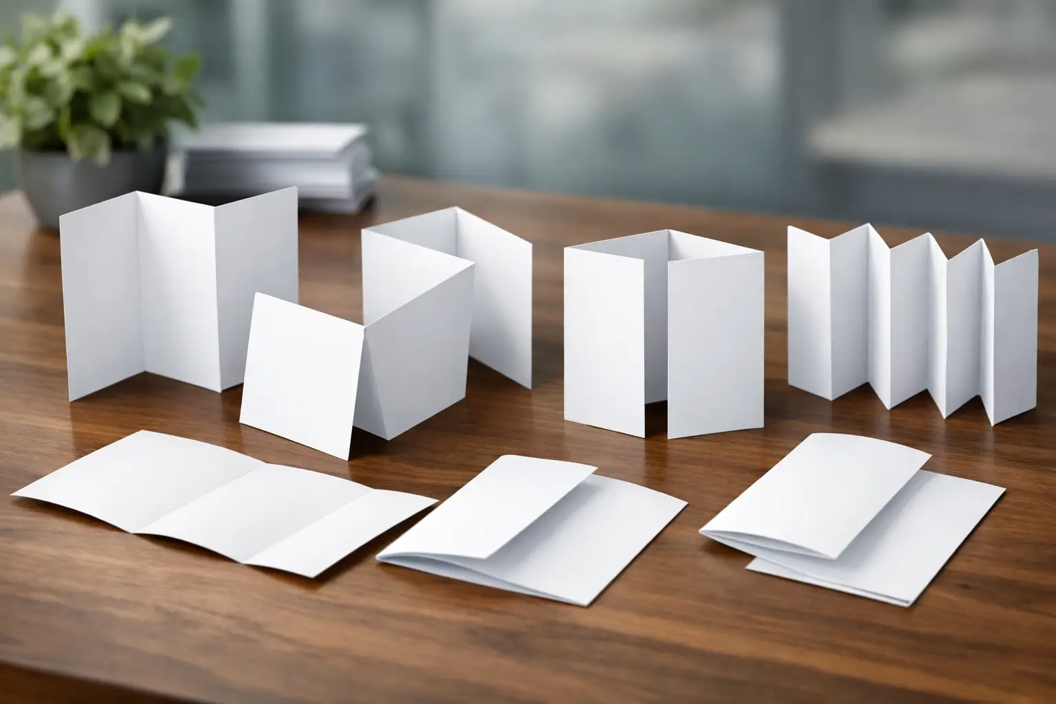
A tri-fold brochure has two vertical folds and six panels. It is one of the most requested brochure styles because it provides clear sections while remaining compact enough for a counter display, presentation folder, or direct mail campaign.
The typical reading path begins with the front cover. Opening the first flap reveals a short introduction, then the full inside spread can carry the main details. The final outside panel usually holds contact information, business hours, a location map, or a direct call to action.
Tri-folds work especially well for service businesses, menus, visitor information, medical offices, and convention handouts. They let you organize content by service category or buyer question without making the piece feel like a booklet.
One production detail matters: the fold-in panel must be slightly narrower than the other panels. This prevents bunching when the brochure is closed. Do not place critical text, borders, or faces too close to either fold line.
Z-Fold: Built for Step-by-Step Messages
A Z-fold also creates six panels, but the folds alternate directions, forming a zigzag pattern. Unlike a tri-fold, it opens like an accordion. Each panel is typically the same width, which can make layout planning more straightforward.
Use a Z-fold when the content has a natural sequence. It is useful for timelines, event agendas, process explanations, product comparisons, or a series of offers. A trade show exhibitor might use one panel for a problem, the next for a solution, then follow with proof points, services, and a meeting invitation.
Because it can be opened one panel at a time, the Z-fold supports a more linear story than a tri-fold. It is less ideal when the inside needs to feel like one uninterrupted, large image or chart.
Gate Fold: Made for a Strong Reveal
A gate-fold brochure has two outer panels that open toward the center, revealing a larger interior area. The closed front can create a premium first impression, particularly when the two doors meet over a bold image, logo, or short message.
This format suits high-impact announcements, hospitality promotions, luxury products, venue launches, and major event invitations. The reveal is part of the experience, so the center interior works well for a hero photo, product launch statement, or visual presentation.
Gate folds require careful planning. The front panels are narrower than the interior panels, and the design needs to align precisely at the center. They are generally not the most economical choice for a quick, information-heavy handout, but they can be worth it when presentation matters most.
Double Gate Fold: More Space, More Impact
A double gate fold uses additional folds to create four opening panels that meet at the center. When opened, it reveals a wide interior spread. It offers more panels than a standard gate fold and creates a memorable, presentation-style format.
This option is a fit for product catalogs, destination guides, premium sales kits, and detailed convention materials where the brochure itself needs to make an impression. It does require more setup, more careful design, and often a larger flat sheet size. Plan extra production time if the job includes specialty paper, coating, or complex finishing.
Accordion Fold: Flexible for Maps and Schedules
An accordion fold uses several parallel folds, creating a series of connected panels that open in one direction. Four-panel, six-panel, and eight-panel versions are common.
It is a practical format for maps, festival programs, venue guides, multi-day conference schedules, and service menus with many categories. Each panel can stand alone, but the fully opened piece provides a broader view when needed.
The key is content discipline. An accordion fold gives you more room, not permission to overload every panel. Keep type readable, repeat navigation cues where helpful, and make sure a reader can identify the front cover when the piece is folded.
Choose the Fold Based on How It Will Be Used
Start with distribution. A brochure placed in a hotel lobby or handed out at a Las Vegas convention needs a clear cover and quick message. A mailed campaign may need to meet postal requirements and leave room for addressing. A sales representative may need a fold that fits neatly inside a folder or presentation packet.
Then consider the amount and type of content. A half fold is effective for a focused offer. A tri-fold works for organized service information. A Z-fold supports a sequence. Gate folds and accordion folds provide more impact or more detail, but each adds complexity.
Finally, think about the audience’s attention span. At a busy trade show, prospects may only give your brochure a few seconds before deciding whether to keep it. Put the benefit, event-specific offer, or reason to visit your booth on the cover. Save company history and technical details for the interior.
Design and Print Details That Prevent Problems
Build the file around the finished size and fold type, not just the flat sheet size. Every panel should have safe margins, and important text should stay clear of fold lines. If a photo crosses a fold, choose an image that will not look strange when interrupted by a crease.
Use high-resolution images and allow bleed beyond the trim edge for any color or photo that reaches the edge of the brochure. Small text reversed out of a dark background can be difficult to read, particularly near a fold. If the brochure will be handled often, heavier text and clear contrast are safer choices.
Paper affects the result, too. A lighter stock may suit high-volume handouts and mailers. A heavier cover stock feels more substantial for sales presentations or upscale promotions. Thick coated stocks can crack along folds if they are not scored correctly, so discuss the stock and finish with your printer before finalizing a rushed order.
For businesses working against an event deadline, send final content early and avoid last-minute structural changes. Changing a headline is simple. Changing from a tri-fold to a gate fold can mean rebuilding the layout from the start.
A well-chosen fold makes your message easier to follow and your brand easier to remember. If you need help matching a brochure format to a campaign, booth handout, or urgent local print order, Design One Printing can help you move from idea to press-ready piece without losing time to preventable setup issues.