
Introduction to Large-Format Signage in Event Environments
Convention halls are crowded, fast-moving environments where attendees make split-second decisions about which booths to approach. In that context, large format printing mistakes can quietly drain ROI—especially when text is undersized, contrast is weak, or visuals aren’t optimized for long sightlines. Treat signage as a visibility system first, a brand canvas second. This section sets the foundation with practical guidance you can apply before you hit “print.”
Start with text scale for signs. A widely used rule of thumb: plan about 1 inch of letter height for every 10 feet of viewing distance for headlines. For a 10’–15′ aisle distance in a standard 10×10 booth, headline letters of 1.5″–2″ are a minimum; 3″–4″ reads faster through crowds. Keep secondary text at least half the headline size, and ruthlessly edit copy—one core message, one call to action, and supporting detail saved for handouts or QR codes.
Maximize large format graphics visibility with contrast and finish. High-contrast pairs (dark navy on white, black on yellow) outperform trendy low-contrast palettes. Convention lighting often creates glare; matte or satin laminates stay readable from more angles than high-gloss. Mount headers above eye level (7’–8′) for over-the-crowd legibility, and avoid placing critical text near fold lines, grommets, or pole pockets.
Prepare files for scale. For banners and backdrops viewed from several feet away, aim for about 150 dpi at final size (use vector logos and type whenever possible). Build in bleeds per hardware specs and keep a 1″–2″ safe area inside edges for grommets and clamps. Convert spot colors thoughtfully to CMYK, and avoid neon-like RGB hues that print dull. If you’re tiling panels, add overlap for clean seams.
Common trade show display mistakes to catch early:
- Too much copy or mixed font families that kill hierarchy
- Low contrast or busy backgrounds behind text
- Rasterized logos that pixelate when enlarged
- QR codes smaller than 1″–1.25″ that fail at aisle distance
- Ignoring sightlines from neighboring booths and corners
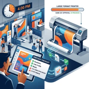
Need fast fixes before doors open? Design One Printing, minutes from the Las Vegas Strip, can review artwork for readability, scale your files correctly, and produce same-day banners, backdrops, and Extreme Cards. Explore our Las Vegas convention printing solutions if your team is on a tight show schedule.
The Impact of Incorrect Text Scaling on Brand Visibility
When headlines and body copy are scaled incorrectly, even strong creative loses impact. Among the most costly large format printing mistakes at conventions is undersized typography that can’t be read from the aisle, which lowers booth traffic and brand recall. Oversized text can backfire too—crowding layouts, forcing awkward line breaks, and diluting hierarchy.
A practical signage readability guide: plan roughly 1 inch of letter height for every 10 feet of viewing distance in busy halls. That means a 30-foot aisle read needs a 3–4 inch headline, while entrance or hanging signs targeting 60–100 feet often need 6–10 inch characters. For close-range graphics (5–10 feet), keep feature callouts 0.75–1.5 inches and ensure line lengths stay under 55–65 characters for quick scanning. Always test at full size on screen or with a printed tile before final production.
Typeface choice and contrast alter perceived scale. Ultra-light or condensed fonts lose strokes on fabric backdrops and textured media; choose medium/semi-bold weights with ample x-height. High-contrast color pairs (e.g., dark navy on white, black on warm light gray) outperform brand-accent-on-brand-accent combinations. Avoid all caps for sentences—mixed case improves word shape recognition at a distance.
Common text scale for signs pitfalls—and quick fixes:
- Tiny booth headers: move to 6–10 inch letters for long-range recognition; reserve 1–2 inch copy for close-up panels.
- Tight tracking: add 10–30 units of letter spacing to headlines over 4 inches tall to reduce “blobbing.”
- Busy backgrounds: add solid color bars or 80–90% opaque overlays to restore legibility.
- Too much copy: promote one promise + one proof; shift specs to handouts or QR codes.
- Low placement: place key messages 5–7 feet off the floor to clear crowds and counters.
- Rasterized text: keep logos/type as vector to stay crisp at any scale.
Production settings also affect large format graphics visibility. For full-size files, 100–150 ppi is typically sufficient; prioritize vector elements for logos and key text. If you’re scaling from small print to a 10-foot backdrop, reflow copy and line spacing—don’t just enlarge. Design One Printing can preflight files, right-size typography for your booth footprint, and deliver same-day adjustments and [high-quality large format printing] for Las Vegas conventions.
Common Design Pitfalls: Contrast and Color Choices
Poor contrast and clashing color choices are among the most common large format printing mistakes—especially on crowded convention floors where attendees read from 10–50 feet away. Even when you’ve nailed text scale for signs, low contrast can erase your message under aisle lighting and visual noise. Prioritize large format graphics visibility by planning color pairs and backgrounds first, then placing copy.
Typical pitfalls include brand-color-on-brand-color (e.g., red headlines on charcoal backgrounds), light text over light gradients, or copy laid across busy photos without a solid anchor. As a practical signage readability guide, aim for contrast ratios near WCAG’s accessibility benchmarks: ~4.5:1 for normal body text and ~3:1 for large text; for distance viewing, higher is safer. Thin weights and fine serifs reduce apparent contrast—bolden key lines or use semibold with increased letter spacing.
Trade show lighting compounds the issue. Glossy vinyl and acrylic can blow out highlights, turning pale yellows, oranges, and light grays into low-contrast glare—classic trade show display mistakes. Choose matte laminates, fabric backdrops, or tension displays to cut reflections, and avoid metallic or mirrored substrates behind small type.

Color management is another trap. Files built in RGB or using neon-like hues can dull in CMYK, collapsing contrast on press. If you need deep backgrounds, use a controlled “rich black” for solid areas but keep small black text 100% K to preserve crisp edges. For photo backgrounds, add a solid color block, high-opacity overlay, or a soft vignette to ensure copy sits on a consistent value.
Quick convention signage design tips to improve contrast:
- Pair dark text on a light field or light text on a near-solid dark field; avoid mid-tone-on-mid-tone.
- Test at scale: print a 12″ sample at final resolution and review from 20–30 feet.
- Desaturate a proof; if the message disappears in grayscale, your contrast is too weak.
- Use strokes or solid panels sparingly to separate type from imagery; avoid heavy drop shadows.
- Account for hall lighting and glare; prefer matte/fabric for high-illumination booths.
- Lock brand colors for blocks or accents, not for small, critical text if contrast is marginal.
Need a second set of eyes? Design One Printing can preflight for contrast risks, produce same-day swatches, and recommend materials like matte fabric and tension backdrops that boost readability under Las Vegas convention lights. Located minutes from the Strip, the team can adjust color builds or substrates fast so your message stays visible when it matters.
Viewing Distance and Font Size: Finding the Right Balance
One of the most common large format printing mistakes at conventions is underestimating how far attendees stand from your display. A busy aisle compresses attention spans, so your primary message must be readable at a glance from 20 to 100 feet. Think in terms of decision distance: what can be understood in three seconds as someone approaches, passes, or glances upward?
A practical signage readability guide is to size letter height in inches to roughly one-tenth of the viewing distance in feet for comfortable reading. Use these quick targets for text scale for signs:
- 5–10 ft: 1–2 in letters for product names and counter graphics.
- 20–30 ft: 3–4 in letters for booth headers and backwall taglines.
- 50 ft: 5–6 in letters for primary value props on large banners.
- 75–100 ft: 8–12 in letters for hanging signs and atrium graphics.
Typography choices matter as much as size. Favor open, uncondensed sans serifs, avoid ultra-light weights, and use mixed case—word shapes scan faster than ALL CAPS. Increase letter spacing slightly for long-range headlines, keep line spacing generous, and reserve high-contrast color pairs to maximize large format graphics visibility.
Context drives scale. On an 8-foot backwall, a 3-inch tagline may look fine on screen but collapses at 30 feet; bump to 4–6 inches and limit the copy to 5–7 words. For a 12-foot hanging banner over a 20×20, 10–12-inch letters keep you legible across multiple aisles; secondary details belong at eye-level panels where viewers are within 5–10 feet. Avoid trade show display mistakes like stacking multiple font sizes in one plane—create a hierarchy: big, bold headline; medium subhead; minimal body copy where traffic slows.
If you’re unsure, Design One Printing can preflight your artwork against actual Las Vegas venue distances and recommend exact point sizes before you print. Their convention signage design tips and same-day large format printing help you correct scale issues fast—minutes from the Strip, ideal for last-minute refinements. Send your booth dimensions, mounting height, and target viewing distances, and they’ll translate them into a clear, reliable sizing plan.
Material Considerations for Clarity and Durability
Material choice directly impacts clarity, longevity, and show-floor compliance—many large format printing mistakes start here. Using glossy vinyl under truss lights, non-blockout fabrics that show hardware shadows, or fragile foam board in high-traffic aisles can ruin legibility and shorten lifespan. Prioritize substrates and finishes that control glare, resist wear, and fit your installation method.
Lighting drives finish. Matte or satin laminates preserve large format graphics visibility under convention spotlights far better than high-gloss, which can wash out brand colors and make text hard to read. For overhead or front-lit banners, blockout fabric prevents light bleed; for backlit boxes, use true backlit film to avoid hot spots. These convention signage design tips often matter more than the file itself.
Choose substrates with the use case in mind:
- Matte scrim vinyl: durable for hanging banners; specify reinforced hems and grommets every 24″ (closer in windy load-in docks).
- Tension fabric (blockout): wrinkle-resistant, travel-friendly; avoid see-through knits that soften small type.
- PVC/Sintra or Gatorfoam: rigid signs that survive handling better than foam board; ideal for mounting QR codes near aisles.
- Anti-curl PET for retractables: grey-back blocks light; don’t use paper stocks in cassettes.
- Window and wall graphics: low-tack, repositionable adhesives protect venue walls; test on textured paint.
- Floor decals: textured, UL slip-rated laminate; square corners lift—spec rounded corners.
Finishing and hardware can make or break durability. Pole pockets reduce banner curl, but orient pockets so seams don’t cut through headlines; avoid placing critical text within 2″ of hems, seams, or grommets. Confirm NFPA 701 fire-retardant ratings for fabrics—overlooked compliance is a common trade show display mistake. For outdoor queues, consider mesh banner for wind relief; for indoor clarity, use solid blockout.
Material texture affects readability, so adjust text scale for signs accordingly. Fine serifs and thin strokes lose crispness on textured fabric—boost weight by 10–15% and increase minimum letter height. As a practical signage readability guide, plan at least 1″ of letter height per 10 feet of viewing distance, then add 10% if the substrate is textured or viewed at an angle.
Located minutes from the Strip, Design One Printing can recommend the right combination of substrate, ink, and finish—matte vs gloss, blockout vs mesh, anti-curl films—and deliver same-day when plans change. Their fabric and tension backdrops, large-format banners, and rigid signage options help you avoid costly material missteps while keeping your brand sharp all show long.

Best Practices for High-Impact Trade Show Graphics
Start with message hierarchy. Lead with a single, benefit-driven headline, a short supporting line, and one clear call-to-action. Avoid large format printing mistakes like cramming product lists, multiple CTAs, or dense paragraphs; at trade show viewing distances, simplicity wins. Keep brand elements consistent across backdrops, counters, and banners to reinforce recognition as attendees move past your booth.
Use a deliberate text scale for signs. A practical rule: larger letter height for longer viewing distances, and prioritize the top third of tall graphics for headlines so they clear crowds and furniture.
- Aisle-facing banners: 8–12 in headline letters for 25–50 ft visibility; subheads 4–6 in.
- 10×10 booth back wall: 4–6 in headline letters for mid-aisle readability; body copy 2–3 in only if necessary.
- Pedestal/counter graphics: 1–2 in for close-range messaging; keep CTAs near hand level.
- Hanging signs: maximize letter height and keep wording to 3–5 words for legibility from across the hall.
Optimize contrast and color. High-contrast pairs (e.g., dark navy on white, black on light yellow) outperform trendy low-contrast palettes under show lighting. If you’re overlaying text on photography, apply a 30–60% dark overlay or choose a clean area of the image to preserve large format graphics visibility. Prefer matte or fabric substrates to reduce glare; glossy laminates can wash out type under convention hall LEDs.
Prep files for production accuracy. Supply vector logos and line art, and set raster images to 100–150 PPI at final size (300 PPI only for small prints). Build in proper bleeds (0.25–1 in for banners) and maintain a 1–2 in safe area to avoid grommets, pole pockets, or frame edges cutting into copy—classic trade show display mistakes. Use CMYK with embedded profiles; spot colors should have Pantone bridges approved via hard proof.
Plan for placement and real-world tests. Mount key messages 5–7 ft from the floor to clear line-of-sight over crowds. Keep 30–40% negative space around headlines for a fast read. Print a small-scale mockup and view it from proportional distances; snap photos on your phone to simulate attendee perception and confirm this signage readability guide in practice.
If you’re on a tight timeline in Las Vegas, Design One Printing can preflight your files, advise on text scale for signs, and produce same-day wide-format banners, fabric backdrops, and booth graphics minutes from the Strip—so last-minute corrections don’t become convention signage design tips learned the hard way.
Conclusion: Ensuring Your Signs Stand Out on the Convention Floor
Standing out on a crowded convention floor is rarely about flashy art alone—it’s about disciplined choices that avoid large format printing mistakes. Plan for real-world sightlines, movement, and lighting, then build your messaging hierarchy to win the three-second glance. The result is signage that looks great up close and does its job from across the aisle.
As a rule of thumb for text scale for signs, aim for roughly 1 inch of letter height for every 10 feet of viewing distance. If your primary headline needs to be read from 40 feet, set at least 4-inch letters; for an overhead banner legible from 80 feet, 8–10 inches is safer. Use short, scannable lines for secondary copy and keep CTAs big enough to read from common approach angles.
Contrast drives large format graphics visibility. High-contrast pairs like dark navy on white outperform light-on-light combinations under exhibit hall glare, and bold sans-serif weights beat thin scripts. Limit the message to one promise, one proof point, and one action; too many elements create trade show display mistakes that dilute the signal.
Material and production choices matter. Matte films and fabrics control glare under LEDs, while tension-fabric backdrops minimize wrinkles and hotspots. Prep files in CMYK with ample bleed (often 0.25–0.5 inch; confirm with your printer), keep photos at 100–150 ppi at full size for large pieces, and supply vector logos to maintain crisp edges.
Quick signage readability guide:
- Measure typical viewing distances and set letter heights accordingly.
- Put the core message in the top third; avoid placing key text below 3 feet where tables and crowds block it.
- Increase line spacing and margins to preserve white space at scale.
- Choose high-contrast color pairs; avoid busy backgrounds behind copy.
- Use 1–2 typefaces, prioritize bold weights for headlines.
- Keep copy to essentials; aim for seven words or fewer in headlines.
- Verify resolution at final size; test print a 100% crop for critical areas.
- Proof color under similar lighting and request a material sample.
If you need a fast, reliable partner in Las Vegas, Design One Printing specializes in convention signage design tips executed under tight deadlines. From wide-format banners and fabric/tension backdrops to same-day printing for urgent replacements, their team can preflight files, advise on scale, and deliver polished results minutes from the Strip. They’ll help you sidestep last-minute trade show display mistakes and ensure every sign earns attention.
Contact us today at designoneprinting.com to see how we can help on your next project.