A packaging file can look perfect on screen and still fail on press if its dieline, color settings, or finishing details are not production-ready. This guide to print ready packaging is built for businesses that need cartons, labels, pouches, sleeves, or product inserts produced accurately on a working deadline – especially when a launch, retail event, or convention date is close.
Packaging is not a standard flyer with a fold added later. It combines graphic design, material specifications, cutting, scoring, folding, and sometimes specialty finishing. A small setup error can shift a logo onto a fold, cut off required product information, or create a color result that does not match the rest of your brand materials. Preparing the file correctly before production protects both your timeline and your budget.
Start With the Packaging Structure
The first question is not what color the box should be. It is what the finished package needs to do. Will it hold a lightweight promotional item, a food product, a cosmetic bottle, or retail merchandise that needs to hang on a display? The product dimensions, weight, shipping conditions, and retail environment all affect the structure and material choice.
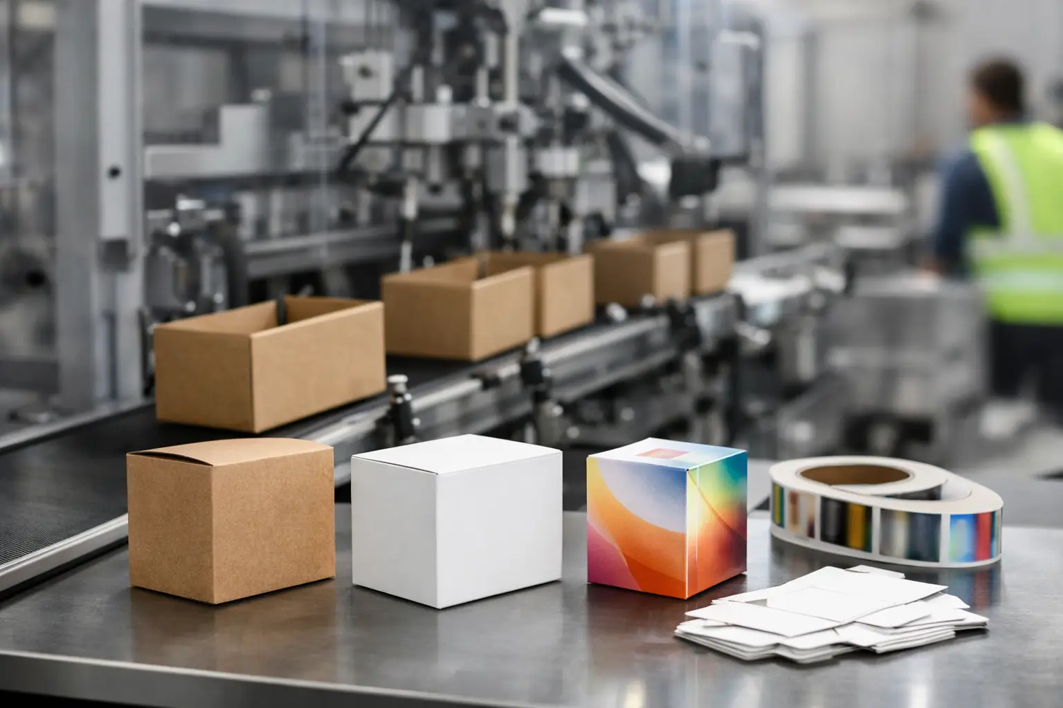
A folding carton, for example, may need tuck flaps, glue tabs, window cutouts, or a hang tab. A label needs to match the exact shape and circumference of its container. A corrugated shipping box needs enough strength to protect the product, while a presentation box may prioritize a premium unboxing experience. Share the product dimensions and intended use before artwork begins so the package is designed around the real-world application.
Once the structure is approved, work from a production dieline. A dieline is the technical template that identifies cut lines, fold or score lines, glue areas, bleed, and safe zones. It is not decoration. It is the map that tells the finishing equipment where each action happens.
Keep Dielines Separate From Artwork
Your printer may provide a dieline, or a packaging designer may create one for a custom project. Either way, retain it at its original size and place it on a separate, clearly named layer. The die layer should remain visible in the supplied file but should be set up according to the printer’s instructions so it does not reproduce as part of the finished artwork.
Do not redraw, stretch, rotate, or modify the dieline without approval. A change that seems minor in a design application can affect flap alignment, glue placement, or the way the package closes. If you need a different size or structural feature, request a revised dieline rather than forcing the existing one to fit.
Build Artwork With Bleed and Safe Space
Packaging gets trimmed, cut, scored, and folded after printing. These mechanical steps are precise, but they are not a reason to place important content directly on an edge or fold. Bleed and safe areas give the production process room to work.
Bleed is artwork that extends beyond the cut line. For most print projects, 0.125 inch is common, but packaging requirements can vary by material, size, and finishing method. Background colors, patterns, and images that reach an edge should extend through the bleed area. Without bleed, small cutting variation can leave an unwanted white edge.
The safe area is the opposite: it is the space inside the cut and fold lines where critical content should stay. Keep logos, small type, barcodes, legal copy, and key product claims away from folds, scores, glue tabs, perforations, and cut edges. A design may technically fit within the trim line but still be difficult to read after the package is folded.
Think about how the customer will hold the finished piece. A front panel might be the primary selling surface, but side panels often carry ingredients, instructions, contact details, or product specifications. Make sure the copy reads in the correct direction once the carton is assembled. This is one of the most common packaging file issues and one of the easiest to prevent with a flat mockup and a folded sample.
Set Up Color for the Actual Printing Method
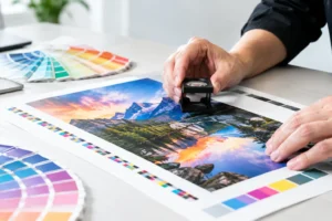
Color decisions made for a digital screen do not automatically translate to ink on paper, film, vinyl, or board. Build production artwork in CMYK unless the project calls for spot colors. RGB files can produce unexpected color shifts when converted for print, particularly in bright blues, greens, and oranges.
If a brand color must match across packaging, brochures, signage, and trade show graphics, provide the approved CMYK values and any Pantone references. A Pantone spot color can be useful when color consistency is especially critical, but it may add cost or require a specific printing process. For short-run packaging or fast-turnaround digital production, CMYK may be the practical choice. The right option depends on run size, material, budget, and how exact the match needs to be.
Dark, saturated backgrounds deserve extra attention. Large solid areas can reveal scratches, scuffs, or minor handling marks more easily than lighter designs. Coatings and laminates can improve durability and presentation, but they also affect color, texture, and glare. A matte finish feels refined and reduces reflection. Gloss can make colors appear more vivid. Soft-touch finishes create a premium feel but may not be ideal for every rush order or high-contact environment.
Use Images, Type, and Graphics That Hold Up on Press
Low-resolution photos are a fast way to make premium packaging look inexpensive. Images should generally be 300 dpi at final printed size. Enlarging a small web image inside a layout does not create more detail. It only enlarges the visible pixels.
Vector artwork is preferred for logos, icons, illustrations, line art, and text-heavy graphics because it stays sharp at any reasonable size. When placing raster images, use original high-resolution files rather than screenshots, social media downloads, or images copied from a website.
For typography, avoid very small reversed type, especially white lettering knocked out of a dark background. Fine text can fill in or lose clarity depending on the stock, ink coverage, and printing method. Thin rules, tiny registration marks, and delicate typefaces may look elegant on screen but can become difficult to reproduce consistently.
Before sending the file, outline fonts when appropriate or package the source file with all fonts and linked images. A press-ready PDF is usually the safest final format because it preserves layout, embeds assets, and reduces surprises caused by missing fonts or broken links. If your printer requests native design files, send those alongside the final PDF rather than instead of it.
Check Barcodes, Legal Copy, and Variable Details
Packaging often includes information that cannot be corrected after a run is printed: UPC or QR codes, nutrition facts, ingredients, warning statements, batch areas, product quantities, and compliance language. Treat this content as production-critical, not as an afterthought.
Barcodes need adequate size, contrast, and quiet space around them so scanners can read them. Place them on a flat area whenever possible, not across a fold, seam, curved surface, or heavy pattern. If a barcode is essential for retail, test it before approving a full run.
Also verify every variable detail: SKU, flavor, scent, size, contact information, web address, social handle, and expiration or lot-code space. A design proof checks appearance, but it should also be reviewed line by line by someone who knows the product. A polished package with the wrong net weight or phone number is still a costly mistake.
Request a Proof Before Full Production
A digital proof is the final checkpoint for layout, spelling, panel order, and general color direction. Review it at 100% scale when possible. Ask whether the proof represents the final stock and finishing method, because a screen proof, paper proof, and finished laminated carton will not look exactly the same.
For custom packaging, a physical mockup or short sample can be worth the extra time. It lets you confirm that the product fits, tabs close properly, glue areas are clear, and copy remains visible after assembly. This matters even more for products heading to a Las Vegas trade show, retail launch, or hospitality event, where replacement inventory may not be available on short notice.
A practical preflight check should confirm that:
- The approved dieline is included at full size and on its own layer.
- Bleed extends beyond every cut edge, and key content stays inside safe areas.
- Images are high resolution, colors are set correctly, and fonts are embedded or outlined.
- Barcodes, legal copy, and variable product details have been verified.
- The final PDF has been reviewed against a folded mockup or proof.
Plan for Turnaround Without Skipping Production Checks
Rush packaging is possible, but speed works best when decisions are made early. Material availability, custom dies, specialty coatings, foil, embossing, and hand assembly can all add time. A simple digitally printed carton or label may move quickly, while a custom structure with multiple finishes requires a more realistic schedule.
If your deadline is fixed, share it at the quote stage. A production partner can recommend materials and finishing options that meet the date without compromising the professional look your product needs. Design One Printing can also review files before production, helping catch problems while there is still time to correct them.
The best time to solve a packaging issue is before ink hits the material. Send the dieline, artwork, product details, and delivery deadline together, and your printer can help turn a complicated file into packaging that arrives ready to represent your business.