Why Large Format File Preparation Matters for Your Convention Deadlines
You’ve got a booth to fill, a banner that needs to command attention, and a convention floor that’s counting down to opening day. When you’re working against a tight timeline, the last thing you want is to send us a file, only to discover halfway through production that something needs rework. That’s not how we operate.
File preparation isn’t just a checkbox on our intake form. It’s the difference between a banner that looks sharp from across the room and one that looks pixelated or off-brand. When your design arrives print-ready, we can turn it around fast without delays. When it needs fixing, we lose time we don’t have.
We’ve worked with hundreds of convention exhibitors, corporate marketing teams, and local businesses who faced this exact pressure. The ones who nail their deadline and walk away proud? They understand that spending five minutes getting the file specifications right saves them hours of back-and-forth later. Your convention materials represent your brand in one of the highest-visibility environments in the country. Every detail matters.
Here’s what we’ll cover in this guide: the exact resolution standards we need, how bleed and safe zones protect your design, and the practical steps to get your files submission-ready. By the end, you’ll have a clear checklist to follow before you hit send.
Understanding Resolution: Getting Crystal-Clear Results for Wide Format Printing
Resolution is measured in dots per inch (DPI). Think of it as density: higher DPI means more detail in a smaller space. For wide format printing, we don’t always need the same resolution as a postcard because viewing distance changes everything.
When someone’s looking at a 10-foot banner from across a convention hall, their eye is farther away. A resolution of 150 DPI at that distance looks perfectly sharp. For materials people will hold close, like a brochure or business card, you’d want 300 DPI. But for your 8-foot banner, 150 DPI is the sweet spot. We recommend 200 DPI as a safe standard that guarantees crisp results no matter the exact viewing scenario.
Here’s what happens if you go lower: text starts to show jagged edges, photographs lose detail, and your brand looks rough instead of premium. You’ve already invested in the design and the event space itself. Don’t let resolution be the weak link.
Set your file at 200 DPI in whatever design software you’re using (Adobe Illustrator, InDesign, Photoshop, or even Canva Pro). If your designer created the file at 72 DPI (common for screen display), we can often upscale it, but there’s a limit to how much quality we can recover. Starting right is always better than fixing later.
Quick checklist for resolution:
- Banners and wide format signage: 200 DPI minimum
- Photos within your design: 300 DPI at final print size
- Vector logos and text: can stay at 150 DPI if they’re vector-based (they scale cleanly)
- Never downscale a file to meet specifications; always work at or above recommended DPI
If you’re unsure whether your file is large enough for the size you’re printing, ask us before you send it. That’s what we’re here for. We’d rather clarify upfront than have you discover blurriness during your event setup.
Bleed Requirements: How We Ensure Edge-to-Edge Coverage Without White Borders
Bleed is a printing term that confuses a lot of people. Here’s the simple version: it’s the extra space at the edges of your design that we trim away after printing.
Imagine designing a banner that’s exactly 48 inches wide with a blue background that should go all the way to the edge. If you stop your blue design exactly at 48 inches, our cutting equipment has a tiny margin of error (usually a few millimeters). The result? A sliver of white at the edge where the trimming wasn’t perfect. That white edge breaks the clean, professional look you’re going for.
Bleed fixes this. You expand your blue background to 48.25 inches (or whatever size plus about 0.25 inches on each edge). We print the full 48.25 inches, then trim it to your final 48 inches. Now the color or image goes right to the edge with zero white borders.
For most of our large format work, we need 0.25 inches of bleed on all sides where color or images should extend to the edge. The safest approach: design everything 0.5 inches larger than your final dimensions, place your full-bleed elements across the entire expanded canvas, and make sure critical content (like your company logo or a product photo) stays inside what we call the “safe zone.”
Here’s where people usually slip up: they design at the final size with background images that don’t extend far enough, or they forget that one corner has a photo that should be edge-to-edge. When we get that file, we have to ask them to revise it. That costs time you don’t have.
Bleed checklist:
- Expand your canvas 0.25 inches beyond your final trim size on all sides
- Any color or image meant to reach the edge must extend into the bleed area
- Don’t rely on a thin border or white space as your bleed; make it active design
- Communicate your exact final dimensions upfront so we trim to the right size
If you’re ordering from us, let us know your exact print size when you submit your file. We’ll make sure the bleed is set correctly before anything goes to press.
Dielines and Safe Zones: Protecting Your Design Elements from the Cutter
A dieline is an invisible boundary that tells our equipment exactly where to cut. A safe zone is the area inside that boundary where you keep anything that absolutely cannot be cut off: logos, important text, faces, product images.
Picture a 36-inch by 24-inch banner with your company logo in the corner. The logo is beautiful, perfectly positioned. But if you place it right at the edge without accounting for trim tolerance, there’s a risk that our cutter catches it and trims part of it away. Not ideal.

The safe zone is usually 0.25 to 0.375 inches inward from your final trim edge. Everything critical to your design must live inside this area. Decorative background images, patterns, and color blocks can extend into the bleed, but your main message and branding stay protected.
We provide dieline files for custom jobs. If you’re working with a designer, ask them to include the dieline in your artwork file. It shows up as a thin outline that marks exactly where we’ll cut. Your designer should place it as a non-printing layer (usually named “dieline” or “cut line”) so it’s visible to us but won’t actually print.
What should live in your safe zone:
- Company logos
- Product photos
- Headline text
- QR codes
- Important contact information
- Any small or detailed element that losing a bit of would damage
What can safely touch or extend into bleed:
- Background colors
- Decorative patterns
- Gradient overlays
- Supporting photography
If you’re not 100% sure whether your design respects the safe zone, send it to us. We review every file before printing, and if something looks risky, we’ll let you know and suggest a quick fix. It’s not about being strict; it’s about making sure your event materials look exactly how you envisioned them.
Scaling Your Artwork: Best Practices for Banner and Signage Success
Scaling means resizing your artwork from its current dimensions to your final print size. This sounds simple until you realize you have to maintain proportion, ensure resolution stays high, and confirm that text remains readable at distance.
Let’s say you have a 11×8.5 inch design file that you want to print as a 48×36 inch banner. The math works cleanly (both are 4:3 ratio), so scaling up is straightforward. But here’s the catch: if that original file was only 100 DPI, scaling it up to five times the size tanks your resolution. You’d end up with a 20 DPI banner, which would look terrible.
The right approach: start with a file at your final print size and final resolution from the beginning. If your banner is 48×36 inches, create your file at 48×36 inches and 200 DPI. Work at that size from day one. This avoids any scaling headaches and guarantees your resolution is correct.
If you’re working with a designer and they’ve already created something at a smaller size, here’s what to do. Have them check the DPI first. If it’s 300 DPI at 11×8.5, scaling to 48×36 will drop you to about 70 DPI, which won’t work. Better option: have them recreate the design at final size. Yes, it takes a little longer, but it’s the professional way to do it.
For vector-based files (Illustrator, AI format), scaling is much more forgiving because vectors don’t rely on pixel density. Your logos, text, and line art scale infinitely without quality loss. Photo elements embedded in vector files still need the DPI consideration, though.
Scaling best practices:
- Design at final print size from the start
- Never upscale a low-resolution bitmap file; it will look pixelated
- Vector files (logos, icons) scale freely; photos do not
- If you must scale an existing photo-heavy file, reduce it no more than 10-15% larger than original
- Ask your designer to provide the final file at final size to avoid confusion
One more tip: if you’re repurposing a design for multiple sizes (one banner at 48×24, another at 24×12), ask your designer to create separate files at each final size. It’s a small extra step that ensures quality across all your materials.
Color Mode and File Format Guidelines for Large Format Output
Color mode determines how colors are defined and displayed. The two main modes are RGB (red, green, blue) and CMYK (cyan, magenta, yellow, black).
RGB is what your monitor displays. It’s how digital screens mix light to create color. CMYK is what printing presses use. It’s how inks on paper mix to create color. If you send us an RGB file, our equipment converts it to CMYK automatically, but that conversion can shift colors slightly. Sometimes a beautiful digital blue comes out a little more purple or darker when printed.
For professional results, provide your file in CMYK mode if possible. This gives us exactly what you see (or very close to it) without conversion variables. Most print-ready design software lets you switch to CMYK export. In Photoshop, go to Image > Mode > CMYK. In Illustrator, go to File > Document Color Mode > CMYK. It takes two clicks.
Now, file format. We accept several formats, but we have strong preferences based on what preserves quality:
PDF is our go-to for most jobs. It locks everything in place (fonts, colors, images), travels between computers without issues, and prints predictably. If you’re sending a PDF, flatten it (merge all layers into one) so there’s no confusion about which version to print.
AI (Adobe Illustrator) files work great if your design is primarily vector-based. They’re scalable and clean.
EPS (Encapsulated PostScript) is old-school but reliable for vector work.
PSD (Photoshop) files can work, but flatten them first. Layered PSDs are harder for us to work with because we need to know which layers to print.
PNG and JPG are generally fine for images, but don’t send them as your main file for a banner. They’re raster formats with compression, and they don’t hold detail as well as PDF or AI for large sizes.

Color mode and format checklist:
- Convert to CMYK before exporting; don’t rely on automatic conversion
- Embed all fonts in PDFs so they don’t change
- Flatten layered files to avoid confusion
- Save as PDF when submitting to us (unless we specifically ask for another format)
- If your design includes transparency, make sure it’s intentional and part of the design (don’t just leave background as transparent expecting white to show)
Here’s a pro move: create a PDF and open it in Adobe Reader before sending it to us. If it looks right in Reader, it’ll look right on our press. Simple quality check that catches 90% of issues.
Common File Preparation Mistakes We Help You Avoid
We see predictable mistakes every week. Most are quick to fix if we catch them early; a few can cost real time if caught during printing. Here’s what to watch for.
Sending low-resolution images is number one. Someone finds a photo online or pulls one from social media, doesn’t check the DPI, and it ends up at 72 DPI in a file heading to a 4-foot print. Pixelated disaster. Always confirm image resolution before locking it into your design.
Text too small to read at distance. We’ve seen headlines at 8-point font that were supposed to be readable from ten feet away. At a convention, people aren’t walking right up to your banner. Test your text size by viewing your design on your monitor at actual zoom levels. If you can’t read it comfortably from arm’s length away, it’s too small for your print size.
Forgetting that Pantone colors (spot colors) don’t always convert perfectly to CMYK. If your brand has a specific Pantone red, tell us upfront. We might need to adjust the CMYK values to match it as closely as possible, or we can use spot color printing if your budget allows.
Designs that work on screens but fall apart in print. Digital displays are backlit and vibrant. Print relies on ink and paper. Neon colors look hot on a screen but can look washed out or completely different on paper. Always request a sample print (we do low-cost proofs) if color accuracy is critical to your brand.
Embedded links or interactive elements in PDFs. They won’t work in print, obviously, but people sometimes submit them and expect them to show up. Print is static; make sure your design doesn’t rely on anything digital.
Overusing special effects or ultra-thin lines. Drop shadows, glows, and 0.5-point lines might look cool in Adobe, but they can disappear or look muddy in large format printing. Keep effects subtle and lines visible (0.75-point minimum).
Assuming one file works for all sizes. A banner at 48×24 doesn’t scale down perfectly to a 24×12 yard sign. Aspect ratios, text visibility, and image prominence all need adjustment. Don’t just shrink the same file; redesign for each size.
Not providing bleed or safe zones. We ask for 0.25 inches on all sides, and people skip it. Then we have to send the file back, ask them to fix it, lose time, and potentially miss your deadline. Not how we want it to go.
Mistake prevention list:
- Check DPI on all images before final submission
- Test text readability at arm’s length in your design software
- Confirm color mode is CMYK
- Request a proof if color matching is critical
- Design each size separately; don’t reuse scaled files
- Always include bleed and safe zones
- Flatten files and remove layers before sending
The easiest way to avoid these? Send your file early, even if it’s rough. We’ll review it, flag any issues, and give you time to fix them before you’re in a crunch. That’s actually faster than submitting at the last second and discovering problems.
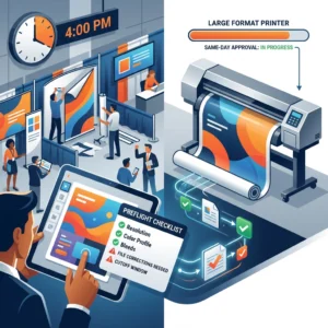
Our Streamlined File Check Process at Design One Printing
When your file lands in our inbox, it goes through a quick but thorough review. We’re not just looking for obvious problems; we’re checking the details that determine whether your final product looks professional or like something’s slightly off.
First, we open your file and confirm it matches your order specs. If you said it’s 48×36 inches and it’s actually 47×36, we catch it immediately and ask before we proceed. We check color mode, confirm it’s CMYK or RGB (and note if conversion will be needed), and verify that resolution is adequate for your print size.
Next, we look at the actual design. Does the bleed extend properly? Are critical elements protected by the safe zone? Is text readable? Are images sharp? We do a visual scan that takes two minutes but catches 95% of potential issues.
Then we check file format integrity. Fonts embedded? Images embedded or linked? (Linked files can break if they move; embedded files stay locked in.) Transparency handled correctly? We confirm that when we send your file to our RIP (raster image processor, the software that converts files to press-ready format), it will render exactly as intended.
If we spot anything that concerns us, we reach out. It’s usually simple: “We’re going to convert this to CMYK; is that okay?” or “Your safe zone is tight; do you want us to adjust spacing?” We give you the option to fix it or approve our approach. Either way, we keep moving forward.
If your file passes, we generate a digital proof that we either email back to you for final approval or prepare for immediate printing if you’ve waived proof review (which many of our convention customers do when time is absolutely critical).
This whole process takes five to fifteen minutes per file. It’s built into our standard turnaround, not an extra charge. It’s how we ensure that whether you’re ordering same-day business cards or a rush convention banner, quality is non-negotiable.
One thing we won’t do: assume your file is ready without checking it. We’ve had designers send us “finished” files that were actually early drafts with watermarks or incorrect sizing. One quick review prevents embarrassing mistakes.

How to Submit Files Correctly for Same-Day Large Format Orders
Timing is everything for same-day work. You can have the perfect file, but if it reaches us after our cutoff or in a format we have to convert, even an hour matters.
Here’s our same-day process: submit your file by 10 AM on a business day, and we print same-day (typically ready by 5 PM). If it’s more complex or a rush during convention season, let us know upfront so we can confirm feasibility.
For file submission, use our website’s upload system or email directly to our team. The upload system tracks your order and keeps everything organized. Attach your file and include your order details: final dimensions, quantity, material choice (vinyl banner, fabric, foam board, whatever applies), and any special finishing (mounting, grommets, etc.).
Use a clear file name. Instead of “Design_final_final_FINAL_v2.ai,” name it “YourBrandName_Banner_48x36_CMYK.pdf.” The clear name helps us immediately understand what we’re looking at and prevents confusion if you submit a revision.
Include a brief note about color: “This is CMYK, ready to print as-is” or “This has Pantone 185 red as a brand color; please match closely” or “This has RGB elements; please convert and confirm color shift.” That note takes five seconds to write and saves us from having to guess your intent.
If you have a designer working with you, confirm they’re submitting directly or you are. Having two people submit slightly different versions of the same file creates chaos. One owner per order.
For rush orders during major conventions (CES, NAB, whatever’s happening that week), call ahead. Let us know you’re coming with a file and when. We’ll make sure someone is ready to do an immediate review, ask clarifying questions if needed, and lock in your turnaround time.
Submit files with enough buffer time. If your event is tomorrow and you’re sending a file at 4 PM, we might be able to print overnight, but that’s luck, not a guarantee. Same-day printing works best when you give us morning hours to work with.
Submission checklist:
- Upload via our website or email directly to our team
- Use clear file names (include dimensions and format)
- Include a brief note about color or special requirements
- Confirm final dimensions in writing
- Specify material choice
- One submission per order; confirm with your designer who’s submitting
- For rush orders, call ahead to confirm capacity
Once we confirm receipt and review, you’ll get a response within 30 minutes. If everything’s good, we move straight to production. If something needs tweaking, we’ll tell you exactly what and how long it’ll take to fix. No surprises, no hidden delays.
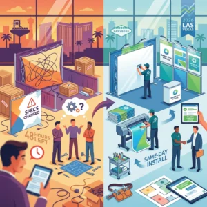
Getting Your Convention Materials Ready in Time
Convention season in Las Vegas is intense. Between planning your booth layout, coordinating with your team, and handling last-minute messaging updates, file preparation can feel like a low priority. It’s not. Getting your files right is the difference between launching with confidence and scrambling an hour before your booth opens.
Here’s our advice: start your file prep at least two days before your convention. Even if you have our same-day turnaround available, having a two-day buffer means a print delay doesn’t tank your event. You can handle a missed cutoff or a quick revision without panic.
Work backward from your event date. If your convention opens Tuesday morning, we should print Monday. That means your file should be submitted and approved Sunday. Which means design reviews need to be done Saturday. Which means your designer needs rough approvals by Friday. Build that timeline and you’ve eliminated 90% of the stress.
Use a checklist. Before you submit anything to us, do an internal review. Does the file have bleed? Safe zones? Correct DPI? Is the color mode CMYK? Are there any notes or watermarks that should have been removed? Five minutes of self-review catches problems before they reach us.
If you’re working with an external designer, give them this guide. Send them the checklist sections we covered and let them know what we need. A designer who understands your printer’s specifications works faster and cleaner than one flying blind.
Consider ordering a proof, even if you’re in a hurry. Most proofs take a few hours, and seeing your design printed on actual material (not just on a screen) is powerful. Colors land differently. Sizing feels more real. Text readability becomes obvious. For convention-critical items, a proof is $40-75 well spent.
Have backup plans. If something goes wrong with your primary file, do you have an alternate design ready? Do you know what materials are readily available if your first choice is delayed? We can help you think through contingencies, but thinking about them ahead of time beats scrambling.
Finally, don’t wait until your event is happening to reach out. We’ve handled everything from small business launches to major conventions. We do this every week for Vegas events. If you’re nervous about timing or unsure about any specification, reach out early. That’s what we’re here for.
When your materials arrive and they look sharp, on-brand, and professional, you’ll be glad you invested the time in getting the file prep right. Your booth will command attention. Your brand will look premium. Your event will move forward without a hitch.
Let’s get your convention materials done right. Submit your file with our checklist in mind, and we’ll handle the rest with the speed and quality you need.
For further reading: Same-day printing guide.
Contact us today at designoneprinting.com to see how we can help on your next project.