A stack of expo postcards usually gets judged in about two seconds. Attendees glance at the headline, decide whether the offer matters, and either keep it or drop it into the nearest tote bag black hole. If you want to know how to create expo postcards that actually pull their weight, start by treating them like a sales tool, not filler for the booth counter.
Expo postcards work best when they do one job clearly. That might be driving traffic to your booth, promoting a show special, introducing a new product, or giving sales reps a leave-behind they can hand out fast. The problem is that many businesses try to cram all of those goals into one small card. The result looks busy, reads slowly, and gets ignored.
Start with one clear expo goal
Before you choose paper stock, colors, or size, decide what the postcard needs to accomplish during the event. If your team is trying to increase booth visits, the card should focus on a reason to stop by. If you’re following up after a conversation, it should reinforce your offer and make it easy to contact you. If you’re mailing postcards ahead of a convention, the message should help people plan a visit before the show floor gets crowded.
This is where a lot of expo marketing goes off track. Businesses often design a postcard around what they want to say, not what the attendee needs to know right away. At an expo, people are moving fast. They are comparing dozens of brands in a short time. Your message has to land quickly.
A practical way to frame it is simple: what should the reader do next? Visit booth 417. Bring this card for a discount. Scan a code to book a demo. Ask for a sample. When the next step is obvious, the postcard becomes useful.
How to create expo postcards with the right message
Good expo postcards are specific. Vague branding language does not perform well in a convention hall because it asks people to work too hard. Instead of a broad statement about excellence or innovation, lead with something concrete. A product launch, a limited-time show offer, a giveaway, a service benefit, or a problem you solve gives the reader a reason to pay attention.
Your front side should carry the main message at a glance. In most cases, that means a short headline, one strong visual, and a call to action that can be read from arm’s length. The back side can carry supporting details, contact information, a booth number, and any event-specific instructions.
Keep the copy tight. A postcard is not a brochure. If you need several paragraphs to explain the offer, either the message is too complicated or the format is wrong. Most expo postcards perform better when the text is reduced to the essentials and the design does more of the work.
That said, simple does not mean generic. If you’re exhibiting in a niche industry event, speak to that audience directly. A hospitality buyer, healthcare distributor, and tech procurement manager do not respond to the same language. The best postcard feels relevant to the room it is being handed out in.
Design for motion, not for a quiet desk
Trade show materials are viewed in motion. People are walking, talking, and carrying bags. That changes how you should design. Fine details, light gray text, and crowded layouts may look polished on a monitor but disappear on a busy show floor.
Use contrast aggressively. A bold headline, readable type, and a clean visual hierarchy matter more than decorative effects. Your logo should be present, but it should not compete with the message. If everything is large, nothing stands out.
Photography and graphics should support recognition, not confusion. If you sell a physical product, show it clearly. If your service is more abstract, focus on the outcome or the environment your audience understands. For expo use, clarity beats cleverness most of the time.
There is also a practical size question. Standard postcard sizes are popular for a reason – they are easy to hold, easy to stack, and cost-effective to print. Larger formats can stand out, but they also cost more and may be awkward for handouts. If you’re producing postcards under a tight convention deadline, standard sizes usually offer the smoothest path from file to finished piece.
Don’t overlook print choices
If you’re learning how to create expo postcards, design gets most of the attention, but print decisions affect the final impression just as much. Paper stock, coating, and finish all change how the card feels in hand.
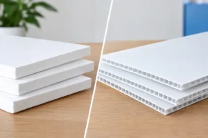
A thin postcard can look like a mass handout. A sturdier stock feels more credible and tends to survive the event longer. Gloss coating can make colors pop, which works well for bold graphics and photo-heavy designs. Matte or uncoated finishes can feel more premium and are easier to write on if your team plans to add notes, appointment times, or rep contact details by hand.
This is a trade-off, not a rule. A glossy card may visually outperform matte in some industries, while a writable uncoated card can be more useful for sales follow-up. The right choice depends on how the postcard will be used, not just how it looks under office lighting.
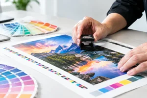
Color accuracy matters too. If your postcard is part of a larger expo package that includes brochures, banners, table signage, and backdrops, the pieces should feel consistent. Brand color drift between materials can make your presentation look pieced together, especially when everything is displayed at once.
Include the information people actually need
At minimum, your postcard should answer four questions fast: who you are, what you offer, why it matters, and what to do next. Booth number placement is especially important for expo pieces. If attendees have to hunt for it, you’ve made the postcard less useful.
A QR code can work well, but only if it leads somewhere specific. Sending people to a generic homepage is a missed opportunity. A dedicated landing page, demo request form, event-special page, or digital catalog usually performs better because it matches the context of the card they just scanned.
Contact information should also reflect the setting. A general office line may be fine, but if your sales team is actively working the show, a direct contact method can be more effective. For some exhibitors, that means a mobile number or rep email tied to the event. For others, it’s enough to route interest through a branded follow-up page.
Timing matters more than most teams expect
One reason expo postcards fail is simple: they get produced too late. When deadlines tighten, businesses often approve rushed artwork, skip proofing, or choose whatever stock is fastest without thinking through the use case. That can still get the job done, but it narrows your options.
Ideally, your postcard should be planned as part of the full event package. That gives you time to align messaging with booth graphics, sales collateral, and any pre-show mailers. It also gives your printer time to flag file issues, recommend better finishing options, and make sure the output matches the rest of your materials.
Of course, expo schedules do not always cooperate. Show dates move, messaging changes, inventory shifts, and sometimes a team realizes two days before setup that it still needs a handout. In a convention market like Las Vegas, fast turnaround is not a luxury. It’s often the difference between showing up prepared and improvising at the booth.
That is why it helps to work with a production partner that understands event timelines, rush jobs, and the realities of convention printing. Design One Printing supports exhibitors and local businesses that need postcards and other event materials produced quickly without losing sight of presentation quality.
Common mistakes that make expo postcards easy to ignore
The most common mistake is saying too much. The second is saying nothing memorable at all. A postcard overloaded with text gets skipped, but a postcard with only a logo and a vague slogan does not give the reader a reason to act.
Another issue is weak hierarchy. If the booth number, offer, and call to action all blend together, the reader has to decode the layout. Most won’t. They will move on to the next thing in their hand.
Printing can also undermine a solid design. Low-resolution images, poor color reproduction, flimsy stock, and last-minute trimming problems all make a business look less prepared than it is. At an expo, where first impressions happen fast, those details carry more weight.
Finally, many teams forget distribution strategy. A postcard should not just sit in a holder and hope for attention. It should be part of how your staff interacts with attendees. Hand it out during conversations, include it in literature packets, place it where booth traffic naturally pauses, and use it as a follow-up reminder after a quick introduction.
Make the postcard fit the event, not just your brand
Strong branding matters, but expo success usually comes from relevance. A postcard for a national trade show should look and sound different from one used at a local business expo or industry-specific conference. Your visual identity should stay consistent, while the message adapts to the audience, event pace, and sales objective.
That flexibility is what separates a postcard that looks nice from one that works. If the piece is built for the actual environment where it will be used, it has a much better chance of being kept, scanned, referenced, and acted on.
The best expo postcards are not complicated. They are clear, timely, and professionally produced. When every inch of space supports a purpose, your postcard stops being a giveaway and starts helping your team win better conversations on the show floor.