A visitor has already formed an opinion before they reach the reception desk. The best lobby signs for offices make that first moment feel intentional: the company name is clear, the finish matches the brand, and the space looks established rather than temporary. For a Las Vegas business competing for attention, that detail matters whether the visitor is a client, candidate, vendor, tenant, or convention partner.
A lobby sign does more than identify an office. It signals the level of care behind the business. The right choice depends on your wall surface, viewing distance, lighting, brand personality, budget, and installation timeline. A polished law firm, a creative agency, a medical office, and a fast-growing startup may all need a lobby sign, but they should not necessarily use the same one.
What Makes a Great Office Lobby Sign?
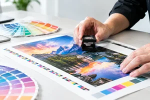
The strongest office signs balance visibility with restraint. A sign should be large enough to read from the entrance, but not so oversized that it overwhelms the reception area. It should use brand colors accurately, especially when matching existing print materials, wall graphics, brochures, or trade show displays.
Material choice matters just as much. High-gloss acrylic can feel modern and clean, while brushed metal communicates permanence and polish. Dimensional letters add depth and shadows that flat graphics cannot create. The right material is not always the most expensive option. It is the one that supports the way your business wants to be perceived.
Before selecting a format, measure the wall and consider where people enter the room. A sign placed behind a front desk may be viewed from 10 to 20 feet away. One mounted in a narrow hallway may be seen up close. That difference affects letter height, line spacing, and how much detail a logo can carry.
Best Lobby Signs for Offices by Style and Use
Dimensional Letters for a Premium, Established Look
Dimensional letters are one of the best choices for offices that want a clean, permanent presence. Individual letters are cut from materials such as acrylic, PVC, metal, or wood, then mounted directly to the wall. They create real depth, which gives even a simple logo more authority.
Acrylic letters work well for professional offices, financial firms, real estate teams, medical practices, and corporate suites. They can be painted or printed in brand colors and finished with a matte or glossy surface. PVC letters offer a similar raised effect at a more budget-conscious price point, making them practical for businesses moving into a new office or opening multiple locations.
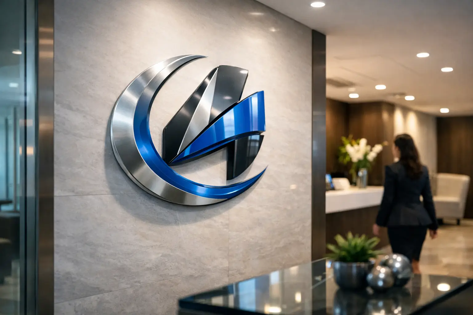
Metal letters, including brushed aluminum and stainless-style finishes, are especially effective in upscale environments. They do cost more and require careful installation, but they hold up well and rarely look dated. If your branding is understated, dimensional metal lettering can make the right impression without relying on a large, busy design.
Acrylic Logo Panels for Modern Reception Areas
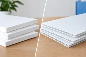
Acrylic logo panels are a reliable option when you need a polished sign with a defined background. Your logo and company name are printed directly onto clear, white, black, or colored acrylic. The panel can be mounted flat against the wall or installed with standoffs to create separation and shadow.
Clear acrylic with standoffs is popular in contemporary offices because it feels light and professional. It is also a useful solution for walls where individual lettering would be difficult to install, such as textured surfaces or locations with uneven finishes. White acrylic can provide stronger contrast for logos that use light colors, while black acrylic gives metallic or white lettering a sharp presentation.
This style is often faster to produce and install than a complex dimensional-letter package. It is also easier to replace if a company updates its logo, changes a suite number, or moves to a new location. For businesses facing a close opening date, an acrylic panel can offer a strong balance of speed, appearance, and cost.
Metal Plaques for Traditional Professional Spaces
Metal plaques are a natural fit for law offices, executive suites, financial advisors, hospitality groups, and established professional services firms. They have weight, durability, and a formal appearance that works particularly well with traditional interiors.
Common finishes include brushed silver, bronze, gold, black, and etched metal looks. Engraved or printed plaques can include a company name, logo, suite information, or a concise statement such as “By Appointment Only.” A plaque is not the best option for every brand, especially a colorful or highly visual one, but it remains a dependable choice when credibility and longevity are priorities.
Wall Graphics for Large Logos and Creative Brands
Printed wall graphics are ideal when the lobby wall is part of the brand experience. They can cover a larger area than a traditional sign and make room for oversized logos, photography, custom patterns, mission statements, or campaign visuals. They are especially useful for creative agencies, fitness studios, retail-adjacent businesses, event teams, and offices with a bold visual identity.
The trade-off is permanence. Vinyl wall graphics can last for years when produced and installed correctly, but they are less forgiving than a small panel if the branding changes. They also require a smooth, clean wall for the best finish. If your lobby sees frequent sunlight, choose materials and inks designed to resist fading.
Backlit Signs for High-Impact Entrances
Backlit lobby signs add illumination behind letters, logos, or panels. The halo effect can make a reception wall feel more refined, particularly in offices with lower ambient light or evening traffic. This option is effective for hospitality, entertainment, technology, and premium service brands that want a memorable arrival experience.
Lighting requires additional planning. You may need access to power, professional electrical work, and more time for installation. It is generally a higher investment than a flat acrylic panel or standard dimensional letters. When the lobby is a major client-facing space, though, the visual result can justify the added effort.
Choosing Materials That Fit Your Timeline and Budget
A permanent lobby sign should not be rushed without a plan, but speed matters when a lease starts, a grand opening is scheduled, or an important client visit is approaching. Start by deciding what cannot change: the approved logo, brand colors, wall location, and target installation date. Those details allow production to recommend materials that can realistically be completed on time.
For quick office upgrades, printed acrylic panels, PVC dimensional letters, and wall graphics are often practical choices. For a long-term headquarters or a high-end executive space, metal letters and illuminated signs may be worth the longer lead time and higher investment.
Do not overlook the wall itself. Drywall, glass, wood paneling, brick, and textured paint each require a different approach. A sign that looks excellent in a digital proof can fail to look finished if it is mounted with the wrong hardware or placed over an uneven surface. A site photo, wall dimensions, and a clear view of nearby doors, desks, outlets, and lighting will help prevent costly adjustments.
Design Details That Keep a Lobby Sign Professional
The most effective signs usually have fewer elements, not more. Use the logo, business name, and only the essential supporting information. A website address, phone number, and a long list of services are usually better placed on brochures, window graphics, or other marketing materials. Your lobby sign should establish identity at a glance.
Contrast is critical. Dark lettering on a light wall, or light lettering on a dark wall, is generally easier to read than low-contrast tone-on-tone designs. If your brand uses subtle colors, consider a backing panel, dimensional depth, or a finish that creates separation from the wall.
Typography needs breathing room. Thin fonts may look elegant on a screen but become hard to read from across a lobby. Small taglines can also disappear at a distance. A production-ready proof should account for the sign’s final size, not just the artwork’s appearance on a monitor.
For offices near the Strip, convention centers, or high-traffic business corridors, consistency can be especially valuable. Matching the lobby sign to your business cards, presentation folders, event banners, and booth graphics helps visitors recognize the same brand at every touchpoint.
Plan the Installation Before Production Begins
A lobby sign is only as polished as its installation. Confirm who will mount it, when the office will be accessible, and whether building management has requirements for drilling, wall adhesives, or after-hours work. Some leased offices allow removable graphics but restrict permanent wall changes. Others require certificates of insurance from installers.
Ask for a proof that shows scale and placement, not only the logo artwork. If the reception desk is centered on the wall, the sign may need to be centered on the desk rather than the full wall width. Small alignment choices are noticeable in a front-office setting.
Design One Printing can help Las Vegas businesses move from approved artwork to a production-ready lobby sign quickly, with practical guidance on materials, sizing, and large-format output. The earlier those decisions are made, the more options you will have when timing is tight.
A well-made lobby sign should make visitors pause for the right reason: it looks like your business belongs there, is ready for them, and pays attention to the details that build confidence.