A business card is often exchanged in a hurry: at a convention booth, across a restaurant table, or just before a meeting on the Las Vegas Strip. That is why a business card paper review should focus on more than how the card looks on screen. The stock has to feel intentional, print clearly, survive a pocket or purse, and support the way your brand wants to be remembered.
For most companies, the best choice is not the most expensive paper available. It is the paper that fits the job. A luxury real estate agent, a nightclub promoter, a construction estimator, and a medical office may all need professional cards, but they do not need the same finish, thickness, or writing surface.
Start With Paper Weight, Not Just Thickness
Business card stocks are commonly described in pounds, such as 14 pt, 16 pt, or 32 pt. In practical terms, a higher point number usually means a thicker, firmer card. A standard office-paper sheet is thin and flexible. A quality business card should feel substantially more durable.
A 14 pt card stock is a dependable baseline for everyday business cards. It is professional, easy to carry, and suitable for full-color printing on both sides. This is often the right choice when you need a larger quantity for staff members, networking events, customer handouts, or a fast reorder.
A 16 pt stock creates a noticeable upgrade in hand feel. It gives the card more stiffness without making it awkward to store in a wallet. For businesses that rely on personal introductions, such as sales teams, consultants, hospitality professionals, and exhibitors, 16 pt is often a strong balance of presentation and practicality.
Extra-thick stocks, including layered or duplex-style cards, make a bolder statement. They can be excellent for premium brands and limited-contact roles where each card is part of a deliberate sales experience. The trade-off is cost, production time, and flexibility. A very thick card may not be ideal if you are distributing thousands at a convention or need same-day quantities for an entire team.
What “Premium” Should Mean for Your Card
Premium does not automatically mean thick. A card with a clean design, accurate color, crisp trim, and the right finish can look more credible than an overly heavy card with crowded information. Choose a heavier stock when it supports your positioning, not simply because it is available.
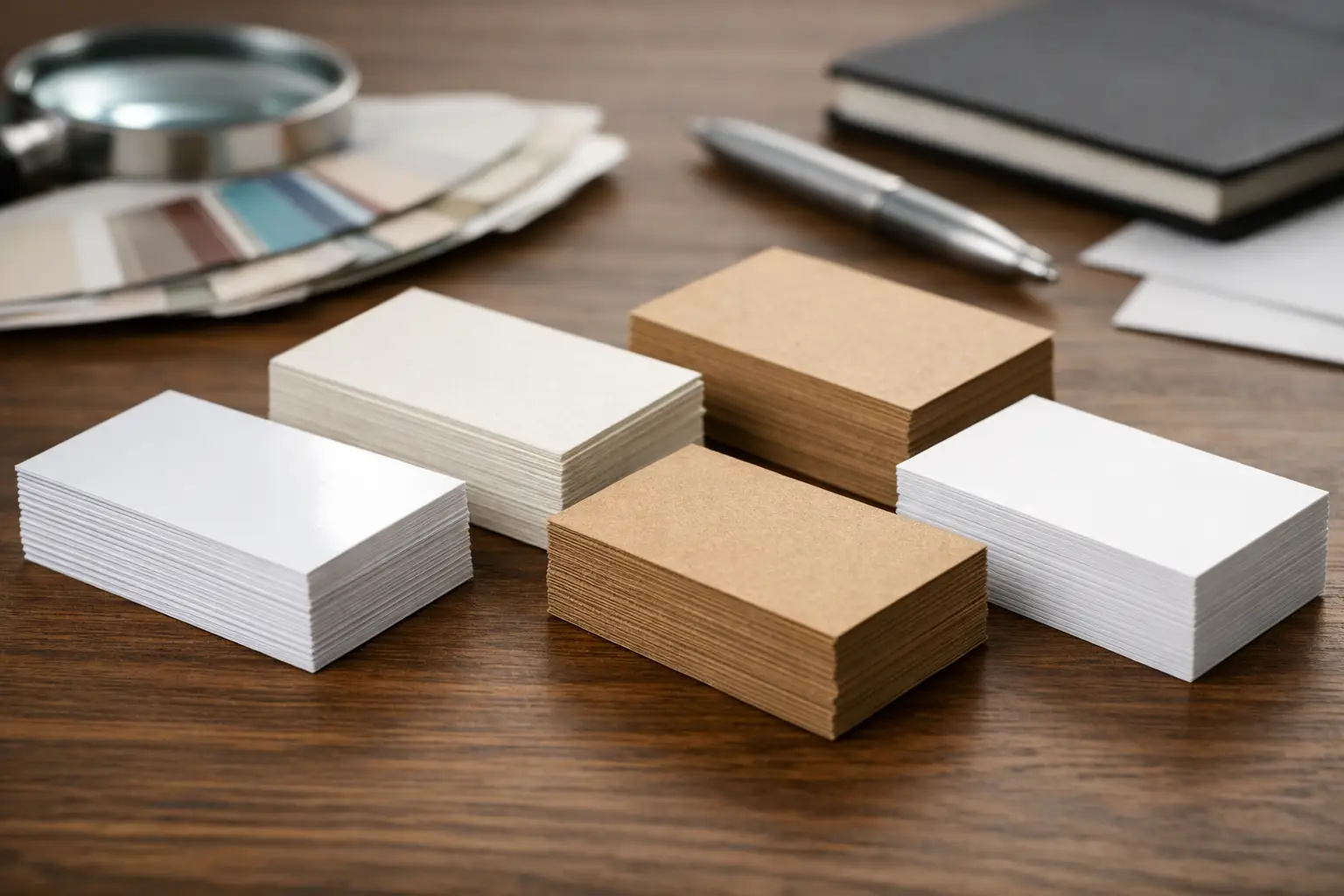
Gloss, Matte, and Uncoated Paper Compared
The finish changes how a business card looks, feels, and functions after printing. It also affects color, readability, and whether someone can write on the card.
Gloss-coated stock has a smooth, reflective surface that makes photographs and vivid colors stand out. It works well for entertainment, food, beauty, retail, and image-driven brands. A glossy card can make product photos, bright logos, and high-contrast graphics look sharp. However, glare can make small text harder to read under direct lighting, and some gloss finishes are not easy to write on with a standard pen.
Matte-coated stock has a softer, low-shine appearance. It is a popular choice for professional services, corporate brands, financial firms, law offices, and B2B sales teams because it feels polished without being flashy. Matte cards also tend to make fine type and QR codes easier to read. If the card will be handled frequently, consider a protective matte coating or lamination to reduce scuffing.
Uncoated stock has no slick coating, so it has a more natural paper feel and accepts handwriting well. It is useful for appointment cards, service reminders, loyalty cards, and businesses that want customers to write notes directly on the card. The trade-off is that uncoated paper can absorb ink more than coated stock, which may slightly soften photos and saturated color areas.
For a business that needs appointment details written in by hand, uncoated or writable matte stock is usually more useful than high gloss. For a photographer handing out image-forward cards, gloss or silk-style stock may better show the work. The right answer depends on what happens after the card is handed over.
Texture Can Add Character, but It Has Limits
Textured papers, linen-like finishes, laid patterns, and soft-touch laminations can give a business card a distinct physical presence. This can be valuable when the card is meant to reinforce craftsmanship, luxury, creativity, or a tactile brand experience.
A linen or lightly textured stock may suit a boutique, interior designer, event planner, or high-end service provider. It creates interest without requiring an elaborate design. But texture can interfere with very small text, delicate line art, and certain solid color areas. Before committing to a textured stock, make sure the design has enough contrast and that important details remain easy to read.
Soft-touch lamination feels velvety and premium, especially on dark designs. It is effective for minimalist cards with a bold logo, limited color palette, or raised print elements. Keep in mind that it can show fingerprints more readily than a standard matte finish, particularly on deep black or navy backgrounds. It is a strong option for presentation cards, but it may be less practical for high-volume outdoor events or cards that need handwritten notes.
Durability Matters at Events and on the Road
A card can look excellent when it leaves the print shop and still fail if it scuffs, bends, or smears before the event is over. This matters in Las Vegas, where exhibitors and sales teams may carry stacks of cards through convention centers, hotels, rideshares, and busy networking receptions.
Coated stocks generally resist surface wear better than plain uncoated papers. Lamination adds another layer of protection and can help preserve color on cards that will be passed around repeatedly. Rounded corners can also reduce dog-eared edges, especially for cards stored loose in a pocket or badge holder.
Durability should be evaluated alongside turnaround. Specialty materials, custom edge colors, foil, and unusual textures may require additional production time. If your team is flying in for a trade show and needs replacement cards tomorrow, a high-quality standard stock with a professional matte or gloss finish may be the smarter choice. Fast production works best when the specification is clear and the design is ready to print.
Print Details Change the Best Paper Choice
Paper does not work in isolation. Your design, print method, and finishing choices should guide the decision.
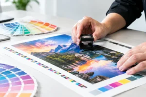
Cards with full-bleed photography and rich color backgrounds typically benefit from coated stock. Cards with tiny type, legal information, maps, or detailed contact information benefit from a finish that keeps text crisp and reduces glare. If you plan to use foil accents, spot UV, embossing, or raised lettering, select a stock substantial enough to support the effect without feeling flimsy.
Dark backgrounds deserve special attention. They can look striking, but they are more likely to reveal edge wear and fingerprints. A durable matte coating, thoughtful use of color, and proper trimming can make a meaningful difference. Likewise, a bright white uncoated stock may be excellent for clean black typography, but it will not reproduce large, saturated color fields the same way a coated sheet will.
Do Not Forget the Back of the Card
The back is valuable real estate. It can hold an appointment area, short service list, QR code, special offer, map, or clean brand statement. If you need customers to write on that side, say so before choosing a coated finish. A beautiful card that cannot support its intended use is not a successful card.
A Practical Business Card Paper Review for Common Uses
For everyday networking and employee cards, 14 pt or 16 pt matte stock is a reliable starting point. It presents well, travels easily, and works across many industries.
For trade show handouts, prioritize readable type, durable stock, and a finish that supports your design at volume. A 14 pt or 16 pt coated card is often the efficient choice, particularly when deadlines are tight and you need enough cards for booth traffic.
For appointment-based businesses, choose writable stock. Uncoated paper or a designated writable area can prevent a common problem: staff members struggling to write a future date or service note on a glossy card.
For premium introductions, consider 16 pt or thicker stock with soft-touch lamination, subtle texture, or a specialty finish. Use these upgrades selectively when the card is part of a higher-value sales conversation rather than a mass-distribution piece.
Ask for a Stock That Fits the Deadline
The best paper choice is the one that supports your brand and is available when you need it. If you are preparing for a Las Vegas convention, opening event, client meeting, or last-minute staff change, explain the quantity, deadline, design, and intended use upfront. Design One Printing can help match those details to a practical stock and finish without pushing your order toward unnecessary complexity.
A well-chosen business card should feel like your business in someone’s hand: clear, credible, and ready to work long after the conversation ends.