A direct mail piece has only a few seconds to earn attention before it is set aside with the rest of the day’s mail. For Las Vegas businesses, exhibitors, hospitality operators, and local service providers, that makes every design choice matter. This direct mail design guide covers how to build postcards, flyers, and self-mailers that look professional, communicate quickly, and arrive ready to support a real business goal.
Direct mail works best when it is treated as a focused sales tool, not a miniature brochure. A restaurant may need to drive reservations before a major convention. A real estate team may want neighborhood leads. A trade show exhibitor may need to put a show offer in front of qualified prospects before they land in Las Vegas. The audience, offer, format, and mailing schedule should all support that one outcome.
Direct Mail Design Guide: Start With One Clear Goal
Before choosing a paper stock, image, or postcard size, decide what the recipient should do next. The strongest direct mail campaigns ask for one action: visit a location, scan a QR code, redeem an offer, call for service, register for an event, or bring the card to a booth.
Trying to promote every service, sale, and company detail in one mailer usually weakens the response. Give the main offer the most visual weight, then provide only the supporting details someone needs to act. If your goal is to fill appointments, lead with the appointment offer. If the goal is event attendance, make the date, location, and registration action impossible to miss.
A practical starting point is to define three things in a single sentence: who the mailer is for, what they receive, and what they need to do. For example: “Local homeowners receive a free design consultation when they call by Friday.” That statement becomes the foundation for the headline, call to action, and mailing list.
Choose a Format That Fits the Message
Postcards are a reliable choice for offers that need immediate visibility. There is no envelope to open, so the headline, image, and call to action are visible right away. They work well for grand openings, restaurant promotions, seasonal offers, local events, service reminders, and convention invitations.
A larger postcard gives you more room for a bold image and clear offer, but it also increases print and postage costs. A smaller format can be efficient for a simple message, especially when the mailing list is large. The right size depends on how much information the recipient truly needs and how competitive the mailbox is likely to be.
Folded self-mailers and brochures are better when your offer requires explanation. A medical office may need to introduce several services. A hotel-adjacent business may want to highlight packages, maps, and group options. A B2B company may need room for case examples or product specifications. The trade-off is that more panels create more opportunities for clutter. The front panel still needs to make the value clear at a glance.
Letters in envelopes can feel more personal and are useful for higher-value offers, donor communications, detailed proposals, or account-based outreach. They demand a stronger reason to open, so the envelope design and recipient targeting become especially important.
Build the Front Around a Fast Read
The mailing piece should communicate its central message before a recipient reads every word. Start with a headline that names a benefit, a deadline, or a relevant problem. “Save 20% on Event Catering This Week” is more useful than “Welcome to Our Business.” “Need Last-Minute Trade Show Graphics?” immediately speaks to an exhibitor under pressure.
Support the headline with one strong visual. Product photography, a finished project, a recognizable local setting, or a clean lifestyle image can work well. Use high-resolution files intended for print. Images pulled from screenshots, social media, or low-quality web downloads often look soft or pixelated when enlarged.
Keep the offer near the headline and repeat the call to action where it can be found quickly. If recipients need to scan a QR code, add a short instruction such as “Scan for available dates” or “Scan to claim your offer.” A QR code without context may be ignored. Include a phone number, web address, or physical location as a backup for people who prefer not to scan.
White space is not empty space that needs filling. It gives the headline, image, and offer room to work. Crowded designs force the reader to search for the point, which is a poor fit for a medium built around fast decisions.
Design the Mailing Side for USPS Requirements
The address side is part of the design, not leftover space. Postal addressing, postage, barcodes, and mailing indicia require a clear area. If artwork, dark colors, patterns, or text interfere with these zones, the mail piece may need revisions before it can be processed.
Plan the mailing panel early. Keep the recipient address area clean and easy to read. Reserve space for postage in the upper-right area, and confirm where any barcode or indicia will go before finalizing the design. Exact requirements can vary based on the mail class, piece dimensions, and mailing method, so it is smart to review the layout with your print and mail production partner before printing.
This is especially valuable on rush projects. Discovering that a photo crosses into a required postal area after thousands of pieces have been printed can cost time and money. A production review catches avoidable issues while they are still simple to fix.
Make Color, Type, and Paper Work Together
A direct mail piece represents your business in the recipient’s hand. Consistent brand colors, readable type, and a stock that fits the message all affect how credible it feels.
Use strong contrast between text and background. Light gray type on white paper may look elegant on screen but become difficult to read in print. Small type can also create problems, particularly for legal copy, offer details, and contact information. If a recipient has to strain to find the expiration date or phone number, the design is working against the campaign.
Paper choice changes the impression. A glossy stock can make photography and bold promotional graphics stand out. An uncoated stock can feel more tactile and personal, which may suit professional services, real estate, or handwritten-style messaging. Heavier card stock creates a more substantial postcard, though it may affect mailing costs. There is no universal best option. Choose based on the campaign’s purpose, budget, and audience expectations.
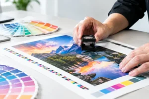
For print files, build artwork at the final trim size with bleed where required. Bleed extends background colors and images beyond the cut line so no unintended white edge appears after trimming. Use CMYK color settings for more predictable print output, and provide high-resolution images. A professional print review is useful when brand colors, gradients, fine lines, or critical photography are involved.
Targeting Matters More Than Decoration
Even a well-designed mailer will underperform if it reaches the wrong households or businesses. A neighborhood offer should go to the neighborhoods most likely to use it. A convention-related promotion may be more effective when sent to past attendees, local partners, or a targeted business list rather than a broad general audience.
Segment lists when the message changes by audience. A new customer may respond to an introductory offer, while a former customer may need a reason to return. Businesses near the Strip may have different needs than suburban service clients. Small adjustments to the headline, image, and offer can make a campaign feel more relevant without requiring a completely new concept.
Timing also has a direct effect on response. Event mailers need enough lead time to arrive before recipients make plans. Seasonal promotions need to land before the buying window closes. For a convention campaign, work backward from setup dates, attendee arrival patterns, and production deadlines. Mailing late can turn a strong offer into wasted inventory.
Measure the Result and Improve the Next Drop
Direct mail should be trackable. Add a unique promo code, dedicated phone number, QR code, landing page reference, or offer deadline. These tools help identify which list, message, and format generated action.
Track more than redemptions when possible. Note calls, scans, store visits, form submissions, booked appointments, and revenue associated with the campaign. If one neighborhood responds better than another, that information can guide the next mailing. If a large postcard produces stronger results but costs more, compare the added cost against the additional revenue rather than judging by response rate alone.
Test one major variable at a time. You might compare two headlines, two offers, or two audiences. Changing the size, image, offer, list, and timing all at once makes it difficult to know what caused the difference.
Before production, use this final check: confirm the offer is accurate, the call to action is obvious, contact details are correct, images are print-ready, and postal areas have been approved. A proof should be reviewed by someone who did not build the design, because fresh eyes often catch missing dates, transposed numbers, and unclear wording.
When a deadline is close, direct mail does not have to become a compromise. Design One Printing can help businesses turn a clear offer into polished postcards and mail pieces with production guidance built around the realities of local campaigns, events, and tight turnaround schedules. Start with a focused message, leave room for the mail process, and give recipients one easy reason to respond.