A sales sheet usually gets judged in about five seconds. That is the window you have to show what you sell, why it matters, and what the next step should be. If you are figuring out how to design sales sheets, start with one truth: they are not mini brochures. A good sales sheet is a fast decision tool.
That matters even more when you are handing materials to prospects at a trade show, leaving them behind after a meeting, or placing them into an event packet on a tight deadline. In those settings, clarity beats cleverness every time. If the page looks crowded, vague, or off-brand, it gets set aside.
What a sales sheet needs to do
A sales sheet has one job – help someone understand an offer quickly enough to take the next step. That could mean booking a call, requesting a quote, visiting your booth, ordering a product, or asking for a demo. If the sheet tries to explain your whole company, your full service menu, and every competitive advantage at once, it will do none of those things well.
The strongest sales sheets are built around a single focus. Sometimes that focus is one product. Sometimes it is one service category. Sometimes it is one campaign, event, or audience. A one-sheet for convention booth visitors should not read the same way as a one-sheet for a property manager comparing vendors.
Before you touch the layout, define the reader. Are they meeting you for the first time, comparing options, or already close to buying? That answer changes what belongs on the page.
How to design sales sheets with the right structure
Most effective sales sheets follow a simple reading path. The top area should identify the offer right away. The middle should explain the value and support it with proof. The bottom should make action easy.
That sounds basic, but this is where many sheets fall apart. Businesses often lead with a generic headline, add dense paragraphs in the middle, and tuck contact details into a footer that feels like an afterthought. A sales sheet should guide the eye, not ask the reader to hunt.
A practical structure looks like this in prose. Start with a strong headline that names the product, service, or result. Follow it with a short subhead that explains who it is for or what problem it solves. Then add a hero image or supporting visual if the offer benefits from it. In the main body, focus on the most persuasive points: key features, measurable benefits, turnaround, use cases, or differentiators. End with clear contact information and one direct call to action.
If you are selling something technical or customizable, a slightly denser format may make sense. If you are selling a straightforward service, keep it lean. The more immediate the buying decision, the faster the sheet should read.
Lead with the buyer, not your company history
One of the easiest ways to weaken a sales sheet is to open with who you are instead of what the buyer gets. Readers care about your business, but only after they understand why the page matters to them.
Compare these two directions. The first says, “We are a full-service company with years of experience.” The second says, “Same-day event printing for exhibitors who need polished materials before show floor open.” The second version gives the reader a reason to stay on the page.
Company credibility still matters. Just place it after the value is clear. Use a short credibility line, a testimonial, a client category, or a proof point instead of a full origin story.
Keep copy short, but not empty
Short copy does not mean thin copy. It means every line carries weight. Your headline should say something specific. Your subhead should remove ambiguity. Your supporting text should answer the next obvious question.
This is where trade-offs come in. If you cut too aggressively, the sheet may look clean but fail to inform. If you add too much detail, it becomes a flyer-sized wall of text. The right balance depends on the complexity of the offer and where the sheet will be used.
For in-person selling, shorter is usually better because a rep can fill in the gaps. For leave-behinds, direct mail inserts, or packet materials, the sheet needs enough substance to stand alone.
Design choices that make sales sheets easier to read
Good layout is not decoration. It is what helps someone move through the page without effort. That starts with hierarchy.
The headline should be the most visible text on the page. Subheads should clearly break up sections. Body copy should be readable at print size, with enough spacing to avoid a cramped look. White space is not wasted space – it helps the important content breathe.
Use no more than two or three font styles in most cases. Too many type treatments make a single-page piece feel scattered. Keep brand colors consistent, but make sure contrast is strong enough for easy reading. Light gray text on a pale background may look refined on screen and fail in print.
Images should support the message, not compete with it. If you are showing a product, use a sharp, professionally cropped image. If you are selling a service, diagrams, icons, or a clean process visual can work well. Generic stock art tends to weaken trust, especially in business-to-business materials.
How to design sales sheets for print, not just for screen
A sales sheet that looks fine in a design file can still print poorly if production details are ignored. This is especially common with rushed event materials.
Build the sheet at the correct size from the start. Standard one-sheet formats are often 8.5 x 11 inches, but that is not your only option. A half-sheet can work for a simple promotion. A larger format might make sense for a premium sell sheet or presentation insert. What matters is how it will be distributed.
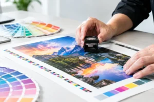
Use high-resolution images. Check margins. Keep important text away from trim edges. If the piece is going into a folder or display rack, think about how much of the page will be visible first. Paper stock matters too. A thin sheet may be cost-effective for volume handouts, while a heavier stock feels more substantial for meetings and proposals.
If speed matters, simplify where needed. A straightforward, well-organized one-sided sheet can often be produced faster than a heavily designed two-sided version with multiple image treatments and dense content.
What to include on a strong sales sheet
Not every sheet needs the same ingredients, but most of the good ones share a core set of content. They identify the offer clearly, explain the benefit, support the claim, and make follow-up easy.
In practical terms, that usually means a headline, a short explanatory line, a few benefit-driven sections, one or two proof elements, and complete contact information. Depending on your offer, you may also include pricing ranges, turnaround times, package options, service areas, dimensions, specs, or a short FAQ-style section.
Use restraint. If a detail does not help the buyer choose, trust, or respond, it probably belongs somewhere else.
Proof matters more than adjectives
Words like premium, high-quality, reliable, and professional are common on sales sheets because businesses want to sound confident. The problem is that every competitor says the same thing.
Proof is more persuasive than adjectives. Instead of saying your turnaround is fast, give the turnaround. Instead of saying your process is dependable, explain what happens and when. Instead of claiming quality, show clean visuals or include a brief client result.
Even simple proof can do a lot of work. Number of years in business, industries served, local production capability, rush-order availability, or a concise testimonial can all reinforce confidence without taking over the page.
Common mistakes when designing sales sheets
The biggest mistake is trying to make one sheet do the work of four. A sell sheet for a booth handout is different from one built for email follow-up or a formal sales meeting. Start by defining where the sheet will be used.
The next mistake is overloading the page. Businesses often feel pressure to justify the print piece by packing in details. More content does not automatically create more value. In most cases, it creates friction.
Another issue is weak calls to action. If the last line says only “Contact us,” you are missing an opportunity to guide response. Be specific. Ask the reader to request pricing, schedule a consultation, stop by a booth, or call for same-day production.
Finally, do not treat printing as the last step. Production choices affect the whole piece. If your design depends on edge-to-edge imagery, small type, or exact color behavior, those choices need to be considered early so the finished sheet performs the way you intended.
When speed matters, keep the process simple
For businesses preparing for an event, sales call, or last-minute promotion, the best approach is often the clearest one. Define the offer. Write the headline. Choose one visual direction. Build around the action you want the reader to take.
If you are under pressure, avoid endless revisions driven by internal preferences. Ask a simpler question: can someone unfamiliar with the offer understand it in a few seconds? If yes, you are close. If not, keep refining the message before adding more design.
A well-designed sales sheet does not need to say everything. It needs to say the right things, in the right order, and look polished when it lands in someone’s hand. When that happens, the sheet stops being filler and starts doing real sales work.