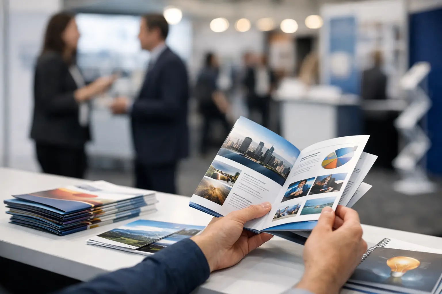
A convention handout has a few seconds to earn its place in a busy attendee’s bag. If it looks generic, feels flimsy, or makes people work to understand what you offer, it is likely headed for the hotel room trash can. Knowing how to print convention handouts means planning for the way people actually move through a trade show: quickly, distractedly, and with far more materials than they can carry.
For exhibitors in Las Vegas, the goal is not simply to print a stack of flyers before the doors open. Your handout should support the conversation at your booth, make your next step obvious, and still represent your brand well after a long day on the convention floor.
Start With One Job for Every Handout
The most effective convention handouts do one thing well. They may introduce a product, promote a show-only offer, schedule a demo, explain a service, or direct attendees to a sales conversation. Trying to turn one piece into a company history, full catalog, price sheet, and lead form usually produces dense copy that gets skimmed and forgotten.
Before choosing paper or size, decide what you want an attendee to do after picking it up. A restaurant supplier may want buyers to request a tasting. A software company may want qualified prospects to book a product demo. A hospitality business may want event planners to call for group rates. That one action should guide the headline, design, and information hierarchy.
Your most important message belongs where a person can find it in seconds: a clear headline, one strong visual or product image, and a direct call to action. Save supporting specifications, longer case studies, and detailed terms for a follow-up email, landing page, or sales conversation.
Choose a Format That Fits the Convention Floor
A standard 8.5-by-11-inch flyer is familiar and economical, but it is not always the best convention format. Full sheets can get folded, crumpled, or buried under larger brochures. Smaller pieces are easier to grab and carry, while folded formats give you more room to tell a story without overwhelming the front panel.
A postcard is a strong choice for a single offer, a giveaway, an appointment reminder, or a concise product announcement. It is compact, durable, and easy for booth staff to hand out quickly. A half-page flyer works well when you need more visual space but still want a lightweight piece. Tri-fold brochures and larger folded brochures are better when attendees need a short overview of multiple services, product categories, or event packages.
Consider how the piece will be used. If your team will place it in a take-one holder, a postcard or rack card keeps the display tidy. If staff will use it as a talking tool, a folded brochure can help them move through key points in a natural order. If you are distributing materials during meetings or educational sessions, a one-page sheet with a clear offer and contact information may be all you need.
How to Print Convention Handouts for Fast Reading
Convention attendees should be able to understand the basics without reading every line. Design for scanning, not for a quiet desk. Use a headline that states the benefit, then support it with short sections, readable subheads, and enough white space for the page to breathe.
Avoid shrinking type to fit one more paragraph. Small text may technically fit, but it creates friction for attendees standing in a crowded aisle. Body copy should remain comfortably readable, especially when your audience includes decision-makers reviewing materials later in a dim hotel room, on a flight, or between meetings.
Make your contact details easy to find. Include your company name, phone number, email address, website, and booth number where appropriate. A QR code can be useful for scheduling a meeting, claiming an offer, viewing a catalog, or joining a mailing list. It should never be the only way to reach you. Pair it with a plain-language instruction and visible contact information for attendees who prefer not to scan codes.
If you use a QR code, test it from a printed proof at the final size. Codes can fail when they are too small, placed over a busy image, printed with weak contrast, or distorted during export. A little testing before production prevents an expensive missed opportunity on the show floor.
Select Paper Stock for the Right Impression
Paper stock changes how your handout feels in a prospect’s hand. A lightweight text stock may be appropriate for high-volume information sheets or inserts, particularly when budget and quantity matter most. For an important offer or a premium brand presentation, a heavier stock gives the piece more authority and helps it survive travel in a tote bag.
Gloss and matte finishes serve different purposes. Gloss paper makes color photography and bold product images pop, which is useful for food, retail, travel, automotive, and visually driven consumer brands. Matte stock is easier to write on and tends to create a more refined, less reflective look. It can be the better choice for appointment cards, lead-generation pieces, premium service brands, or handouts with extensive text.
Do not choose a finish only by appearance. Think about lighting at the venue and how the material will be handled. Under bright convention center lights, high gloss can create glare. If staff need to write notes, appointment times, or discount codes on the piece, uncoated or matte stock is more practical.
Build Files That Print Cleanly
Great printing starts with production-ready artwork. Set your document to the final trim size and include bleed whenever color, photos, or graphics extend to the edge. A standard bleed area gives the printer room to trim accurately without leaving thin white edges around your design.
Keep critical text, logos, and QR codes safely inside the trim area. Important elements placed too close to an edge can look crowded or risk being cut during finishing. Use high-resolution images sized for print, not low-resolution images pulled from a website or social media post. What looks acceptable on a phone screen can appear soft or pixelated on paper.
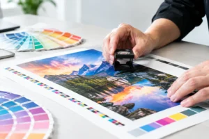
Color also deserves attention. Screens display color with light, while commercial presses reproduce it with ink or toner. Bright neon shades, very saturated blues, and certain brand colors may shift when moved from screen to print. If color accuracy is central to your brand, provide approved color references and request a proof when time allows. A proof is especially valuable for large quantities, premium collateral, or pieces featuring skin tones, product photography, or a tightly controlled corporate palette.
Order the Right Quantity and Plan for Reprints
Quantity depends on booth traffic, event duration, your team size, and how selective you plan to be. Printing too few handouts can leave your staff empty-handed during peak hours. Printing far too many creates unnecessary cost and leaves you transporting outdated collateral after the show.
Start with the event’s projected attendance, then estimate the percentage of visitors who match your target audience. A booth with a broad giveaway may need a much higher quantity than a B2B exhibitor that qualifies leads before sharing detailed materials. If you have multiple handouts, print the highest quantity for the simplest awareness piece and fewer copies of detailed brochures intended for qualified prospects.
Leave room in the schedule for changes. Speakers change, booth numbers move, offers get revised, and sales teams often spot a missing detail after reviewing the first version. For Las Vegas conventions, a local print partner can be particularly valuable when a file needs a last-minute correction, additional copies are needed overnight, or materials are damaged in transit. Design One Printing can help exhibitors coordinate fast-turnaround flyers, brochures, postcards, signage, and other booth materials without sacrificing a professional finish.
Proof the Details That Cost the Most to Miss
Before approving production, review the handout as a buyer would. Confirm the booth number, dates, phone number, email address, pricing, promotional deadlines, and call to action. Check that product names and legal language are correct. Then ask someone who did not create the piece to review it. Fresh eyes catch errors that a busy marketing team can miss.
Print a desktop sample at actual size if possible. It will reveal whether the text feels too small, whether the fold sequence makes sense, and whether your strongest message is visible from a quick glance. For folded pieces, make sure panel order is correct. For double-sided postcards, make sure the front earns attention and the back makes follow-up easy.
Get Handouts to the Booth Without Last-Minute Stress
Finished pieces should arrive before your booth setup window, not five minutes before opening. Pack them in clearly labeled boxes and keep a smaller working supply behind the counter so staff can replenish displays without searching through shipment cartons. If you are shipping materials to a hotel, convention center, or advance warehouse, verify receiving rules, delivery labels, deadlines, and handling fees well ahead of time.
Keep a small reserve outside the main shipment when possible. A few hundred extra postcards or flyers in a carry-on, local office, or vehicle can save the day if a box is delayed, misplaced, or damaged. For local exhibitors, arranging pickup close to the Strip can also reduce the uncertainty of venue deliveries.
A well-printed handout will not replace a strong booth conversation, but it gives that conversation a useful next chapter. Make it clear, easy to carry, and worth keeping, then have your team ready to turn every serious question into a specific follow-up.