A logo may begin as a small file on a screen, but it has to perform in much bigger places. Effective logo design needs to look sharp on a business card, hold up on a storefront sign, read clearly across a trade show aisle, and reproduce accurately on everything in between. For Las Vegas businesses working fast and competing for attention, that practical performance matters as much as the logo’s visual appeal.
A polished mark can make a new company look established, help a growing business look more consistent, and give event materials a professional center point. A poorly prepared logo does the opposite. It can print soft, disappear against a busy background, lose detail at large sizes, or create mismatched colors across flyers, banners, and sales materials.
Start Logo Design With the Job It Must Do
The strongest logo is not always the most decorative one. It is the one that helps the right audience recognize and remember a business. Before choosing fonts, colors, or symbols, define where the logo will appear and what it must communicate.
A law office, restaurant, home service company, event promoter, and convention exhibitor all have different needs. A premium hospitality brand may benefit from refined typography and restrained color. A contractor may need a bold, high-contrast mark that is easy to identify from a vehicle or yard sign. A trade show vendor may need a logo that can be understood in seconds from 20 feet away.
Consider the real-world applications early: business cards handed out at a networking event, postcards mailed to nearby customers, embroidered apparel, window graphics, presentation folders, product labels, banner stands, and booth backdrops. A logo designed only for a website header can become a production problem when it reaches print.
Ask the questions that prevent costly revisions
Good design starts with clear direction. What does the business sell? Who needs to notice it? Is the goal to appear established, approachable, premium, energetic, technical, local, or straightforward? What competitors are customers already seeing?
It also helps to identify what should be avoided. If every competitor uses the same house icon, cursive script, or predictable color combination, a similar look may blend into the market instead of building recognition. Differentiation does not require a complicated concept. Often, a distinct type treatment, a well-chosen color palette, or a simple custom symbol is enough.
Make the Logo Read at Small and Large Sizes
Scale is one of the most common weaknesses in logo design. Details that look impressive on a large monitor can turn into a blur on a business card or sticker. Thin lines may break up. Tiny type may become unreadable. Gradients and delicate effects may reproduce inconsistently, particularly across different materials and print methods.
A useful test is to view the design at its smallest intended size before approving it. If the company name cannot be read on a card, label, or social profile image, the logo may need fewer details or a simpler arrangement. Then test it at large format. A logo that looks clean at two inches can reveal uneven curves, low-resolution artwork, and awkward spacing when enlarged for a banner or wall graphic.
This does not mean every logo must be minimal. Detailed marks can work for businesses that primarily use them in larger or controlled applications. The trade-off is that those businesses usually also need a simplified version for smaller spaces. A primary logo, a compact alternate logo, and a standalone icon or monogram can provide flexibility without weakening the brand.
Typography needs more than a nice-looking font
Typography carries a major share of a logo’s personality. A typeface can feel modern, traditional, playful, technical, upscale, or utilitarian before a customer reads a single word. But style should not outrun legibility.
Avoid relying on overly thin fonts, tightly compressed lettering, or scripts that are difficult to read quickly. These can create problems on postcards, promotional products, decals, and directional signage. Custom lettering can set a brand apart, but it needs careful spacing and clean letterforms to reproduce well.
When a logo includes a tagline, treat it as an optional element rather than a permanent requirement. A tagline may fit well on a brochure cover or website, but it is often too small for a business card or banner header. Having versions with and without the tagline keeps the brand usable.
Choose Color for Print, Not Just for the Screen
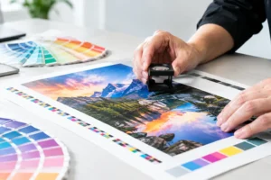
Color can create instant recognition, but it must be selected with production in mind. Screen colors are created with light, while most commercial print uses ink. A bright RGB color that looks electric on a monitor may print differently in CMYK. That is normal, and it is why color planning should happen before materials go to press.
A dependable logo package should include full-color, one-color, black, and reversed white versions. The one-color version is especially valuable for stamps, apparel, vinyl lettering, forms, and budget-conscious print jobs. The reversed version allows the logo to sit clearly on dark backgrounds without forcing an awkward colored box behind it.
Contrast matters as much as the color itself. A pale yellow logo on white paper may look clean on screen but disappear in print. Dark blue type over a black event photo may become difficult to read from a distance. If a logo needs to work over photography, create an approved version that includes a solid background, a clear area, or an alternate color treatment.
For brands with highly specific colors, spot-color matching may be worth considering for select projects. It depends on the material, order quantity, budget, and how critical color consistency is across multiple pieces. For everyday flyers, brochures, and postcards, a well-prepared CMYK version is often the practical choice.
Prepare the Right Files Before Ordering Print
A logo is not finished when the design is approved. It is finished when the business has usable files for print, web, signage, and future projects. Receiving only a low-resolution PNG can create repeated delays whenever a new marketing need comes up.
Vector artwork is the foundation for print-ready branding. Common vector formats include AI, EPS, SVG, and press-ready PDF files. Because vectors are built from mathematical paths rather than fixed pixels, they can be enlarged for wide-format banners, trade show displays, and signs without becoming blurry.
Raster files such as JPG and PNG still have a place. They are useful for web use, email signatures, and certain digital applications. For print, they need sufficient resolution at the final printed size. A small image pulled from a website rarely has enough quality for a poster, booth graphic, or large decal.
A complete file set should include color and black-and-white versions, light-background and dark-background versions, and files in horizontal, stacked, and icon-only formats where applicable. Keep them labeled clearly. When a deadline is tight, no one should have to guess which file is approved for a 10-foot banner.
Build Clear Space Into Every Layout
A logo needs room to work. When it is crowded by photos, headlines, borders, phone numbers, or other graphics, even a strong mark can look accidental. Clear space protects visibility and gives the brand a more confident presence.
A simple guideline is to preserve a buffer around the logo equal to at least the height of a key letter or element in the mark. The exact measurement can vary, but consistency is more important than a complicated rule. Use that same breathing room on brochures, postcards, signs, retractable banners, and presentation materials.
Placement should follow the way people actually scan a piece. On a trade show backdrop, the logo usually belongs high enough to be visible above tables and attendees. On a flyer, it may work best near the top or bottom, depending on the headline and offer. On a business card, it should support the contact information rather than compete with it.
Keep the Brand Consistent Across Fast-Turnaround Projects
Rush marketing materials are common in Las Vegas. A convention opens tomorrow, a sales event is added at the last minute, or an exhibitor needs replacement graphics before doors open. Speed is easier to achieve when the logo and brand assets are already organized.
Create a basic set of brand standards: approved logo files, color values, font names, minimum logo size, and examples of acceptable backgrounds. This does not need to be a long corporate manual. Even a one-page reference can prevent inconsistent colors, stretched logos, and last-minute approvals.
Consistency does not mean every printed piece must look identical. A postcard campaign, event banner, and brochure should be designed for their individual jobs. The logo, color system, and visual tone should make them feel like they came from the same business. That recognition is what turns individual print pieces into a working marketing system.
For businesses that need help bringing those pieces together, Design One Printing can support logo development alongside the printed materials that will carry it. Planning the design and production together helps identify size, color, and file issues before they become expensive reprints or deadline problems.
Your logo should be ready before the opportunity arrives. When it is clear, flexible, and prepared for print, every card handed over, banner displayed, and flyer distributed has a better chance of making the right first impression.