A card is often exchanged in the smallest window of a business relationship: a quick introduction at a convention, a meeting with a prospective client, a hotel lobby conversation, or a handoff at the register. When you design premium cards, every detail has a job to do. The card must feel intentional, communicate clearly, and look as strong in someone’s hand as it did on screen.
For Las Vegas businesses, exhibitors, and event teams, presentation is not a minor detail. A well-produced card can reinforce credibility long after a crowded trade show floor or networking event ends. The goal is not to add expensive effects for their own sake. It is to choose materials, finishes, and design decisions that support the way your brand needs to be remembered.
Start With the Card’s Actual Job
Before selecting paper or adding a foil accent, decide what the card needs to accomplish. A premium business card for a financial consultant has different needs than a VIP event invitation, a hotel key sleeve, an appointment card, or a product insert for retail packaging.
Business cards need fast recognition and easy contact access. Appointment cards need writable space and clear dates. Event cards may need to create anticipation, direct guests to a venue, or communicate a dress code. A loyalty or gift card needs to hold up to repeated handling. The format should follow the function.
This early decision prevents a common mistake: treating every card like a miniature brochure. Premium cards are usually more effective when they are focused. Give the recipient one clear reason to keep it, whether that is a useful contact, a memorable offer, a next step, or an invitation they do not want to miss.
Build a Layout That Works at Arm’s Length
A premium card should be easy to understand before someone has to study it. Start with hierarchy: the most important information should stand out immediately, followed by the supporting details. On a business card, that may be your name, company, role, phone number, and website. On an event card, it may be the event name, date, location, and RSVP instruction.
Avoid using every available area simply because it is there. White space is not wasted space. It gives the logo, type, and visual elements room to carry more authority. Crowded cards often look less premium, even when printed on excellent stock.
Typography matters just as much. Choose typefaces that are consistent with your broader brand and remain readable at a small size. Fine script, thin letterforms, and tiny reverse type can look appealing on a digital proof but lose clarity in print. For contact information, readability should win every time.
Also account for print-safe margins and bleed. Background colors, photos, and graphic elements that run to the edge need bleed beyond the finished trim size. Important text and logos should stay safely inside the trim area. These production details protect the final piece from looking cramped or accidentally cut off.
Use Both Sides With Purpose
Two-sided cards offer valuable space, but the back should do more than repeat the front. It can carry a short service list, appointment fields, a map, a QR code, a promotion, or a concise brand statement. For an exhibitor, the back can also include booth information and a post-show follow-up offer.
A QR code is useful when it has a clear destination, such as a portfolio, ordering page, contact card, menu, or event registration. Keep enough empty space around it, use strong contrast, and test it from a printed proof. A code that does not scan quickly creates friction at the exact moment a prospect is interested.
Choose Paper Stock for Feel, Durability, and Use
Paper stock is one of the first things people notice, even if they cannot name the weight or finish. A heavier stock signals substance and tends to stay flatter in wallets, badge holders, and presentation folders. For cards that need to make a strong first impression, thicker uncoated, coated, or layered stocks are often worth the investment.
Uncoated stock has a tactile, natural feel and is a practical choice for appointment cards, notes, and pieces that require handwriting. It also suits brands that want a refined, understated appearance. Coated stock delivers sharper image reproduction and stronger color saturation, making it a good fit for photography, bold color fields, and polished corporate graphics.
The right choice depends on what the recipient will do with the card. If they need to write on it, a glossy surface may be frustrating. If the design relies on rich photography or dense color, uncoated stock may not provide the same visual impact. There is no universal premium stock – there is a stock that supports the use case.
Add Finishes That Earn Their Place
Specialty finishes can turn a standard card into a piece that feels considered and memorable. But a premium finish works best when it supports the design rather than competes with it.
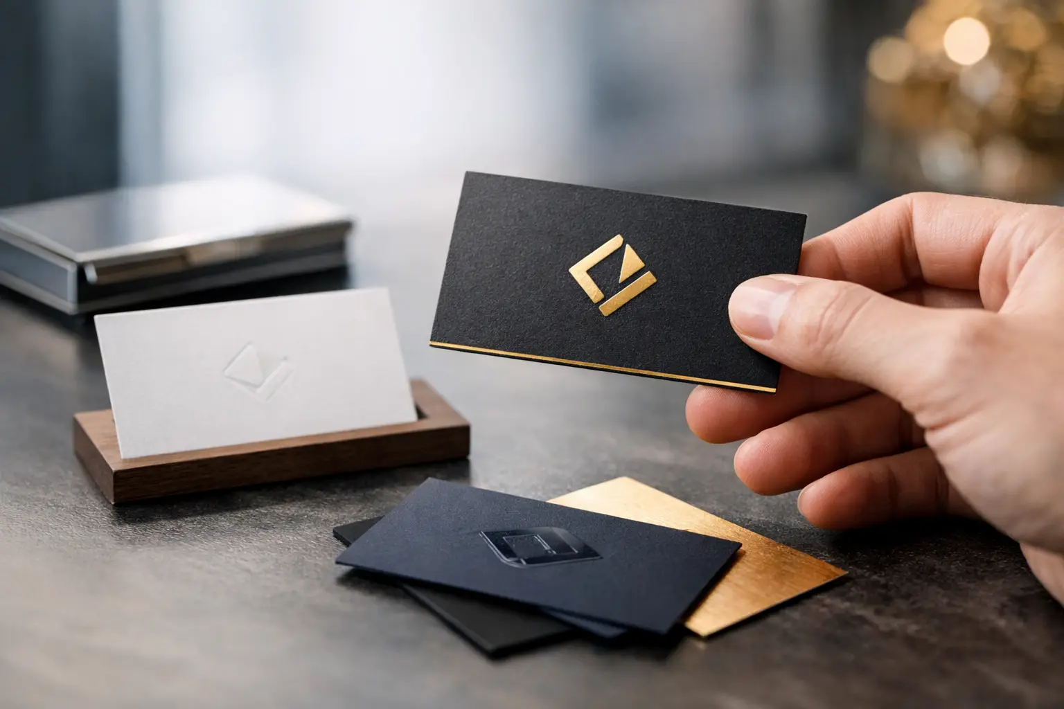
Soft-touch lamination creates a smooth, velvety surface that feels substantial in hand. It is especially effective for dark, minimal designs, luxury services, hospitality brands, and high-end event pieces. Matte lamination offers a clean, low-glare look and adds protection against scuffs and handling. Gloss lamination can make colors and photographs appear more vivid, though it may show fingerprints more readily on darker designs.
Spot UV adds a raised-looking gloss effect to selected elements such as a logo, product image, pattern, or headline. Foil can add contrast and visual impact, particularly when used sparingly on a logo or key detail. Die-cut shapes, rounded corners, painted edges, and extra-thick layered cards can also elevate a piece.
The trade-off is practical: every specialty treatment affects cost, schedule, and production requirements. A card with multiple finishes may be ideal for an executive introduction or VIP event, while a large run of handout cards may need a simpler construction to meet a tight deadline. Prioritize the detail that will create the greatest return, not the longest list of upgrades.
Keep Color Consistent From Screen to Print
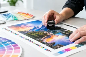
A screen emits light. Print reflects it. That difference explains why colors that appear bright on a monitor can shift when reproduced on paper. Brand colors should be prepared with print production in mind, especially when a card needs to match brochures, signage, trade show displays, or packaging.
Use high-resolution artwork and work from the correct color setup for the print process. Low-resolution logos, screenshots, and images pulled from social media can look soft or pixelated when printed. If your brand relies on a precise color, provide established color specifications whenever possible and request a proof for critical projects.
Dark backgrounds deserve extra attention. They can look sharp and sophisticated, but they make small scratches, fingerprints, and imperfect registration more visible. Lamination, a thoughtful finish choice, and adequate turnaround time can make a noticeable difference.
Design Premium Cards for the Moment They Are Used
The strongest cards are designed around a real interaction. A realtor meeting a new lead may benefit from a card with a professional headshot and direct mobile number. A restaurant promoting private events may need a card that highlights a booking contact and venue details. A convention exhibitor may need a bold card with a QR code, booth number, and simple offer that can be understood in seconds.
For event-driven work, timing is part of the design plan. Do not wait until the last minute to decide on a specialty stock or finish if the card is central to a launch, trade show, grand opening, or VIP event. Some jobs can move quickly, but complex finishing and custom construction may require additional production time.
At Design One Printing, the best results usually come from sharing the intended use, event date, quantity, and artwork status early. That gives the production team room to recommend a card format that looks right, fits the timeline, and avoids avoidable compromises.
Review the Proof Like a Recipient
Before approving production, review the card at its finished size, not only at a zoomed-in screen view. Check spelling, phone numbers, URLs, names, dates, and QR codes. Look at contrast, especially for small text. Confirm that images are sharp and that important elements sit inside the safe area.
Then ask a more useful question than whether the card looks good: would a busy person know what to do with it after five seconds? If the answer is yes, the design is working.
A premium card does not need to be loud. It needs to feel deliberate, read clearly, and survive the handoff with its value intact. Choose the details that fit your brand and deadline, then produce it with the same care you expect people to associate with your business.