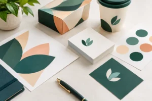

A dated booth backdrop, a business card that no longer matches the website, or a brochure that feels like it belongs to a different company can cost attention before a conversation even starts. A brand refresh gives your business a more current, consistent presentation without requiring you to abandon the recognition and reputation you have already built.
For Las Vegas businesses, exhibitors, hospitality vendors, and local organizations, presentation moves quickly. A prospect may see your signage from across a convention floor, pick up a postcard at a networking event, or compare your leave-behind materials with those from five competitors in the same afternoon. Your brand needs to look intentional at every point of contact.
A Brand Refresh Is Not Always a Full Rebrand
A full rebrand changes the foundation of how a company is known. It may include a new business name, positioning, audience, messaging, logo, color system, and visual identity. That level of change is appropriate when a company has outgrown its market position, merged with another business, changed ownership, or needs to move away from a damaged reputation.
A brand refresh is more focused. It keeps the recognizable parts of your business while updating the details that make the brand feel current and professional. You might simplify a logo, modernize the typefaces, adjust the color palette, improve photo direction, or create a cleaner layout system for printed and digital materials.
The difference matters because a refresh can often be completed faster and introduced with less disruption. If customers already know your name and trust your service, there is usually no reason to make them relearn who you are. The goal is to make that familiar name look sharper, clearer, and more competitive.
Signs It Is Time to Refresh Your Brand
The need for a refresh is often visible in the materials your team uses every day. Maybe sales representatives have created their own versions of flyers because the existing ones no longer work. Maybe your current logo reproduces poorly on a small promotional item, or your old banner looks weak next to newer trade show displays.
Inconsistent materials are another clear signal. When business cards, menus, postcards, presentation folders, social graphics, and signs all use different colors or logo versions, the business can appear disorganized even when the service is excellent. Consistency is not cosmetic. It makes your company easier to recognize and easier to trust.
A refresh may also be right when your business has evolved. A contractor may now serve larger commercial accounts. A restaurant group may have added catering. A local retailer may be selling online and attending pop-up events. If the work you do today is stronger or broader than what your current brand communicates, your materials should catch up.
Start With What Must Stay the Same
Before changing colors, fonts, or signage, identify the assets that already carry value. Your business name, core logo shape, established color, tagline, or customer promise may be worth retaining. Existing recognition is an asset, particularly for a company with repeat customers or a visible presence in the local market.
Ask practical questions. What do customers recognize first? What appears on your vehicles, uniforms, storefront, trade show displays, or product packaging? What would create unnecessary confusion if it changed overnight? The answers help define the boundaries of the project.
This is where a refresh becomes a business decision rather than a design exercise. A new mark may look better on screen but be difficult to reproduce on embroidered apparel, vinyl graphics, or small labels. A lighter color palette may look clean online but lack contrast on a large banner under convention hall lighting. The strongest direction works across the places where your brand actually needs to perform.
Build for Print From the Beginning
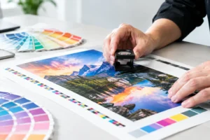
A visual identity should not be finalized only as a digital mockup. Colors, finishes, paper stocks, sizes, and viewing distance all affect how a design reads in the real world. A postcard mailed to a prospect has different requirements than a 10-foot fabric backdrop. A menu has different durability needs than a one-day event flyer.
Review the designs at their intended size. Fine details that appear polished on a laptop can disappear on a business card. Light text may become difficult to read when printed over a photo. A busy background can compete with the call to action on a window graphic or retractable banner.
Working with a production-minded design and print team early can prevent costly revisions later. At Design One Printing, that practical review can help businesses move from approved artwork to professional marketing materials without treating print production as an afterthought.
Apply the Refresh Where Customers Actually See It
Not every asset needs to be replaced on day one. Prioritize the materials with the highest visibility, the greatest volume, or the most immediate impact on revenue. For many businesses, that means business cards, sales sheets, brochures, postcards, storefront signs, event banners, and trade show graphics.
For an exhibitor, the booth is usually the priority. A refreshed backdrop, table throw, retractable banner, product signage, and handout can make a cohesive impression even if older internal documents are updated later. For a service business, business cards, vehicle graphics, estimate folders, door hangers, and direct mail pieces may deserve immediate attention.
Think through the full customer journey rather than selecting items one at a time. A prospect should see the same logo treatment, contact information, tone, and visual hierarchy on the postcard that brings them in, the sign that welcomes them, and the brochure they take home. That continuity makes the investment feel deliberate.
Set a Rollout Plan That Fits Your Deadline
A brand refresh does not have to stop your marketing activity. The right rollout depends on inventory, budget, upcoming events, and how quickly customers need to see the new materials. If you have a major trade show next week, start with the booth graphics and handouts. If an old brochure still contains accurate information, use the remaining stock while new versions are being prepared.
Avoid mixing old and new identity elements in the same customer-facing campaign whenever possible. If the updated logo is on a banner but the old logo is on the flyer, prospects may assume the materials came from different businesses. Plan the transition around campaigns, events, or reorder points so the switch feels coordinated.
Timing should also account for production needs. Large-format graphics, specialty finishes, direct mail projects, and custom display pieces require different preparation and finishing steps. Fast turnaround is valuable, but it works best when final files, quantities, sizes, and delivery details are confirmed early. Rush production can solve an urgent need, yet a few extra hours spent checking artwork can prevent a last-minute mistake from becoming a large-format mistake.
Keep a Simple Brand Standard
After the new materials are printed, protect the investment with a practical set of standards. Your team does not need a 100-page brand manual to stay consistent. A clear reference sheet covering approved logo versions, colors, fonts, photo style, spacing, and basic usage rules is often enough for day-to-day needs.
Make sure employees know where to find approved files. This is especially useful when multiple people order promotional products, create event materials, or request signs on short notice. Keeping one approved source reduces the chance that an old logo file resurfaces during a rush order.
Measure More Than Visual Appeal
A successful refresh should make business communication easier, not merely prettier. After launch, pay attention to whether prospects understand what you offer faster, whether sales teams feel more confident handing out materials, and whether event visitors respond to your display. Track practical indicators such as inquiries from postcards, scans from QR codes, booth conversations, quote requests, and repeat orders.
There are trade-offs. A highly minimal design may look premium but leave too little room for product details. A bold color system can improve visibility but may not fit every audience. The best answer depends on your industry, your sales process, and where customers encounter your brand.
If your current materials no longer reflect the quality of your work, do not wait for a complete overhaul to improve them. Start with the customer-facing pieces that matter most, make the changes consistent, and put a brand your team is proud to hand out in front of the people you want to reach.