A real estate flyer has seconds to earn attention. Whether it is handed out at an open house, displayed in a lobby, mailed to a neighborhood, or placed in a local business, it must make the next step obvious. The strongest real estate flyer design examples do not try to say everything about a property or an agent. They lead with one reason to act, present it clearly, and make it easy to respond.
For Las Vegas agents, property managers, and real estate teams working against a listing launch or open-house deadline, print quality matters as much as the message. Sharp images, readable type, accurate color, and a well-chosen paper stock communicate that the property and the professional behind it deserve attention.
Real Estate Flyer Design Examples for Common Goals
The right flyer format depends on the job it needs to do. A luxury listing announcement should not look like a rental availability sheet, and an agent-introduction flyer should not compete with a just-listed postcard. Start with the action you want readers to take, then build the design around it.
1. The just-listed property flyer
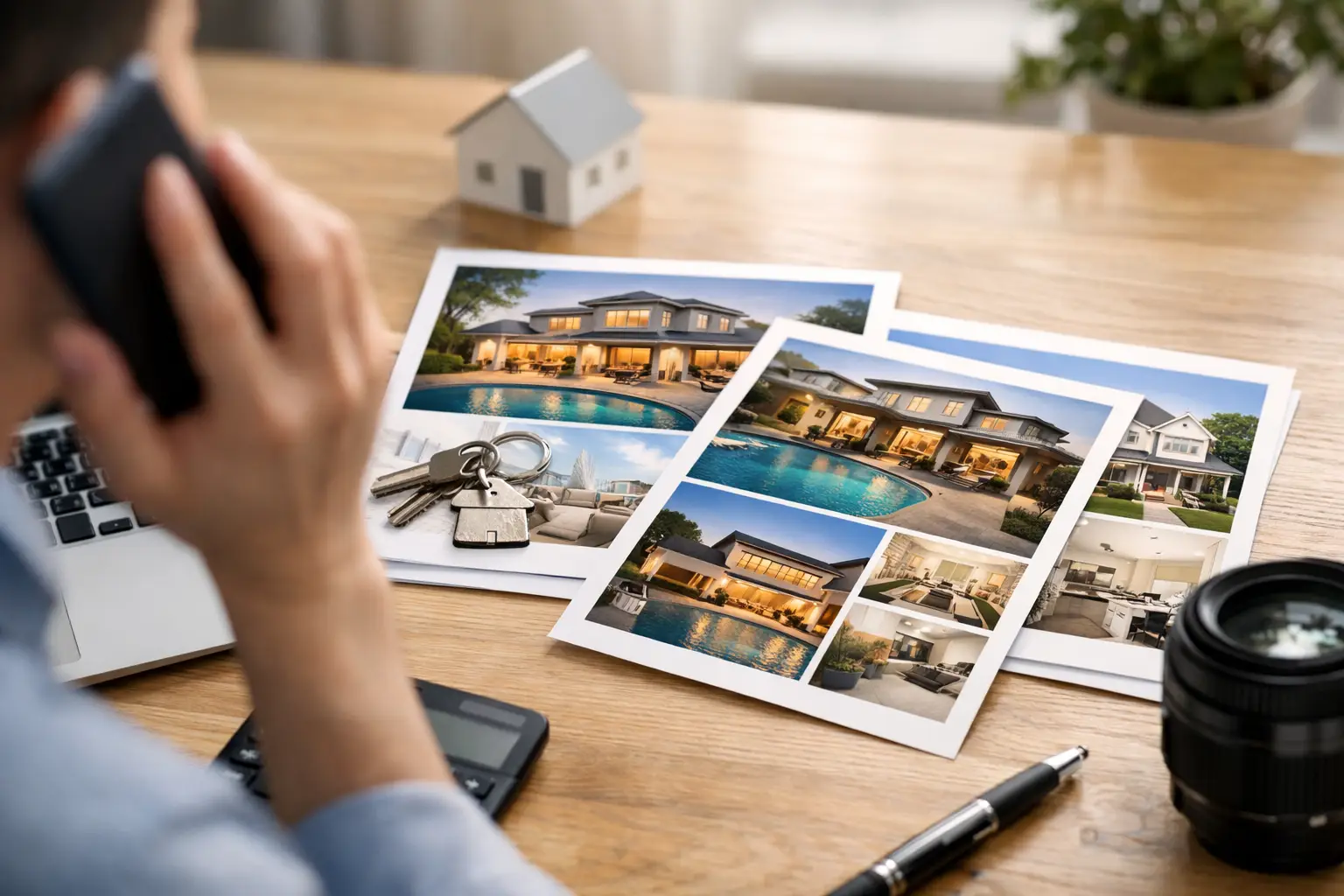
This is the classic single-property flyer, built around one outstanding image. A bright exterior, dramatic pool view, polished kitchen, or city-facing balcony should dominate the top half of the page. The headline can be simple: “Now Available in Summerlin” or “Modern Home Near Downtown Las Vegas.”
Below the main image, give buyers the facts they need to decide whether to learn more: price, bedrooms, bathrooms, square footage, neighborhood, and a concise property highlight. Keep the copy selective. “Newly renovated kitchen, covered patio, and three-car garage” is more useful than a full paragraph of generic praise.
A clear contact block belongs near the bottom, with the agent’s name, phone number, brokerage information, and a QR code if it leads directly to the listing or virtual tour. This format works best on a full-color 8.5 x 11 sheet because the property image has room to make an impact.
2. The open-house invitation
An open-house flyer is about timing. The date, hours, and address should be visible before a reader has to search for them. Many effective designs place a bold “Open House” banner across the top, followed by the day and time in large type. The hero image still matters, but the event details are the priority.
Use a high-contrast color treatment for the time-sensitive information. For example, a clean white layout with a deep navy or black event banner keeps the message readable from a distance. A small map or directional note can help when the home is in a large community or difficult-to-find location.
This design is especially useful for door-to-door distribution near the listing, local coffee shops, community boards, and sign-in table handouts. If the event is close, same-day or next-day flyer printing can make the difference between promoting the open house and missing the opportunity.
3. The neighborhood seller campaign
A homeowner is less interested in your newest listing than in what that listing means for their own property. A neighborhood campaign flyer should therefore lead with local proof. “Just Sold in Your Community,” “Multiple Buyers Looking in This Area,” or “What Could Your Home Sell For?” gives the recipient a relevant reason to read on.
A good seller flyer may include one recently sold property photo, a brief market statistic, and a direct call to request a home valuation. Avoid overstating results or using vague claims that cannot be supported. Specific, local information builds more trust than a page filled with sales language.
For this type of outreach, a postcard-sized flyer can be practical for direct mail or neighborhood drops, while an 8.5 x 11 format provides more room for a market update. The deciding factor is not which size looks more impressive. It is how much information the campaign genuinely needs.
4. The agent introduction flyer
New agents, expanding teams, and professionals entering a new farm area need a flyer that introduces the person behind the service. A professional headshot should be current, well lit, and large enough to recognize. Pair it with a short positioning statement that says who you help and where you work.
Instead of filling the page with a biography, focus on practical value. Mention local market knowledge, relocation assistance, investment property experience, or a focused service area. Add a friendly invitation to connect, not a hard sell. This flyer is often kept, so clear contact details and a memorable visual identity matter.
5. The investment or rental property flyer
Investment opportunities require a different information hierarchy. Investors want the numbers and the location context quickly. The headline may reference potential income, proximity to major employers, convention activity, walkability, or property type. The design should include clear financial figures only when they are current, accurate, and compliant with applicable advertising requirements.
For rental availability, clarity wins. Lead with monthly rent, bed and bath count, neighborhood, availability date, and the most compelling photo. A QR code can direct prospects to an application or a photo gallery, but include a phone number as well. Not every interested renter will scan a code while standing at a bulletin board.
What Makes a Flyer Look Professional in Print
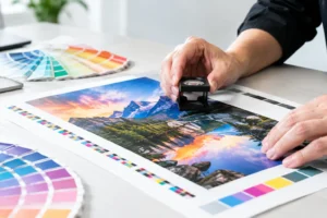
A flyer can look polished on a screen and still disappoint once it is printed. Small text becomes harder to read, dark photographs lose detail, and low-resolution images reveal blur. Design for the finished piece, not just the digital preview.
Use property photos that are large enough for print and edited naturally. Over-filtered skies, oversaturated lawns, and heavy contrast can make a listing feel less credible. Make sure the main image remains sharp at the final size, especially if the flyer will be enlarged for window display or used as a take-one sheet.
Typography should be equally disciplined. Use one font family or a restrained pairing, with a clear difference between headlines, property details, and supporting copy. If the flyer is difficult to scan from arm’s length, it is asking too much of the reader. White space is not wasted space when it improves legibility.
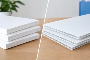
Paper choice also changes the impression. Glossy stock makes property photography pop and is a strong fit for high-end listings and open-house handouts. Matte stock offers a more understated feel and is easier to write on, which can be helpful for valuation offers, notes, or event follow-up. Heavier paper creates a more substantial presentation, but it may not be necessary for every high-volume neighborhood campaign.
A Simple Layout That Keeps Readers Moving
Most effective real estate flyers follow a visual sequence: attention, proof, details, action. The hero image or headline earns the first look. The supporting information explains why the opportunity matters. The contact section tells the reader exactly what to do next.
Do not let brokerage logos, equal housing information, licensing details, or social media icons crowd out the primary message. These items need appropriate placement, but the address, value proposition, and response path should remain easy to find. Compliance details are essential; they simply should not become the headline.
QR codes are useful when they reduce friction. Use them for virtual tours, property videos, listing pages, or home valuation forms. Test every code before printing, and leave enough clear space around it for reliable scanning. A code without a short instruction, such as “Scan for photos and pricing,” often gets ignored.
Avoid These Common Flyer Mistakes
The most common problem is trying to fit too much into one page. A flyer is not a property brochure or a complete market report. When the design includes too many photos, too many font styles, or long blocks of copy, the key message gets lost.
Another mistake is treating every audience the same. Buyers want listing details and a reason to tour. Sellers want evidence of local expertise and a reason to request a valuation. Neighbors may respond to an open-house invitation, while investors may need a more data-focused presentation. One template can support multiple campaigns, but the headline and content should change with the audience.
Finally, do not wait until the last hour to check files, quantities, and finishing needs. A rush order can be handled efficiently when the artwork is print-ready and the objective is clear. If you need design help, involve your print partner early enough to review image quality, margins, fold options, and the stock that fits the campaign.
At Design One Printing, real estate professionals can bring a listing, an event date, or a campaign goal and turn it into a printed piece built for the deadline. A well-planned flyer is not just a leave-behind. Put it in the right hands with a focused message, and it becomes a reason for the next call, showing, or conversation.