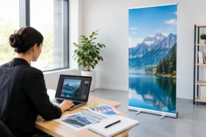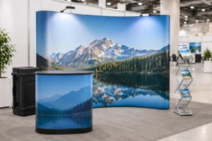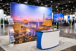
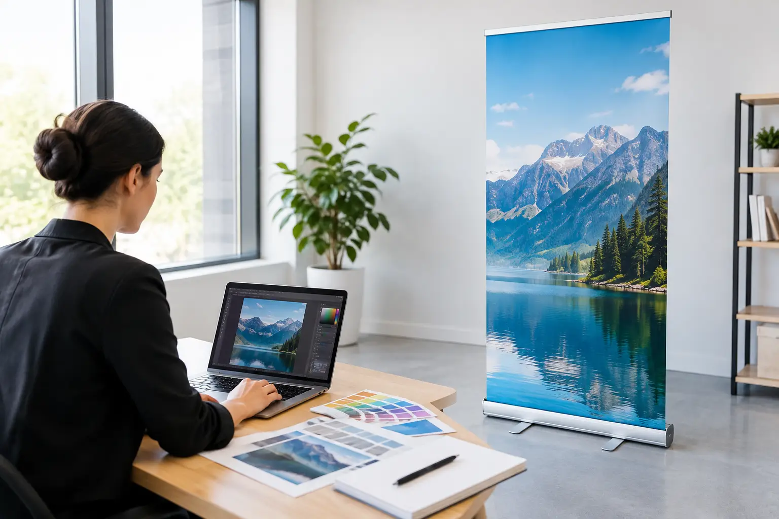
A retractable banner has about three seconds to earn attention on a busy trade show floor. In Las Vegas, where attendees move quickly between booths, sessions, and meetings, a crowded layout or tiny headline can disappear before it gets a chance to work. To create retractable banner artwork that performs, design for distance first, then build in the technical details that protect the finished print.
A good banner is not a brochure turned vertical. It is a focused visual message: who you are, what you offer, and what the viewer should do next. The strongest files make that message easy to read from across an aisle while giving the printer clean, usable production artwork.
Start With the Banner’s Job
Before opening a design program, decide what the banner needs to accomplish. A booth banner for a convention should usually support a quick conversation with a clear service, product category, or benefit. A lobby banner may have more time to communicate a promotion. A retail banner often needs a price, deadline, or directional message.
Trying to make one banner do every job is where layouts lose focus. If you need to explain several services, use a brochure, handout, or additional display piece. Let the retractable banner handle the first impression.
For most business uses, begin with one primary statement. Examples include a short promise, a product name, an event offer, or a recognizable brand line. Place that message near the top, where it is visible above tables, crowds, and booth equipment. Supporting copy can sit below it, but it should never compete with the headline.
Use the Correct Template Before Designing
Retractable banner stand sizes vary by hardware model. Common visible widths include 24, 33, 36, and 48 inches, but the total printed graphic is taller than the visible display area because a portion feeds into the base. The top may also require extra material for attachment to the support rail.
Always build from the template for the exact banner stand being produced. A generic online template may have the wrong bottom allowance, trim area, or finished dimensions. That can result in a logo or contact line being pulled into the base, even when the design looked fine on screen.
Your production template should identify three areas:
- Visible area – the section attendees will see when the banner is assembled.
- Safe area – the space where important text, logos, QR codes, and faces should remain.
- Bleed and base allowance – extra printed material needed for trimming and installation.
Do not place essential information near the bottom edge. The lower portion of a retractable banner is typically hidden inside the stand, and the exact amount can depend on how the hardware is assembled. Keep important content comfortably above the safe-area line instead of treating the bottom edge as usable space.
Create Retractable Banner Artwork for Viewing Distance
Banner artwork should be evaluated at real viewing distance, not only at 100 percent on a large monitor. A visitor standing six to 10 feet away should understand the core message immediately. If they need to stop and squint, the hierarchy is too small or too busy.
Start with a large headline in a bold, legible typeface. Script fonts, condensed styles, and light weights may look polished in a digital mockup but become harder to read under convention lighting. Use strong contrast between type and background. Dark lettering on a light field or light lettering on a dark field is usually more dependable than low-contrast brand colors placed together.
A practical hierarchy moves from largest to smallest: headline, supporting benefit, call to action, then contact details. Your company name or logo may lead if brand recognition is the main goal, but for a newer business, a clear statement of what you do often deserves the top position.
Keep copy tight. A banner does not need a paragraph of company history. Use a short phrase such as “Custom Event Graphics, Fast Turnaround,” then support it with two or three concise proof points. A phone number, website, social handle, or QR code can complete the layout, depending on what action you want the viewer to take.
Make QR Codes Usable, Not Decorative
QR codes are useful for lead capture, menus, catalogs, appointment booking, and event promotions. They also fail frequently when made too small, placed too low, or printed over a complicated background.
Give the code clear white space on all sides, use a high-contrast color combination, and avoid placing it over a photo or texture. Test it from the expected scanning distance with more than one phone before sending the file to print. If the action matters, add a short instruction such as “Scan for Show Specials” rather than assuming attendees know why they should scan.
Build a Layout That Has Room to Breathe
Vertical banners reward restraint. Leave open space around the headline, logo, and call to action so each element can be recognized quickly. White space is not unused space – it is what gives the message authority and makes a booth feel more organized.
Photos can be effective when they show a product, finished project, location, or real customer interaction. Choose one strong image rather than a collage of small images. If a photo carries the full background, add a solid or lightly transparent color panel behind text to preserve readability. Be careful with transparency effects, though, since complex shadows and overlays can reproduce differently across software and print workflows.
Keep the logo clear of visual clutter. A logo placed over a detailed image, tight against an edge, or surrounded by too many badges loses the value of the brand recognition you are trying to build. The same applies to sponsor logos and certification marks. If several marks are required, align them cleanly and reserve a secondary section of the banner for them.
Prepare Images, Colors, and Fonts for Print
Low-resolution images are one of the most visible banner mistakes. A photo copied from a website or pulled from a screenshot may look acceptable on a phone but print soft or pixelated at display size. Use original photography, properly licensed stock images, or high-resolution supplied assets.
For large-format graphics, required resolution depends on final size, viewing distance, and image content. As a general working target, use high-quality images sized appropriately for the banner and avoid enlarging small files dramatically. Your print provider can review questionable images before production, which is far better than discovering the issue after installation.
Set color thoughtfully. Screen colors are produced with light, while print uses ink, so bright RGB colors can shift when converted for production. Build artwork in CMYK when possible and use approved brand color values if they are available. If a precise corporate color is essential, communicate that requirement early. Material, ink system, lighting, and the original color specification all affect the closest achievable result.
Font handling matters too. Package fonts with editable design files or convert final text to outlines when appropriate. If you are submitting a PDF, verify that fonts are embedded and that no text reflows when opened on another computer. This is especially important for rush jobs, where file corrections can cost valuable production time.
Export a Print-Ready File
A press-ready PDF is commonly the safest final format for retractable banner artwork. Export at the full template size unless your printer specifically requests scaled artwork. If you design at half scale because the full file is difficult to manage, clearly label the scale and make sure image resolution remains sufficient at the final output size.
Before exporting, inspect the file for trim marks only if requested, correct bleed, embedded images, and the proper page dimensions. Flattening or simplifying overly complex transparency can prevent output surprises, but do not flatten so aggressively that type or fine details degrade. A high-resolution PDF preserves the layout while making the file easier for production teams to preflight.
Run one final visual check at reduced size. Look for spelling errors, missing periods in web addresses, inconsistent alignment, and accidental overlaps. Then review it as a customer would: Can someone understand the offer without a salesperson standing next to it?
Plan for the Event Environment
The best design can still underperform if it ignores its surroundings. At a crowded convention, the banner may sit behind a six-foot table, beside a large monitor, or next to competing displays. Keep your headline high, avoid relying on bottom content, and consider whether brand colors will stand out against nearby booths.
If the banner will be used repeatedly, avoid dates, show-specific discounts, and event names in the main artwork. Those details can be added to a separate sign or counter card. A reusable banner costs more up front than a disposable one only if it is designed too narrowly for future use.
For an event-specific launch, the opposite may be true. A bold deadline or limited-time offer can create urgency and justify a banner that is meant for one campaign. The right choice depends on whether long-term versatility or immediate response matters more.
When timing is tight, send the banner concept, stand size, logo files, copy, and any required event details together. Design One Printing can help review production requirements and turn a rushed idea into a display that looks prepared, not last-minute. A clear file and an early proof review give your banner the best chance to arrive ready for the floor – and ready to start conversations.