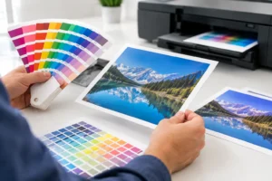
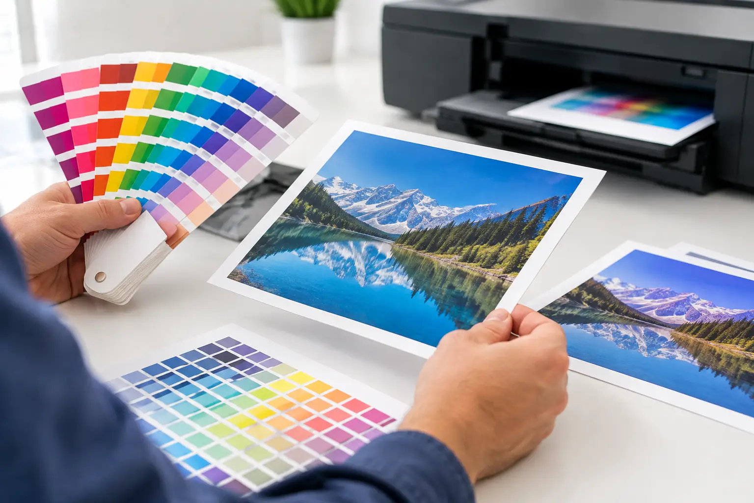
A blue logo that looked perfect on a laptop can print darker, duller, or slightly purple on a brochure. A photo approved from a PDF can lose detail in a shadow area on a banner. These print color differences are common, especially when a project moves quickly from screen to press for a Las Vegas event, trade show, or marketing deadline.
The good news is that most color surprises are preventable. Understanding where they come from helps you build files that reproduce more predictably, communicate clearly with your printer, and protect the consistency of your brand across business cards, flyers, signage, postcards, and display graphics.
Why Print Color Differences Happen
A screen creates color with light. A printed piece creates color with ink or toner on a physical material. That basic difference changes everything.
Monitors use RGB – red, green, and blue light – to display millions of bright colors. Commercial printing generally uses CMYK – cyan, magenta, yellow, and black inks or toners. RGB has a wider range of vivid colors than CMYK, particularly in bright blues, greens, oranges, and neons. When an RGB file is converted for print, some colors must shift to the closest printable alternative.
This does not mean a printed piece is lower quality. It means the file must be prepared for a different medium. A glowing electric blue on screen may become a deeper blue in print. A fluorescent-looking green may print more muted. If that color is central to your identity, it should be evaluated before a full production run.
Your monitor may not be showing an accurate reference
Every screen is different. Brightness settings, display technology, age, room lighting, and color settings all influence what you see. A phone screen turned up to maximum brightness can make colors look more saturated than they will ever appear on paper or vinyl.
Professional designers often calibrate their monitors because they need a more reliable preview. Even then, a monitor is still a preview, not a physical proof. For a rush project, it is best to base approval on a properly prepared PDF and a clear understanding of the output material, rather than assuming the screen is the final color standard.
Paper, vinyl, and fabric change the result
The same CMYK file can look different on uncoated paper, gloss cardstock, matte cardstock, adhesive vinyl, banner material, or fabric. Uncoated stocks absorb more ink, which can make colors appear softer and less saturated. Coated papers keep more ink near the surface and often produce stronger contrast and richer images.
Large-format materials introduce their own variables. A retractable banner, window graphic, foam board sign, and trade show fabric display do not reflect light in the same way. A dark background may look more intense on one substrate and less dense on another. For materials viewed under convention-center lights or direct Las Vegas sunlight, those differences can be especially noticeable.
Lighting affects what customers see
A print piece can look one way under office lighting and another under warm hotel lighting, daylight, or bright exhibit-hall fixtures. This is particularly relevant for hospitality materials, product packaging, retail displays, and booth graphics where brand color is part of the customer experience.
If exact matching is critical, review a physical proof under lighting similar to where the finished piece will be used. That extra check matters more for premium product launches, branded event environments, and campaigns with a signature color that must remain consistent across multiple items.
File setup can shift color before production begins
Color issues often begin in the design file. An image may be embedded in RGB while the logo is set in CMYK. A photo may have an unintentional color filter. A black background may be built from multiple CMYK values, while body text is set to rich black instead of 100% black. These choices can affect sharpness, density, and consistency.
For most printed files, CMYK color mode is the practical starting point. It allows you to see a more realistic approximation of printable color before files reach production. It also gives designers more control over conversions instead of leaving every decision to an automated workflow at the last minute.
How to Reduce Print Color Differences Before Ordering
Start with the right file type. A press-ready PDF is typically the most dependable format for commercial print because it preserves layout, fonts, vector artwork, and image placement. Keep images at an appropriate resolution for the product. For most close-viewed printed pieces, 300 DPI at final size is a sound target. Large-format graphics may use different resolution standards depending on viewing distance and final dimensions.
Use CMYK for standard full-color printing whenever possible. Do not build an important brand color in RGB and assume it will convert perfectly. If your company has official CMYK, Pantone, or spot-color values, include them in the artwork or provide them with the job details. A defined brand standard gives the production team a much better starting point than a screenshot from a website.
Be deliberate with black. Small black text should generally use 100% K only, which helps it print crisp and avoids colored registration edges. Large black areas may benefit from a rich black build, but the best formula depends on the printing method and substrate. Ask before specifying one if you are producing a large dark poster, brochure cover, or backdrop.
Avoid relying on extremely bright digital colors, especially neon green, intense cyan, and highly saturated blue-violet shades. They may look compelling on screen but sit outside the normal CMYK gamut. If the effect is essential, a specialty ink, spot color, or different production approach may be worth considering. The right choice depends on budget, quantity, turnaround time, and how exact the match needs to be.
When a Proof Is Worth the Extra Step
Not every flyer needs a physical proof. For straightforward short-run marketing pieces, a well-prepared PDF and standard production process may be entirely appropriate. But a proof is a smart investment when color carries financial or brand risk.
Consider requesting a proof for a first-time brand color, a large run, a packaging component, a photo-heavy brochure, a major trade show display, or a project that must match previously printed materials. A proof is also useful when a job includes multiple substrates, such as postcards, stickers, table throws, and booth graphics. It helps establish realistic expectations before the final pieces are produced.
There is a trade-off: proofs can add time and cost, which may not work for a same-day order. In that situation, provide the cleanest possible CMYK PDF, identify your must-match colors, and tell the print team where the material will be displayed. Clear direction early is faster than correcting a color concern after production has started.
Keep Brand Colors Consistent Across Print Products
Consistency starts with a usable brand color system. Rather than relying on a single hex code from your website, keep approved values for RGB, CMYK, and Pantone or spot color where applicable. Your logo files should include vector versions, and any approved brand guide should identify the intended color specifications.
It is also helpful to retain a physical sample of successful past pieces. If a postcard, folder, or banner printed exactly as intended, bring in a sample or provide a high-quality reference when reordering related materials. It will not override the limits of different substrates or production methods, but it gives your print partner a useful target.
For businesses producing materials on tight schedules, working with one responsive production partner can reduce variation over time. Design One Printing can review files before production, flag potential color concerns, and help determine whether a proof, a substrate change, or an adjusted color build makes sense for the job.
A Better Standard for Color Approval
The goal is not to make every printed piece look identical to a backlit screen. The goal is to produce a professional, consistent result that works in the real environment where customers will see it. That may mean choosing a more printable version of a digital color, selecting a coated stock for stronger saturation, or approving a physical proof before committing to a large run.
When color matters, send production-ready files early, identify the colors that cannot drift, and share how and where the piece will be used. Those few details give your printer the information needed to make practical recommendations and keep your materials looking intentional when the deadline is close.