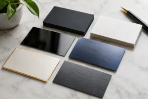
A business card is often exchanged in a fast moment – at a convention booth, during a client meeting, or after a networking event near the Las Vegas Strip. The right finish gives that small piece of paper a clear job: make your brand feel considered, professional, and worth remembering. This guide to business card finishes explains what each option does, where it works best, and how to choose without adding unnecessary cost or production time.
Start With the Impression You Need to Make
A finish is more than a visual preference. It changes how a card feels in the hand, how colors appear, how well it resists scuffs, and whether people can write on it. Before selecting one, consider where the card will be used and what you need it to communicate.
A real estate professional may need a polished card that survives a purse or wallet. A restaurant owner may want a tactile, premium finish that matches an elevated dining experience. A trade show exhibitor handing out hundreds of cards may prioritize a clean, durable option with quick production. None of these choices is automatically better. The right finish depends on the brand, the budget, the artwork, and the deadline.
Paper stock comes first. A heavier stock generally feels more substantial and holds up better than a lightweight card. Finish comes next, either as part of the paper itself or as a coating applied after printing. Your printer can help match these details to the look you want and confirm which options fit a rush schedule.
The Main Business Card Finishes
Matte finish
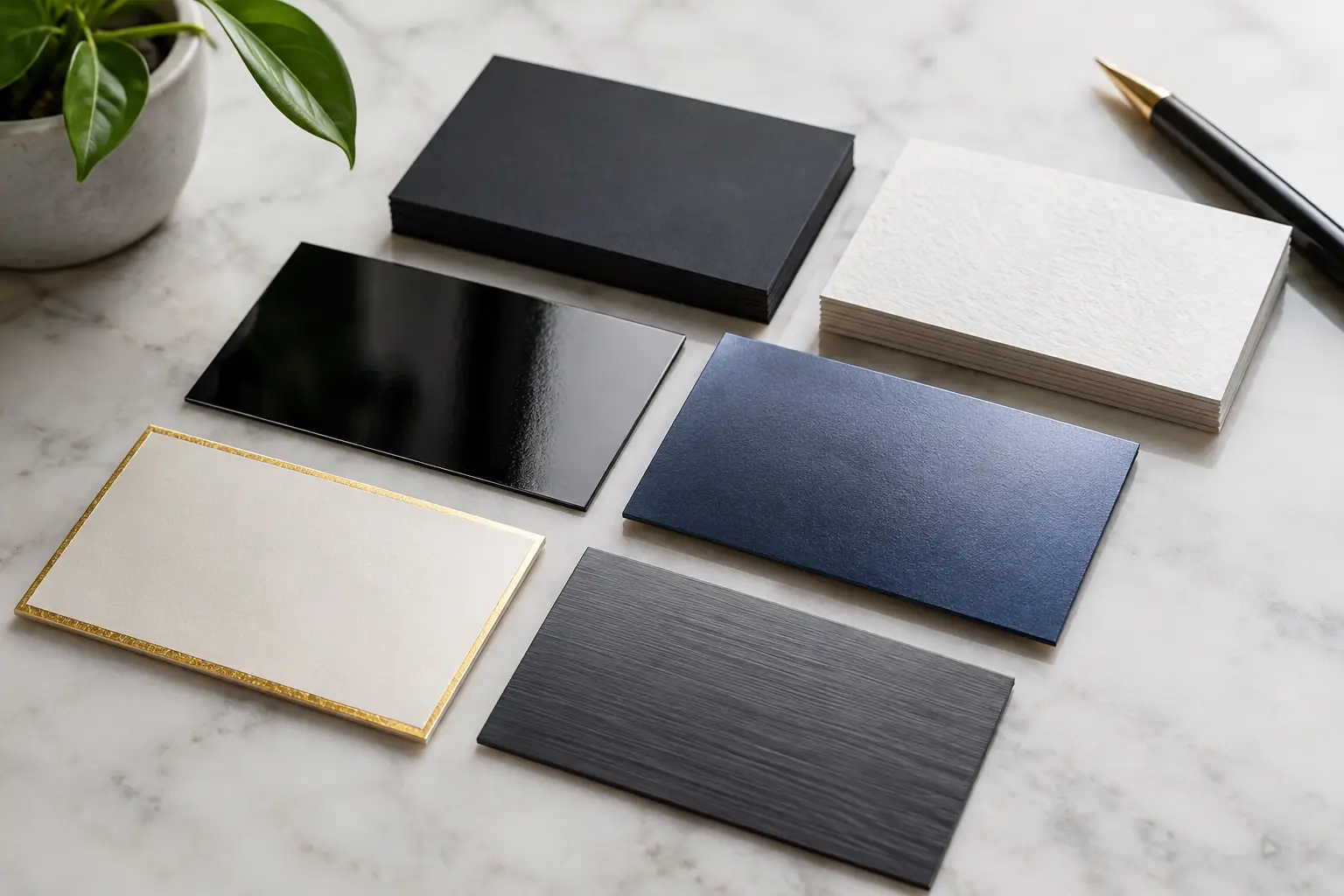
Matte business cards have a smooth, non-reflective surface. They look refined and read easily under bright lights, which makes them a practical choice for conferences, hospitality businesses, professional services, and brands with a clean visual identity.
Matte works especially well with dark backgrounds, subtle photography, and minimalist layouts. Because it does not reflect much light, it can make text feel calmer and more readable. It also provides a more natural surface for writing a note, appointment time, or direct phone number on the back.
The trade-off is that dark matte cards can show fingerprints or rub marks more readily than glossier alternatives. If your card has a large solid-black background and will be handled heavily, ask about protective coating options or consider a design with more open space.
Gloss finish
Gloss coating gives business cards a smooth, shiny surface that makes colors appear more vivid. It is a strong fit for retail, entertainment, beauty, food, automotive, and any brand using bold photography or saturated color.
A gloss card is durable, wipeable, and designed to catch the eye quickly. That can be valuable at a crowded trade show where your card needs to stand out in a stack. It is also a cost-effective choice for higher quantities, especially when the design depends on bright images or product photos.
The downside is glare. Small text can be harder to read under direct lighting, and writing on a glossy surface can be difficult. If you want a glossy front with room for notes, a common solution is to use an uncoated or matte back.
Satin or silk finish
Satin, sometimes called silk, sits between matte and gloss. It has a soft sheen rather than a high shine, delivering richer color than matte with less reflection than gloss. For many business cards, this is the most flexible all-purpose choice.
Satin is well suited to companies that want a polished look without appearing overly flashy. It works with corporate branding, real estate, healthcare, financial services, consultants, and upscale local businesses. The surface feels smooth, and it tends to handle everyday contact well.
If you are unsure whether your design needs matte restraint or gloss intensity, satin is often the safest middle ground. It gives logos and color blocks enough presence while keeping the card professional in nearly any setting.
Uncoated finish
Uncoated cards have no glossy or protective surface layer. They feel like premium writing paper and offer a tactile, approachable quality. This choice works well for law firms, accountants, wellness brands, artists, nonprofits, boutique retailers, and businesses that want an organic or understated presentation.
The biggest advantage is usability. Clients can write on uncoated stock easily, making it useful for appointment cards, referral cards, loyalty cards, and cards that include a space for a staff member to add information. Uncoated paper also gives a softer, more natural appearance that supports muted color palettes and simple typography.
However, uncoated stock absorbs ink differently than coated stock. Colors may look less bright, and detailed photos may not reproduce with the same sharpness or contrast. It can also pick up marks more easily. Use it when the tactile experience and writeability matter more than maximum color pop.
Specialty Options That Create a Premium Look
Specialty finishes can turn a standard business card into a stronger brand touchpoint, but they should support the design rather than compete with it. They may also require additional production steps, so plan ahead if you need cards for an upcoming convention, grand opening, or sales meeting.
Soft-touch lamination
Soft-touch lamination has a velvety, almost suede-like feel. It is frequently used by luxury brands, creative agencies, beauty businesses, and professionals who want their card to feel distinct before it is even read.
It looks particularly effective with deep colors, black backgrounds, and minimal designs. Soft-touch cards are memorable, but they can cost more than standard finishes and may show fingerprints on dark areas. A simple layout with strong contrast usually gets the best result.
Spot UV
Spot UV adds a high-gloss coating to selected areas, such as a logo, business name, pattern, or product image. On a matte or soft-touch card, that contrast creates an immediate visual and tactile effect.
Use spot UV selectively. A glossy logo against a matte background looks intentional; coating every element can make the card busy and reduce the impact. It is best for brands with a clear focal point and enough lead time for the extra finishing process.
Foil accents
Foil adds metallic shine in colors such as gold, silver, copper, or other custom tones. It can make a logo, monogram, or small graphic feel premium and precise. Foil is a strong fit for high-end hospitality, luxury services, event planning, jewelry, and executive brands.
The design should remain simple. Fine details, tiny type, and large foil-covered areas may not produce the crisp result you expect. Foil also adds cost and time, so it is most effective when reserved for an element that deserves attention.
Raised print and embossed details
Raised print, embossing, and debossing create dimension you can feel. These choices can make a card especially memorable, but they are not ideal for every project. They require carefully prepared artwork, and their production timeline is typically longer than standard digital business cards.
Consider these options for relationship-driven businesses where a smaller number of cards carries more value, such as architecture firms, luxury real estate teams, private events, or executive introductions. For a high-volume convention handout, a durable standard finish may be the better investment.
Choosing a Finish for Your Artwork
The finish should work with your design, not compensate for it. If your logo uses vivid colors and product photography, gloss or satin can help preserve intensity. If your layout depends on understated typography, neutral colors, or significant white space, matte or uncoated stock may better reflect the brand.
Also think about information density. Cards with small type, QR codes, maps, or multiple contact methods need crisp reproduction and easy reading. Avoid using a reflective finish on a design already packed with detail. If your card relies on a QR code, keep sufficient contrast around it and test it from a printed proof whenever possible.
For double-sided cards, you do not have to use the same approach on both sides. A coated front can present the brand, while an uncoated back provides room for a handwritten follow-up. This is particularly useful for service businesses that schedule appointments or give personalized estimates.
Plan Around Quantity and Turnaround
Fast production does not have to mean settling for a generic card. Standard matte, gloss, and satin options are usually the most practical when you need dependable turnaround for a meeting, event, or last-minute shipment. Specialty laminations, foil, and dimensional treatments may require more lead time because they involve additional finishing steps.
Share your deadline early, along with the quantity, paper preference, and any existing artwork. If you are preparing for a Las Vegas convention, factor in time for proofing and delivery to your hotel, booth, or event location. Design One Printing can help identify options that look professional while fitting the schedule you actually have.
A business card should feel like a natural extension of the conversation that earned it. Choose the finish that supports your brand, holds up to real-world handling, and gives the recipient a reason to keep it rather than file it away.