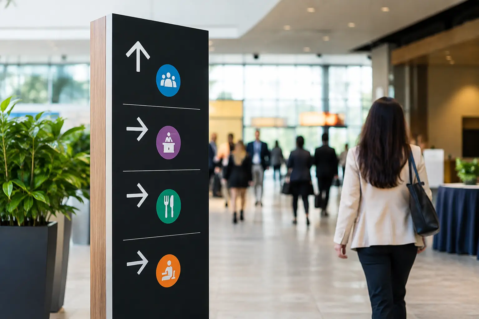
A guest steps off the elevator at a Las Vegas hotel, checks the event schedule, and sees three ballrooms, two escalators, and a line of people moving in the opposite direction. At that point, your event’s first impression is not the registration desk. It is the sign that tells them where to go. This guide to event wayfinding signage explains how to create clear, professional directions that keep attendees moving and reduce avoidable questions for your staff.
For conferences, trade shows, corporate meetings, weddings, and large networking events, wayfinding is an operational tool. Good signage gets people to registration, breakout rooms, exhibit halls, restrooms, transportation pickup, and emergency exits without confusion. It also protects the experience you worked hard to create.
Start With the Guest Journey, Not the Sign List
A common planning mistake is ordering signs by product type: a few foam boards, several banners, some decals. That can leave critical decision points uncovered. Instead, map the route a first-time attendee takes from arrival to departure.
Consider where guests park or get dropped off, enter the property, locate registration, move to the main program, find sessions or exhibitors, and return to transportation. At every turn, elevator bank, hallway intersection, stairwell, and doorway, ask one practical question: what does this person need to know right now?
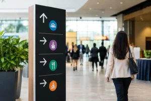
A directional sign should answer one question at a time. “Registration – Ballroom C” is easier to act on than a crowded panel that lists the full agenda, sponsor logos, social handles, and five competing arrows. Branded event graphics matter, but directional information must remain the priority.
For a multi-room event, build a simple wayfinding plan before finalizing artwork. Mark each sign location, its message, arrow direction, size, and mounting method. This prevents conflicting arrows and last-minute gaps when the venue changes a room assignment.
Make Every Direction Easy to Read at a Glance
Wayfinding signage succeeds when attendees can understand it while walking. The design needs contrast, hierarchy, and enough empty space to make the message visible from a distance.
Use a large, readable typeface for the destination and keep supporting details smaller. Dark lettering on a light background or light lettering on a dark background usually delivers stronger visibility than low-contrast brand colors. If your brand palette includes subtle tones, use those as accents rather than the main text background.
Arrows deserve special attention. Keep their style and placement consistent throughout the event. If an arrow points right on one sign, do not use a different arrow icon or place it on the opposite side of the next sign unless the direction truly changes. Small inconsistencies make people hesitate, especially in a busy convention corridor.
Avoid relying on color alone to identify routes or event tracks. Pair color coding with plain-language labels, symbols, or room names. This supports attendees with color-vision differences and makes the system easier for anyone to follow under changing venue lighting.
Use the Right Information Hierarchy
The strongest directional signs generally put the destination first, followed by a clear direction and only the details needed to make a decision. For example, “Exhibit Hall – Level 2” is more useful at an elevator than a logo-heavy sign that simply says “Welcome to the Expo.”
For events with several programs running at once, use a consistent format. Put the event name or logo in a fixed location, then give the session, track, or destination prominent space below it. Attendees learn the visual pattern quickly and can scan signs faster as the day goes on.
Choose Sign Types Based on Location and Duration
The best material depends on where the sign will be used, how long it needs to last, and whether venue rules limit installation options. A one-day seminar in a hotel ballroom has different needs than a three-day convention spread across multiple floors.
Rigid signs work well for registration areas, session entrances, sponsor activations, and freestanding directional points. Foam board, PVC, or similar mounted materials provide a clean, professional presentation indoors. They are particularly useful when signs need to sit on easels or be placed in sign holders.
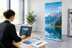
Retractable banners are a practical choice for high-visibility directions near entrances, registration, escalators, and exhibit hall doors. They are portable, stand on their own, and can be reused if the message remains relevant. For changing room assignments, however, a reusable banner may be less practical than a newly printed rigid sign or insert.
Vinyl banners can work well for large entrances, outdoor check-in areas, parking directions, and long hallways. They offer visibility at larger sizes, but installation details matter. Confirm whether the venue permits grommets, stands, wall mounting, or other hanging methods before production begins.
Floor graphics can direct traffic where wall space is limited, especially in exhibit halls and wide corridors. They should be used carefully. Keep messages short, make sure the material is rated for the surface and foot traffic, and place them where people can safely look down without creating congestion.
Plan for the Places People Actually Get Lost
Most attendees do not get lost in the main ballroom. They get lost at transitions: leaving parking garages, choosing between elevators, exiting escalators, crossing a lobby, or finding the correct door in a long hallway.
Place directional signs before the decision point, not after it. If attendees need to turn left at the end of a corridor, give them an advance sign before they reach the corner, then reinforce it at the turn. This repeat-and-confirm approach feels excessive on a floor plan but feels reassuring in a crowded venue.
Registration deserves its own sign system. Use an exterior directional sign to bring guests toward the desk, a visible header that confirms they have arrived, and smaller signs that organize lines by attendee type, alphabet range, badge pickup, or on-site registration. A well-marked registration area keeps queues from blocking doors and hallways.
At trade shows, exhibitors need guidance too. Loading dock instructions, booth-number ranges, exhibitor check-in, freight pickup, and service desk locations should be distinct from attendee-facing signs. Mixing these messages on the same panels creates clutter and slows both groups down.
Build Accessibility Into the Wayfinding Plan
Accessible wayfinding is good event planning, not an optional add-on. Leave clear paths around signs, avoid placing freestanding displays where they narrow traffic lanes, and make sure important information is visible to guests using mobility devices.
Use plain language and recognizable icons where appropriate. Restroom, elevator, information, first aid, and accessibility symbols help guests scan quickly, particularly when they are unfamiliar with the building or speak English as a second language.
For large events, include clearly marked information points where attendees can get help beyond what a sign can provide. Signage should reduce basic directional questions, while trained staff can handle schedule changes, special accommodations, and more detailed requests.
Prepare Artwork and Production Details Early
A sign can be beautifully designed and still fail if the final file is not set up for its actual size. Large-format graphics need high-resolution images, correctly scaled artwork, appropriate bleed where required, and fonts or linked graphics handled properly. A logo that looks sharp on a laptop may appear soft when printed on a six-foot banner.
Before sending files to print, confirm these details with your production partner:
- Final sign sizes and quantities for each location
- Indoor or outdoor use, including expected lighting and weather exposure
- Mounting method, stands, easels, grommets, or adhesive requirements
- Venue delivery rules, loading access, and installation timing
- Whether room names, schedules, or sponsor details may change before the event
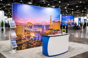
In Las Vegas, timing can be the deciding factor. Convention schedules move quickly, venue instructions change, and exhibitors often discover missing signage after arriving on site. Design One Printing can help event teams produce professional directional signs, banners, posters, floor graphics, and last-minute replacements on a fast turnaround when the plan changes.
Leave Room for Last-Minute Changes
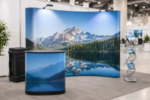
Room changes happen. So do sponsor additions, schedule updates, weather issues, and revised entrances. Build flexibility into the system by separating permanent event branding from variable details when possible. A reusable welcome display can remain in place while smaller session signs or room inserts are updated.
Keep editable source files organized and name them by location, not just by design version. “Level 2 Elevator Direction” is much easier to find during a rush than “Final_Approved_v7_NEW.” Bring a small set of blank sign holders or neutral directional signs if the venue allows it, since they can solve an unexpected problem quickly.
Review the Signage Like an Attendee
Before doors open, walk the full event route with someone who did not help plan it. Start where a guest arrives and follow the signs to registration, the main program, a breakout room, restrooms, food service, and the exit. If that person has to ask where to go, a sign is missing, too small, unclear, or placed too late.
This walkthrough also reveals practical problems that are easy to miss on a digital map: a banner hidden behind an open door, a sign blocked by a queue, glare on a glossy surface, or an arrow that points toward a locked corridor. Correcting those issues before attendees arrive is far less expensive than managing confusion all day.
Clear wayfinding does more than direct traffic. It gives guests confidence that the event is organized, makes staff more available for meaningful conversations, and lets your brand show up professionally at every turn. When deadlines are tight, prioritize the signs that answer the next question your attendees will have.