A new retail location can have the right inventory, a strong team, and a polished interior, then still lose opening-day traffic because passersby cannot tell what is happening inside. Retail launch signage solves that problem. It tells people a store is open, gives them a reason to enter, and makes the experience feel intentional from the sidewalk to the checkout counter.
For Las Vegas retailers, timing matters as much as appearance. A launch may coincide with a convention, seasonal traffic, a resort event, or a limited promotional window. Signage has to be clear at a glance, consistent with the brand, and ready when the doors open.
Start With the Customer’s First Three Questions
Most people approaching a new store are not studying every detail. Within a few seconds, they want to know: What is this business? Is it open? Why should I come in now? Your launch signs should answer those questions in that order.
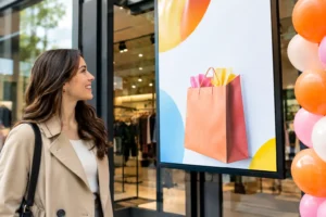
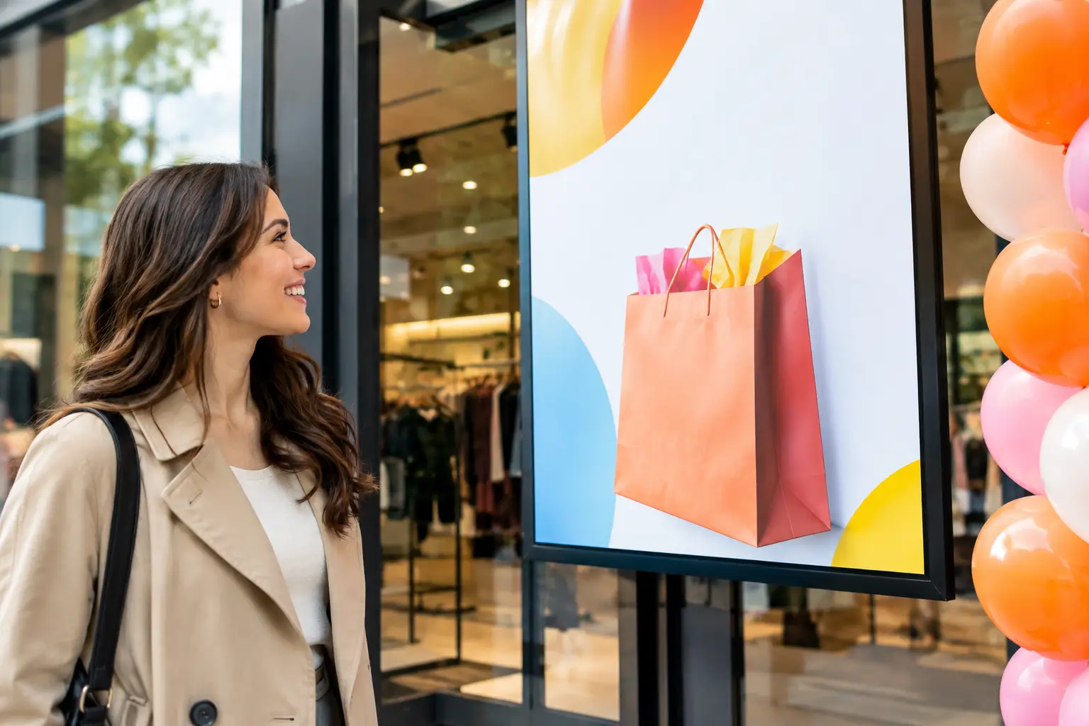
The storefront is usually where the decision happens. A large window graphic, banner, or mounted sign should feature the business name or logo, the product category, and a simple opening message. “Now Open,” “Grand Opening,” or “Opening Weekend” works because it is immediate. Add one specific reason to visit, such as a launch offer, product demonstration, giveaway, or limited-time service.
Avoid treating the window as a flyer board. Too many competing messages make a new business look unprepared. One dominant message, supported by one offer and a clear call to action, is easier to read from a parking lot, sidewalk, or adjacent storefront.
Make the Main Message Visible From a Distance
Sign size and type hierarchy should match the viewing distance. A promotion meant for pedestrians can carry more detail than a message intended for drivers. If customers need to understand the offer from across a busy street or a large resort corridor, use fewer words and larger type.
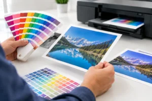
Color contrast also matters. Light text on a busy image may look attractive on a screen but disappear in direct sunlight. High-contrast graphics, clean typefaces, and adequate white space tend to perform better in real retail environments. If the space has bright exterior lighting or reflective glass, request a proof or discuss material options before production.
Build Retail Launch Signage Around the Customer Path
A strong launch package does more than announce the opening. It guides customers through the space and keeps the campaign visible after they walk through the door.
Start outside, then work inward. Exterior signs bring people to the entrance. Door decals and window graphics confirm they are in the right place. Interior posters, floor graphics, shelf talkers, and counter signs help them find featured products, understand promotions, and complete a purchase.
For a retail opening, these are often the most useful printed pieces:
- Window graphics or vinyl decals for the opening message and branded storefront presence.
- Banners for high-visibility grand-opening announcements, parking areas, or temporary exterior placement.
- Posters and foam board signs for entrance displays, product features, and event schedules.
- Directional signs for fitting rooms, checkouts, pickup areas, demonstrations, and launch activities.
- Counter cards, shelf signs, and stickers for limited-time offers and add-on purchases.
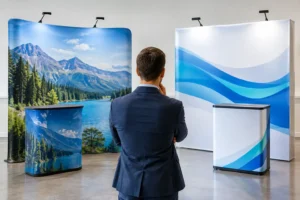
Not every store needs every item. A boutique with a street-facing window may prioritize premium window graphics and a small in-store promotional set. A pop-up in a large venue may need bold banners, directional signs, and portable displays because customers are navigating a crowded environment. The best mix depends on the location, footprint, traffic flow, and duration of the launch.
Do Not Leave Wayfinding Until the End
Wayfinding is easy to overlook when the focus is on promotional graphics. It is also one of the fastest ways to create friction during an opening. If customers cannot find the register, fitting rooms, demo table, or featured collection, staff members spend the day giving directions instead of helping people buy.
Keep directional signs plain and consistent. Use familiar labels, arrows that point clearly, and colors that match the rest of the campaign without sacrificing legibility. For temporary retail activations, foam board signs, posters, and removable decals can provide a professional solution without requiring a permanent installation.
Choose Materials That Fit the Location and Timeline
The right material is not always the most expensive one. It is the one that looks professional for the required timeframe and performs in its specific environment.
Vinyl window graphics are a practical choice for storefront launches because they create a large visual presence without taking up floor space. Depending on the application, they can be used for full-color promotional graphics, simple lettering, or privacy coverage. Banners are useful when the message needs to be seen from farther away or when signage must be installed and removed quickly.
Posters offer flexibility for indoor campaigns and short-term promotions. Mounted signs, such as foam board, are better when the display needs more structure at an entrance, on an easel, or near a product display. Floor graphics can draw attention to a launch offer or guide customers through a defined path, but they should be used selectively. A floor message must be placed where it will not create a safety issue or compete with too many other visual elements.
For exterior signage in Las Vegas, heat, sun exposure, wind, and installation conditions deserve attention. A graphic that works well for a weekend event may not be the right choice for a months-long storefront campaign. Explain where the sign will be used, how long it needs to last, and whether it will be installed indoors or outdoors. Those details affect material, finishing, and mounting recommendations.
Keep the Offer Specific and Easy to Act On
Grand-opening language creates interest, but it does not always create urgency on its own. Pair it with a clear, real offer. “Grand Opening” becomes more effective when customers also see “20% Off Through Sunday,” “Free Gift With Purchase,” or “Live Demo at 2 PM.”
The offer should be simple enough to understand while walking by. If there are exclusions, dates, or redemption instructions, place the main message on the large sign and reserve the fine print for a smaller nearby piece. Trying to fit every condition into the primary graphic weakens the message.
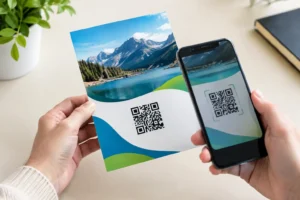
If the launch includes a QR code, make it large enough to scan and give people a reason to use it. It might lead to an opening-week coupon, loyalty signup, event RSVP, or product preview. Test the code from the distance and angle where customers will encounter it. A code placed behind reflective glass or too close to the floor may not get used.
Plan Production Before the Last-Minute Rush
Retail openings create moving deadlines. Fixtures arrive late, merchandising changes, and a landlord or venue may have rules about what can be displayed. That is exactly why the sign plan should be created early, even if some details are still pending.
Begin with the launch date, installation window, and list of required locations. Measure each sign area and photograph the space if possible. Include doors, windows, counters, walls, display tables, and any exterior placement. Then identify what is essential for day one versus what can follow after opening.
Your production schedule should allow time for design review, proofreading, print production, finishing, and installation. Names, prices, dates, suite numbers, and phone numbers deserve a final check before anything goes to print. A polished sign with one incorrect date can create unnecessary customer service problems.
When deadlines tighten, working with a local production partner can make a meaningful difference. Design One Printing helps Las Vegas businesses produce banners, posters, signs, window graphics, and other launch materials with fast turnaround and hands-on support when plans change close to opening day.
Create a Consistent Look Across Every Sign
A launch feels more established when every printed piece speaks the same visual language. That does not mean every sign has to look identical. It means the logo, colors, typography, photography style, and promotional voice should feel connected.
Use one primary headline style for major messages, one supporting type style for details, and a limited color palette. Feature product photography only when it adds clarity. For some concepts, a bold color field, logo, and short offer will be more visible than a photo-heavy layout.
Consistency also protects against a common opening-day issue: staff members adding handwritten notices that do not match the campaign. Prepare a few editable or quick-print templates for changing hours, sold-out items, event timing, and last-minute announcements. That gives the team a practical way to stay on-brand as the launch unfolds.
Treat Opening Day as the Start of the Signage Plan
The signs that announce your opening do not have to disappear after the first weekend. Refresh the message as the business moves from “Now Open” to a seasonal offer, loyalty program, featured collection, or upcoming event. Reusing the same sign locations with updated graphics keeps the storefront active and gives returning customers a reason to look again.
A well-planned launch starts with a clear message, but its real value is momentum. Put the right message where customers will see it, make every direction easy to follow, and leave room to update the campaign when the next opportunity arrives.