
A postcard has only a few seconds to earn attention – whether it is picked up at a Las Vegas trade show, handed to a hotel guest, or pulled from a mailbox. To design effective business postcards, start with one clear business goal and build every design choice around it. A crowded postcard may look busy and expensive, but it rarely gives the reader a reason to act.
For businesses working on a deadline, the goal is not to fit every detail onto a small card. It is to make the right message impossible to miss, then produce a piece that feels polished in the reader’s hand.
Start With One Action You Want the Reader to Take
A business postcard works best when it asks for one primary response. That might be visiting a location, scanning a QR code, booking an appointment, calling for an estimate, registering for an event, or presenting the card for a limited-time offer.
Choose that action before writing the headline or selecting photos. If a restaurant wants to fill seats during a slow weekday, the offer and reservation details should lead the design. If an exhibitor is promoting a convention booth, the booth number, event dates, and a reason to stop by deserve the most visual weight.
Trying to promote a new service, introduce the company, announce a sale, share five testimonials, and collect social followers on one postcard creates a decision problem for the customer. They may remember none of it. Keep supporting information focused on the action you want next.
Match the message to the moment
Timing changes what a reader needs to see. A postcard promoting an event happening this weekend should make the date and location immediate. A neighborhood direct mail campaign can spend more space on the offer, service area, and proof that the business is local and dependable.
For trade shows and conventions, assume readers are moving quickly and collecting materials from many vendors. A bold benefit is more useful than a long company history. For example, “Same-Day Signs for Las Vegas Events” tells a time-pressed planner more than “Your Complete Printing Partner Since…”
Design Effective Business Postcards With Clear Hierarchy
Visual hierarchy is the order in which the eye reads the page. On a postcard, it should be intentional: first the headline or offer, then the image or key benefit, then the call to action and contact details. If every element is large, colorful, and bold, nothing stands out.
Use one dominant headline that says something useful. “20% Off Your First Service Visit” is clearer than “Welcome to Our Company.” “Custom Event Graphics Ready Fast” is stronger than “Quality You Can Trust,” because it explains both the product and the advantage.
Keep the supporting copy short. One or two sentences can clarify who the offer is for, what is included, and when it expires. Readers should not have to search through a paragraph to find the value.
Give the design room to breathe
White space is not wasted space. It separates ideas, helps important details stand out, and makes a postcard easier to scan. This matters especially when the postcard will be read in a crowded lobby, on a showroom floor, or while someone is sorting mail.
Avoid placing text too close to the trim edge. Printing requires a safety margin so essential copy, logos, phone numbers, and QR codes are not at risk of being cut off. If a background color or photo is meant to run to the edge, it should extend into the bleed area required for production.
A clean front side might include a headline, one strong image, a short offer, and a call to action. The mailing side needs a more disciplined layout, leaving adequate space for the address, postal indicia, and required mailing information. Planning for these areas early prevents an otherwise good design from becoming cramped at the final proof stage.
Choose Images and Color That Support the Offer
Use photographs that demonstrate the result a customer wants. A salon can show a finished style, a restaurant can show a signature dish, and a contractor can show a clean before-and-after project. Generic stock imagery can work when it is well chosen, but it should not overpower the actual offer or make the business look interchangeable.
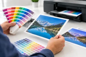
Images must be high resolution for print. A photo that looks acceptable on a phone screen may print soft or pixelated when enlarged. Whenever possible, use original photography, professionally prepared artwork, or source files sized for the postcard’s final dimensions.
Color should also serve a purpose. Brand colors create recognition, while a contrasting accent color can pull attention to the offer or call to action. Do not rely on color alone to communicate a deadline, price, or key instruction. Pair it with clear text so the message remains readable for every customer.
Dark, full-coverage backgrounds can create a premium look, but they require careful file preparation and may show wear more easily in high-handling environments. A lighter design can be more economical and easier to read. The right choice depends on the brand, quantity, distribution method, and how long the postcard needs to stay useful.
Make the Call to Action Easy to Follow
A call to action should state exactly what to do and reduce friction. “Call today for a free estimate,” “Scan to view available appointments,” and “Bring this card to booth 614” are direct instructions. Vague phrases like “Learn more” can work only when the surrounding context already makes the next step obvious.
Include the easiest response path for the audience. A local service business may prioritize a phone number. A retail promotion may use a short web address or QR code to send customers to an offer page. A B2B exhibitor may direct prospects to a meeting scheduler or provide a booth location.
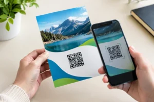
If using a QR code, test it before printing. It needs adequate contrast, a clear quiet zone around the code, and a size that can be scanned easily by a typical smartphone camera. Do not place it over a detailed image or texture. Add a short instruction nearby, such as “Scan for event pricing,” so people know why they should use it.
Track the campaign when possible. Use a dedicated offer code, landing page, QR code, or phone extension. Tracking reveals whether the postcard produced calls, visits, redemptions, or qualified leads – information that makes the next print run more effective.
Select Size, Stock, and Finish for the Job
The standard 4 x 6 postcard is a practical choice for many direct mail and handout campaigns because it is compact, familiar, and cost-effective. Larger formats create more room for images and offers, which can help when the piece must compete in a busy mailbox or a convention setting. The trade-off is that larger cards can cost more to print and mail.
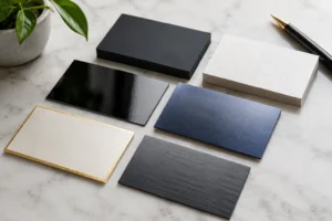
Paper stock shapes perception. A heavier cardstock generally feels more substantial and is a strong fit for premium services, hospitality promotions, real estate, and professional event materials. A lighter stock may be appropriate for high-volume offers where budget and reach are the priority.
Gloss finishes can make product photography and vivid color pop. Matte finishes offer a more understated, easy-to-read look and can be easier to write on. If recipients need to fill in information, carry the card as a coupon, or add notes after a conversation, that detail matters.
For rush campaigns, discuss the intended use before approving the job. A postcard needed tomorrow for a Strip-adjacent event may require a different production approach than a direct mail piece scheduled weeks in advance. Design One Printing can help confirm the file setup, stock, finish, and turnaround that fit the deadline without compromising the essentials.
Proof for Accuracy Before It Goes to Print
Postcard mistakes are costly because they are repeated across the entire run. Before approving artwork, verify the offer dates, pricing, phone number, website spelling, address, event name, booth number, and QR code destination. Have someone unfamiliar with the project review it too. Fresh eyes often catch a missing digit or confusing instruction.
Review the design at actual size, not only zoomed in on a large monitor. Small type that appears readable on screen may be difficult to read in print. As a general rule, body copy should be comfortable to read without effort, while legal terms or conditions should remain legible and not become an afterthought.
A final proof should also confirm that images are sharp, colors are appropriate, and critical elements stay within the safe area. These checks take minutes and protect the investment in printing, postage, distribution, and staff time.
A well-designed postcard gives a busy customer a simple reason to respond. Lead with the value, make the next step clear, and leave enough room for the message to do its job. When the deadline is tight, getting expert eyes on the artwork before production can be the difference between a card that merely gets printed and one that gets results.