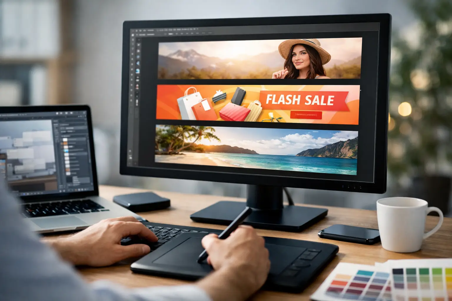
A promotion can be approved in the morning and need to appear online before lunch. Whether you are filling rooms for a Las Vegas event, promoting a retail offer, or supporting a trade show appearance, web banner design services give your campaign the polished visual assets it needs without slowing down the launch.
A web banner has a small window to work. It must communicate the offer, identify the brand, and direct the viewer toward one clear action, often within a few seconds. That calls for more than placing a logo and a headline into a standard-sized rectangle. It requires a design built for the platform, audience, message, and deadline.
What Web Banner Design Services Should Deliver
Professional web banners are campaign tools, not simply decorative graphics. The right creative should make it easy for a customer to understand what is being offered and why they should respond now. A banner for convention registration, for example, needs a different message hierarchy than a banner announcing a restaurant special or an apartment leasing incentive.
Effective web banner design starts with the campaign goal. Are you driving users to buy tickets, request a quote, visit a location, download information, or register for an event? Once that action is clear, the copy and visual direction can support it. Trying to promote five services, three discounts, and a company history in one small banner usually produces an ad that is difficult to read and easy to ignore.
A complete design service should also account for the technical details that affect where the banner can run. Digital ad platforms, websites, email campaigns, and social channels all have their own size and file requirements. Preparing the artwork correctly from the beginning avoids last-minute resizing that can crop a message, stretch a logo, or weaken the visual impact.
Build the Message Before Choosing the Size
Banner dimensions matter, but they should not be the first decision. The strongest banners begin with a focused message and a clear call to action. Then the design is adapted for the placements that matter most.
For a limited-time offer, the headline may lead with the deadline or value: Save 20% This Week or Book Your Booth Before Friday. For a business-to-business campaign, the value proposition may need to lead: Fast Turnaround Trade Show Printing or Custom Event Graphics Near the Strip. The call to action should be direct, such as Get a Quote, Register Now, Order Today, or Learn More.
Short copy is usually more effective. A banner is not a brochure, and the viewer should not have to work to find the point. If a message needs supporting details, use the banner to earn the click, then provide the full explanation on the destination page.
Use a Clear Visual Hierarchy
Every banner needs an order of importance. In most cases, the eye should reach the headline first, the supporting offer second, and the call to action third. Your logo should be visible without competing with the offer itself.
Color, font size, spacing, and contrast make that hierarchy work. A low-contrast headline over a busy photo may look attractive in a draft but fail on a phone screen. Likewise, thin type and small legal copy can become unreadable when a banner is displayed at a reduced size. Good design balances brand style with practical legibility.
Choose Images That Support the Offer
Photography, illustrations, and product images can quickly establish context, especially for hospitality, events, retail, and professional services. But the image should support the message rather than take it over. A beautiful photo with no room for readable text may not be the best choice for a high-response ad.
For trade shows and local events, imagery that shows the product, venue atmosphere, or real customer experience can add credibility. For service businesses, a clean design with strong typography may perform better than generic stock imagery. The right choice depends on what the audience needs to understand first.
Web Banner Design Services for Multi-Size Campaigns
Most campaigns need more than one banner size. A website may need a wide header graphic, while paid display ads require multiple standard formats. Email promotions, social posts, and digital signage can add more variations. Designing each asset from scratch wastes time and often creates inconsistencies.
A better approach is to establish a core campaign design, then adapt it for each placement. The central headline, offer, color palette, imagery, and call to action remain consistent, while the layout changes to fit each space. A wide horizontal banner may allow room for a product image and supporting copy. A tall vertical unit may need a shorter headline and a more simplified composition.
This is where experienced web banner design services add practical value. The work is not merely resizing. It is preserving the message when the available space changes. A banner that works at 1200 pixels wide may need a different text arrangement, image crop, or button placement when converted for a narrow mobile display.
Before production begins, provide the required dimensions, platform specifications, and delivery dates whenever possible. If those details are not available, a design partner can help identify the likely formats based on where the campaign will run. Early planning reduces revisions and helps keep a rush campaign on schedule.
Keep Digital and Printed Campaigns Aligned
For Las Vegas businesses, campaigns often move quickly between online promotion and physical materials. An event graphic may need matching postcards, booth signage, posters, table tents, badges, or flyers. A retail offer promoted through display ads may also need window graphics and counter cards before the weekend.
Using the same campaign direction across web and print gives customers a more consistent experience. They see the offer online, recognize it in person, and are more likely to trust that the message is current and intentional. It also prevents a common problem: different dates, prices, colors, or calls to action appearing across campaign materials.
There are trade-offs. A digital banner can use motion, clickable buttons, and quick message changes. A printed piece must remain readable at its final physical size and use color settings suited for production. The creative should feel connected, but it should not be copied blindly from one format to another. Each piece needs to do its own job well.
Design One Printing can help businesses coordinate web banner creative with the printed materials that support a promotion, event, or trade show presence. That means fewer handoffs, faster approvals, and a more unified presentation when timing is tight.
Avoid the Problems That Weaken Banner Performance
The most common banner mistakes come from trying to say too much in too little space. Long paragraphs, multiple competing offers, tiny contact information, and weak calls to action all reduce clarity. If a viewer cannot identify the main offer immediately, the banner needs a simpler message.
Another issue is designing only for a desktop preview. Many users will see the ad on a smaller screen, in a crowded webpage layout, or while scrolling quickly. Test readability at reduced sizes. Check that the headline remains clear, the logo is not distorted, and the call to action is visible without relying on hover effects or tiny details.
Brand consistency also matters. Using an outdated logo, off-brand colors, or a mismatched font can make a legitimate business look disorganized. Maintain a current set of brand assets, including logo files, approved colors, fonts, photos, and key messaging. When a rush opportunity appears, those materials allow the design process to move much faster.
What to Send for a Faster Design Turnaround
A design team can work more efficiently when the campaign essentials arrive together. Start with the offer, deadline, target audience, destination or contact method, and preferred call to action. Include any mandatory wording, current logo files, brand guidelines, approved images, and examples of previous materials that reflect the desired look.
It also helps to identify what is flexible. If the date, headline, or discount is still being finalized, say so early. Designers can build a layout that accommodates a pending detail, but late changes to the primary message may require more than a simple edit.
For urgent projects, fast feedback is just as important as fast production. Choose one decision-maker when possible, review proofs promptly, and consolidate edits into a clear response. That keeps the campaign moving and helps prevent unnecessary rounds of revisions.
A well-designed web banner can turn a short promotion window into real attention for your business. Start with one clear offer, provide the campaign details early, and build every format around the action you want customers to take.