When event signage is handled late, the problems show up fast. Guests miss check-in, sponsors lose visibility, directional signs get taped up in the wrong places, and your team spends the first hour answering questions that clear graphics should have handled. A strong event signage planning guide helps you avoid that scramble by treating signage as part of event operations, not a last-minute print order.
For organizers, exhibitors, and marketing teams, signage does more than label a room. It moves people, reinforces branding, supports sponsors, and reduces confusion at every stage of the event. The better the plan, the less your staff has to improvise on site.
Why an event signage planning guide matters
Every event has pressure points. Parking and arrival create the first impression. Registration sets the pace. Session rooms, booths, activations, and exits all depend on clear wayfinding. If the signage plan is incomplete, your event can still happen, but it feels harder than it should.
That matters in busy venues, especially around Las Vegas convention spaces where attendees are often navigating large properties, tight schedules, and multiple entrances. A sign that is technically correct but too small, poorly placed, or buried in visual clutter will not do its job. Planning early gives you time to match the message, size, material, and placement to the real conditions on site.
Good signage also protects your budget. Reprints, emergency replacements, and overnight fixes cost more than getting the scope right from the start. On a tight timeline, that difference is not small.
Start with movement, not artwork
A common mistake is beginning with the design file before identifying how people will move through the event. The better approach is to map the attendee journey first. Think through what guests need to know from the moment they arrive until they leave.
Start outside the venue if that is where confusion begins. Do attendees need parking guidance, entrance identification, or branded welcome signage? Once inside, consider registration, badge pickup, agenda displays, room identification, sponsor recognition, exhibitor directions, food and beverage areas, restrooms, and exits.
This process usually reveals that signage falls into a few distinct categories. Directional signs help people move. Informational signs answer practical questions. Branded signs shape the look and feel of the event. Promotional signs support sponsors, exhibitors, or calls to action. Operational signs guide staff, vendors, and setup crews behind the scenes.
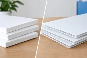
When these categories are clear, it becomes easier to prioritize what must be printed large, what can be mounted on easels, and what should be produced as temporary decals, foam board signs, posters, banners, or rigid displays.
Build the signage plan around decision points
The best event signage planning guide is built around moments where attendees have to make a choice. Where do I go? Where do I check in? Which room is this? Is this line for VIPs or general admission? Where is the next session?
If you identify those decision points early, your signage becomes more useful and more efficient. You do not need a sign on every wall. You need the right sign where people hesitate.
That usually means focusing on entrances, hallway intersections, elevators, escalators, registration areas, room thresholds, and large open spaces where people lose orientation. In some venues, one large overhead-style directional graphic does more work than five small signs placed too late in the path.
Placement is always tied to viewing distance. A schedule board that looks sharp from three feet away may be unreadable from ten. A branded backdrop may photograph well but offer no directional value. Both can be worth producing, but they solve different problems.
Match sign formats to real-world use
Not every sign should be printed the same way. Material choice affects durability, appearance, transport, and installation speed. That is where practical planning saves time.
For short-term indoor events, foam board, mounted posters, and retractable banners are often efficient choices. They present well, move easily, and work for check-in areas, sponsor recognition, and room identification. For high-traffic directional use, larger rigid signs or posters mounted securely may hold up better than lighter pieces that can shift or fall.
For outdoor use, weather matters. Wind, heat, and direct sun can quickly expose weak material choices. Banners may make sense in one setting, while rigid signs are the safer option in another. If a sign will be handled repeatedly during setup and teardown, durability matters as much as appearance.
There is also the issue of portability. Trade show teams and event marketers often need signage that travels well, packs efficiently, and can be replaced quickly if details change. A beautiful oversized piece is not always the right choice if it is difficult to transport, install, or update.
Keep the message short and readable
Event signage is not brochure copy. People read signs while walking, waiting in line, or scanning a crowded room. That changes how the content should be written.
Use short headlines, clear arrows, simple room names, and high-contrast layouts. If attendees need to stop and study the sign, the message is probably doing too much. Prioritize the information that helps them act immediately.
Typography matters here. Thin fonts, low contrast colors, and dense copy can weaken even a strong design. Brand consistency is important, but readability comes first. If your event colors are subtle or your logo palette is low contrast, those elements may need adjustment in wayfinding applications.
This is also where version control matters. Event details change. Room assignments move. Sponsor names are updated. Session times shift. Keeping a single approved signage list helps prevent costly production errors caused by multiple versions circulating between organizers, venues, designers, and print teams.
Create a signage schedule, not just a sign list
A sign list tells you what to print. A signage schedule tells you when decisions must be locked, files approved, and installation completed. That difference matters when your event is on a fixed date and the venue has delivery rules.
Work backward from setup day. Identify final content deadlines, design approval dates, print production windows, and delivery or pickup timing. If some signs depend on late sponsor confirmations or updated agendas, separate those from the signs that can go into production earlier.
This reduces risk. Your core directional package should not be delayed because one sponsor board is still waiting on logos. Breaking the project into phases often keeps the event on track, especially for conventions and multi-room programs.
For rush events, responsive production support can make a major difference. In Las Vegas, where schedules can shift quickly and replacement graphics are sometimes needed with very little notice, working with a local print partner that understands event timelines is often more practical than relying on a distant vendor.
Walk the venue before you print
If possible, do a site walk. Photos and floor plans help, but they do not always show ceiling heights, sightline issues, competing venue signage, or bottlenecks caused by furniture and stanchions.
A quick walk-through often reveals where signs need to be larger, where easels will block traffic, or where natural attendee flow differs from the original plan. It also helps you identify installation constraints. Some venues limit wall mounting, tape types, delivery hours, or placement in public corridors.
If an in-person visit is not possible, ask for detailed venue photos and setup guidelines. That small step can prevent signs from arriving at the right event but the wrong size.
Don’t overlook sponsor and exhibitor visibility
Event signage is often expected to serve two goals at once – operational clarity and branded exposure. That balance takes planning.
Sponsors want visibility, but sponsor graphics should not interfere with navigation. Exhibitors want booth traffic, but oversized promotional signs placed in the wrong spots can create congestion. The best approach is to define dedicated zones for branding, recognition, and promotion while keeping directional messaging clean.
That may mean separating sponsor walls from registration directions or using step-and-repeat graphics for photo moments instead of crowding directional signs with logos. Both objectives matter, but they should not compete on the same surface unless the layout truly supports both.
Plan for updates and backup pieces
Even well-run events change. A speaker cancels. A room assignment moves. Weather affects an entrance. Those changes do not mean the original plan failed. They mean your signage plan needs some flexibility.
Leave room in the schedule and budget for a few update items. This could include reprint-ready room signs, extra directional arrows, blank templates for last-minute inserts, or duplicate registration signage. For multi-day events, backup pieces can save hours of frustration.
This is one reason many organizers prefer working with experienced local providers like Design One Printing when timing is tight. Fast turnaround is not just about speed for its own sake. It gives your team options when event details shift close to show time.
What a strong signage plan looks like
A solid plan is not necessarily a huge one. It is a coordinated one. The signage is easy to read, placed where decisions happen, produced in materials that fit the venue, and scheduled early enough to prevent avoidable rush charges and mistakes.
If your event team can answer three questions clearly, you are in good shape. What does the attendee need to know at each stage? What sign format fits that moment? When does each piece need to be finalized to stay on schedule?
Handle those questions early, and signage stops being an afterthought. It becomes one of the simplest ways to make your event feel organized, professional, and easier to navigate from the first arrival to the final session.
The best sign at any event is the one nobody has to think twice about.