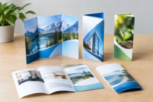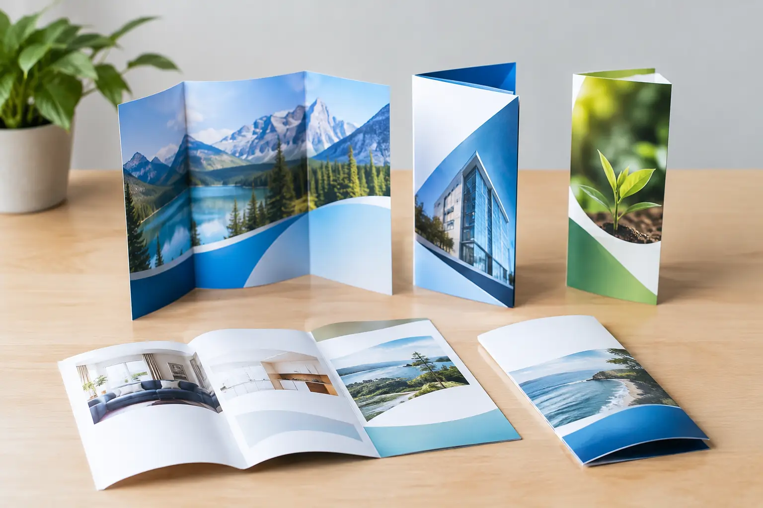
A brochure can look polished on screen and still fail once it is folded. A phone number may disappear into a crease, a product image may split across panels, or the most important call to action may land on the back where few people see it. Choosing among brochure fold options early keeps the design, message, and production schedule working together.
For Las Vegas businesses, exhibitors, and event planners, that decision often comes down to what the piece needs to do in a few seconds. Is it a quick take-home handout from a trade show booth? A restaurant menu? A detailed service guide for a sales meeting? The right fold gives the reader a clear path through the information while helping your finished piece feel intentional and professional.
Start With the Reader’s Next Step
Before selecting a fold, decide what should happen when someone picks up the brochure. A handout for a convention booth may need to introduce your company quickly, show three core services, and direct visitors to a meeting, website, or QR code. A property brochure may need room for photos, amenities, floor plans, and contact details. Those are different jobs, and they call for different panel layouts.
Think about the order in which the brochure will be opened. The front panel should earn attention. Inside panels should explain the offer without forcing the reader to hunt for context. The final panel should make the next step easy, whether that is calling, visiting, registering, ordering, or stopping by your location.
Panel count matters, but usable panel space matters more. A fold creates visual breaks that can organize information well, yet those same breaks can interrupt a large image or a long paragraph. Keep copy concise, use clear headings, and leave enough margin around folds so important content is not crowded.
Common Brochure Fold Options and When to Use Them
Half Fold
A half-fold brochure is one sheet folded once down the center, creating four pages: a front cover, two inside pages, and a back cover. It is clean, familiar, and especially useful when your message needs more room than a flyer but does not require several separate sections.
Use a half fold for event programs, presentation folders inserts, restaurant menus, product sheets, or service overviews with larger photos. Because the inside spread is broad, it works well for a strong hero image, a comparison chart, or a simple story that benefits from uninterrupted space.
The trade-off is limited segmentation. If you have six different services, multiple pricing tiers, and a lengthy company story, a half fold can become crowded. It is best when the message is focused.
Tri-Fold or Letter Fold
The tri-fold is one of the most recognized brochure formats. It divides a sheet into three vertical panels on each side, resulting in six panels total. One outer panel folds inward, and the other closes over it.
This format is a practical choice for service menus, medical and dental information, hospitality materials, promotional offers, neighborhood mailers, and trade show handouts. Readers naturally move from the cover to the inside sequence, making it useful for presenting a problem, solution, proof, and call to action.
A tri-fold requires careful setup. The fold-in panel must be slightly narrower than the other two panels so the brochure closes properly. Avoid placing tiny type, borders, QR codes, or critical details too close to the fold lines. If an inside image must span multiple panels, account for the creases so faces, logos, and product details do not break in awkward places.
Z-Fold
A Z-fold also has six panels, but it opens in an accordion pattern rather than folding inward. Each panel is generally the same width, and the brochure can be opened one section at a time or laid out flat.
Choose a Z-fold when your content follows a sequence. It is effective for timelines, step-by-step processes, schedules, maps, event agendas, product feature progressions, and before-and-after stories. At a convention, a Z-fold can walk prospects through your offering without requiring them to fully open the piece in a crowded aisle.
Unlike a tri-fold, the panels do not nest inside one another. That makes the layout more consistent, but it also means the outer panels need special attention. Decide which panel will serve as the cover based on how the brochure will be stacked, displayed, and handed out.
Gate Fold
A gate-fold brochure has two outer panels that fold inward to meet in the center. Opening those panels reveals a larger inside spread. It feels more premium than a standard tri-fold and creates a natural reveal for a major photo, product launch, venue image, or brand statement.
Gate folds work well for luxury hospitality, real estate, high-end retail, special events, sponsorship packages, and presentations where visual impact is central. The closed front can feature two complementary images or a short message that builds curiosity before the reader opens it.
This format is not the best choice for dense copy or rush designs that have not been planned around the fold. The center meeting point can make alignment more noticeable, and the interior spread needs a strong visual concept to justify the format. When used well, however, it gives a printed piece more presence.
Double Gate Fold
A double gate fold adds another set of folds, creating a compact brochure that opens into a wide display area. It offers several panels for structured content and a large interior reveal.
Consider this option for detailed product launches, maps, large-format event schedules, architectural presentations, or a campaign with a substantial central graphic. It can be memorable, but it costs more to produce and needs more precise artwork than a basic fold. It is most effective when the expanded experience supports the message rather than simply adding complexity.
Roll Fold
In a roll fold, panels fold over one another in the same direction. It creates a layered, page-by-page experience that can work well for instructional materials, product catalogs, service packages, and narratives with a defined order.
Because each panel rolls inward, panel widths must be adjusted for proper closure. This is not a format to build from a standard equal-panel template. Production planning matters, especially if you are ordering on a deadline or incorporating custom sizes.
Accordion Fold
An accordion fold uses multiple alternating folds and can include four, six, eight, or more panels depending on the finished size. It is useful when information needs to expand over a long horizontal layout.
Maps, festival guides, city guides, exhibits, instructional sequences, and multi-stop tours are strong candidates. An accordion fold also gives event organizers a way to present a full schedule while keeping the piece compact enough for a badge holder, purse, or pocket.
More panels bring more opportunities for confusion, so establish a reading order before design begins. Numbered sections, color blocks, and repeated visual cues can help readers follow the content.
Match the Fold to Your Content and Distribution
The way a brochure will be used should influence the fold as much as the amount of content. For a direct mail campaign, a tri-fold can fit standard envelopes and gives recipients an obvious cover panel. For a hotel lobby rack, a tri-fold or Z-fold is easy to display and replenish. For a sales presentation, a gate fold may create a stronger first impression.
At trade shows, compact formats usually perform best. Attendees collect materials from dozens of vendors, so a brochure should be easy to carry and quick to scan. Put your company name, main benefit, and a clear next action on the cover. If the piece includes a QR code, give it breathing room and test it after printing at the final size.
Paper selection changes the experience, too. A glossy stock can make color photography stand out for travel, food, entertainment, and product marketing. A matte finish is often easier to read under bright convention lighting and can feel more refined for professional services. Heavier stock adds durability and perceived value, while lighter stock may be more practical for high-volume mailers or handouts.
Design for the Folds, Not Just the Flat Sheet
A common production mistake is treating a folded brochure like a flat poster. Every fold line is a functional boundary. Keep type, logos, faces, and fine design elements away from those boundaries. Do not use thin borders that must align perfectly across folded panels unless you are prepared for the small production tolerances that naturally occur in printing and folding.
Ask whether each panel can stand on its own. People may see only the front panel in a display rack, only an inside panel after opening it, or only the back panel while someone else is holding it. Each visible section should provide enough context to make sense, even as the full brochure tells a larger story.
If the job is time-sensitive, involve your print partner before finalizing artwork. A quick review can catch panel-width issues, fold placement conflicts, low-resolution images, and finishing details that may affect turnaround. Design One Printing can help businesses move from a rough concept to a production-ready brochure without losing time to preventable revisions.
The best brochure fold is the one that makes your message easier to open, understand, and act on. Choose the format around the reader’s experience, then give the folds the same attention you give the headline and visuals.