A brochure has to earn attention quickly. At a trade show, in a hotel lobby, at a sales meeting, or inside a direct mail piece, people will decide in seconds whether it looks worth keeping. This brochure printing options review covers the choices that affect that decision: size, fold, paper, finish, quantity, and turnaround.
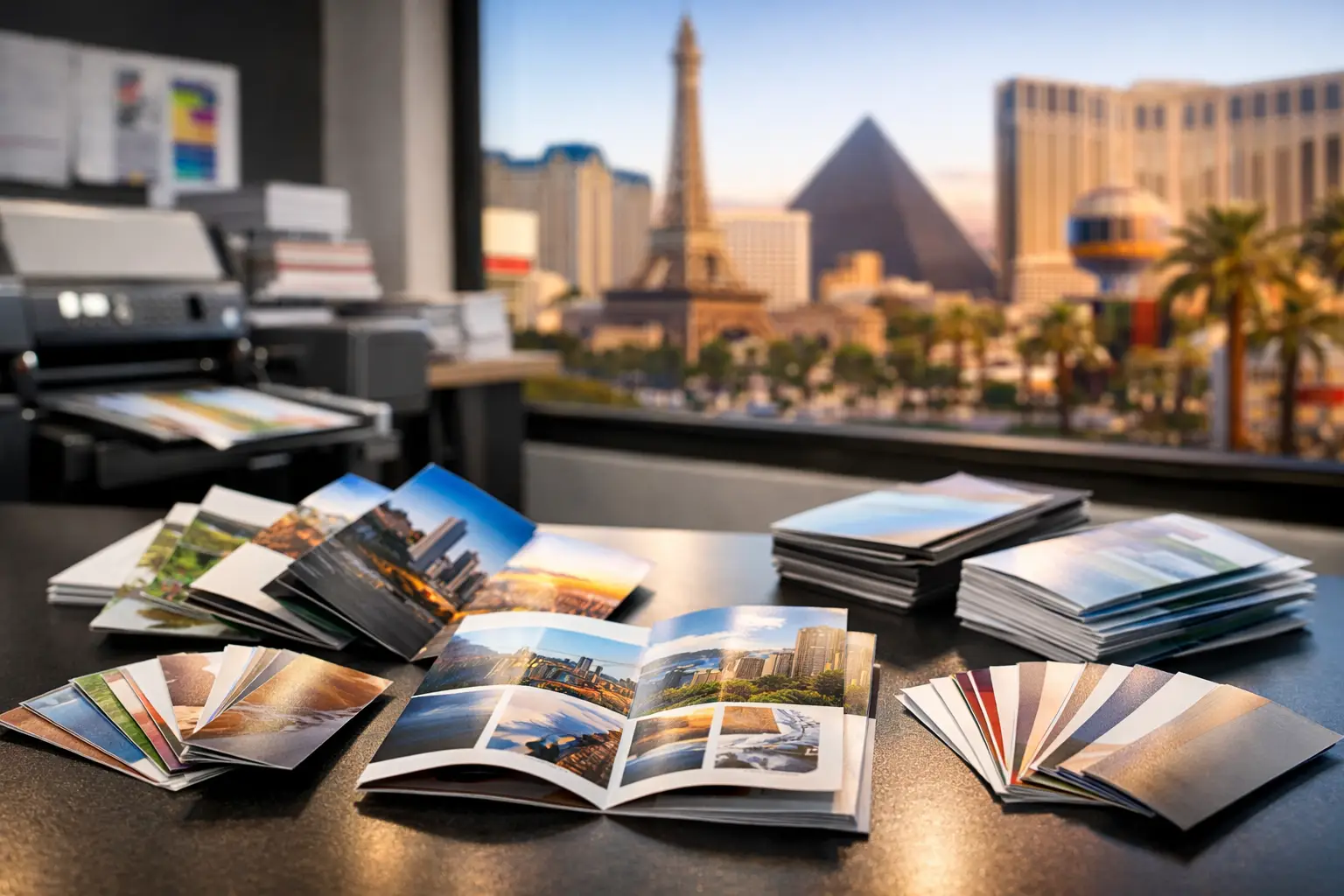
For Las Vegas businesses and exhibitors, the right brochure is not always the most expensive one. It is the piece that fits the message, survives handling, looks consistent with the brand, and arrives before doors open. A product menu, property sheet, event program, and convention handout may all be called brochures, but they need different print specifications.
Start With the Job the Brochure Must Do
Before selecting paper or requesting a quote, decide what happens after someone picks up the piece. Is it meant to introduce your company? Explain a service? Show a floor plan? Hold a menu, rate card, or event schedule? The answer determines how much space you need and how durable the brochure should be.
A compact handout works well when staff members are distributing materials at a booth or networking event. It is easy to carry, inexpensive to replenish, and less likely to be left behind because it will not fit in a bag. A larger folded brochure makes more sense when your audience needs details, photographs, maps, packages, or comparison information before making a decision.
Think about the reading path, not just the page count. A brochure that asks prospects to call, visit, register, or scan a code should place that next step where readers naturally see it. If the piece will be displayed in a rack, the front panel needs a clear headline and recognizable branding. If it will be handed out after a sales conversation, interior panels can carry more detail because the conversation has already created interest.
Brochure Printing Options Review: Size and Fold
Size and fold control both presentation and usability. A standard letter-size sheet folded in thirds is a familiar choice for service menus, medical information, hospitality promotions, and business overviews. It fits standard display racks and envelopes while providing six panels for organized content.
A half-fold brochure creates four larger panels and gives photos, pricing, or feature explanations more room to breathe. It is often a good fit for event programs, restaurant promotions, real estate materials, and company presentations. A gate fold can create a more dramatic opening for premium invitations, product launches, and high-end marketing pieces, but it requires careful panel planning and usually costs more to produce.
Z-folds are useful when information needs to unfold in a sequence. They work well for maps, timelines, process explanations, and multi-step offers. The key trade-off is that a complicated fold can make a piece feel more substantial, but it can also slow production and create layout problems if text or images sit too close to fold lines.
When speed matters, standard sizes and common folds are usually the safest choice. They are easier to proof, print, fold, and replace on short notice. Custom sizes can help a campaign stand out, but they should be selected because they support the message, not simply because they are different.
Choose Paper for Handling, Color, and Budget
Paper is one of the first things a prospect notices, even if they cannot name the stock. A thin, lightweight sheet may be appropriate for high-volume distribution, inserts, or short-term promotions. A heavier stock gives the brochure more presence and is often better for sales collateral, retail counters, and materials that representatives hand directly to prospects.
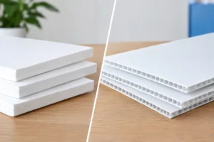
Text-weight paper is flexible and folds cleanly, making it a common choice for tri-fold brochures and pieces with several panels. Cover-weight stock is thicker and more durable. It is better suited to flat cards, simple half-folds, or premium handouts where the feel of the piece matters as much as the information on it.
Finish changes the result further. Gloss paper makes photographs and saturated colors appear more vivid, which can be helpful for food, entertainment, hospitality, travel, and product imagery. Matte stock has a softer, less reflective appearance and is easier to read under bright convention hall lighting. It also tends to feel more understated and professional for consulting, financial, legal, healthcare, and business-to-business materials.
Uncoated paper is a practical choice when people need to write on the brochure. Appointment cards, workshop materials, loyalty offers, and response forms benefit from a surface that accepts pen marks easily. It will not deliver the same visual pop as a glossy coated sheet, so strong design and high-quality images matter even more.
There is no universal winner between gloss, matte, and uncoated stock. The right choice depends on the content, the environment, and whether the brochure is meant to be read, kept, written on, or passed from person to person.
Finishes That Add Value Without Adding Noise
A coating can protect the printed surface and make a brochure feel more polished. Aqueous coating is a common option for brochures that will be handled frequently. It adds a subtle protective layer without making the piece feel overly plastic. UV coating can create a stronger shine and deeper color contrast, especially on image-heavy designs, though it is not ideal for pieces that need to be written on.
Lamination offers the most durability for materials used repeatedly, such as menus, reference sheets, property information, or long-running promotional handouts. It also adds cost and can increase production time. For a one-day event with thousands of giveaways, lamination may be unnecessary. For a brochure that will sit at a concierge desk or be carried by a sales team for months, it may be worthwhile.
Spot gloss, foil, and other specialty effects can highlight a logo, product name, or key visual. Use them selectively. When every element is treated as premium, nothing stands out. Specialty finishes work best when the base design is clean, the audience is targeted, and the campaign can support the additional production time.
Color, Images, and Readability Matter More Than Effects
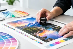
Most business brochures print in full color because even a restrained brand palette benefits from professional color reproduction. The bigger question is whether the design is prepared for print. Low-resolution images, incorrect color settings, tiny type, and crowded panels can turn a good concept into an expensive disappointment.
Use high-resolution photos at their intended print size. Keep important copy, phone numbers, logos, and QR codes away from folds and trim edges. A QR code should be tested from a printed proof or sample, not just on a computer screen. It needs enough contrast and clear space around it to scan reliably in real conditions.
Typography deserves the same attention. A brochure can contain a lot of information without looking crowded, but only if headings, body copy, captions, and calls to action have a clear hierarchy. Avoid shrinking every paragraph to make more content fit. A cleaner message with a direct next step often produces a better response than a brochure that tries to say everything.
Quantity and Turnaround Should Be Planned Together
The lowest unit cost usually comes with a higher quantity, but ordering more is only a savings if the message will remain current. Print fewer brochures when pricing, dates, staff information, promotions, or services may change soon. Order more when the design is evergreen and you distribute materials consistently through sales calls, locations, mailers, or events.
Turnaround affects the available options. Same-day and next-day brochure printing can be the right answer for a missing booth handout, a last-minute conference update, or an unexpected sales opportunity. In those situations, standard stocks, standard folds, and print-ready files help keep production moving. Specialty stocks, custom die cuts, intricate folds, and unusual finishes may require more lead time.
If timing is tight, communicate the deadline at the beginning. Include the quantity, finished size, fold type, paper preference, and whether you need design assistance. That gives the print team the information needed to recommend a realistic path instead of discovering a production issue after the job is already underway.
When Design Support Is Worth It
A polished brochure is more than a logo placed on a template. Panels need to align with folds, images need to support the message, and the cover must work whether it is viewed flat, folded, or in a rack. If your source file was built for social media, a web page, or an office printer, it may need adjustment before commercial production.
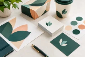
Design support is especially useful when you are preparing for a convention or launch and need several pieces to match: brochures, flyers, business cards, banners, signs, and display graphics. Consistent color, fonts, imagery, and calls to action make a booth or campaign look organized. That consistency also helps visitors recognize your brand after the event.
Design One Printing can help businesses move from a rough idea or existing artwork to a brochure specification that fits the deadline and the intended use. For rush projects, early file review is often the difference between a smooth production schedule and a last-minute compromise.
A brochure should make the next conversation easier. Choose the format your audience can use, the paper they will want to keep, and the turnaround that gives you time to distribute it with confidence.