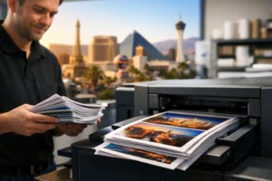

A postcard can look great on screen and still miss the mark once it comes off press. That usually comes down to choices that seem small at first – paper weight, coating, and especially finish. When businesses ask about matte vs glossy postcards, they are usually trying to solve a practical problem: make the piece look professional, get the message noticed, and make sure it fits the way the postcard will be used.
The right finish depends on what the postcard needs to do. A restaurant mailer, a luxury real estate handout, a trade show leave-behind, and an appointment reminder all ask different things from the same format. Finish affects more than appearance. It changes how colors read, how easy text is to scan, whether people can write on the card, and even how the brand feels in someone’s hand.
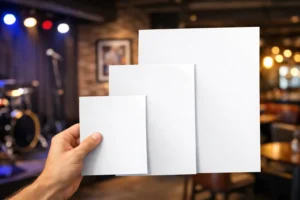
Matte vs glossy postcards: the real difference
Glossy postcards have a coated surface that reflects light. That extra shine tends to make colors appear richer and images look more vibrant. If your design relies on bold photography, saturated brand colors, or a polished retail look, glossy often gives the strongest visual impact at first glance.
Matte postcards have little to no shine. The surface looks flatter and more understated, which can make text easier to read and give the piece a more refined, professional feel. Matte does not compete with the design. It lets the layout, message, and typography do the work.
Neither option is automatically better. The better choice is the one that matches the job.
When glossy postcards make more sense
Glossy is usually the better fit when image quality is doing most of the selling. Hospitality promotions, food photography, tourism offers, product launches, entertainment marketing, and retail promotions often benefit from a glossy finish because the visuals need to grab attention quickly.
In a direct mail stack, glossy postcards can stand out fast. Bright colors feel more energetic, and photos often appear sharper. If your postcard is competing for attention in a crowded environment, that visual punch can help.
Glossy also works well for event marketing. If you are promoting a grand opening, nightclub event, casino-adjacent offer, or convention giveaway, shine can support that high-energy presentation. It signals something promotional and immediate.
That said, glossy has trade-offs. Glare can make smaller text harder to read under strong lighting. It is also not ideal if someone needs to write on the postcard, since many pens and markers can smear or skip on a slick coated surface.
Best use cases for glossy
Glossy postcards are often a strong fit for photo-heavy campaigns, restaurant menu promotions, travel and entertainment offers, retail sales pieces, and promotional handouts meant to catch attention fast. If the postcard is acting like a mini billboard, glossy usually helps.
When matte postcards are the better business choice
Matte postcards are often the smarter choice when clarity, sophistication, and usability matter more than shine. If your postcard includes a lot of copy, contact details, appointment information, or a response area, matte gives you a cleaner reading experience.
Many professional service brands prefer matte because it feels more controlled and less flashy. Law firms, medical offices, consultants, B2B companies, real estate professionals, financial services, and corporate event teams often lean matte for that reason. It presents the message with confidence without overplaying the design.
Matte is also more practical when recipients need to write on the postcard. That matters for appointment cards, quote follow-ups, thank-you cards, reminder mailers, or leave-behinds with note space. If your sales team plans to handwrite a message or your staff needs to add details quickly, matte is easier to work with.
Under bright overhead lights, matte usually stays more readable because there is less glare. At trade shows and networking events, where people glance at materials under uneven lighting, that can matter more than expected.
Best use cases for matte
Matte postcards are often the right fit for appointment reminders, professional service mailers, real estate announcements, informational postcards, handwritten follow-ups, and event materials where clean brand presentation matters more than high shine.
How finish affects color, photos, and brand feel
This is where many postcard decisions are won or lost. Glossy tends to make colors feel deeper and more reflective. Blues, reds, and blacks can appear more dramatic. Photography often looks more vivid, which is why glossy is so common in promotional print.
Matte softens the presentation. Colors still print well, but they tend to look more natural and less reflective. For brands that want a premium, modern, or understated look, that can be an advantage. Matte often feels more intentional, especially when the design uses white space, elegant typography, or muted color palettes.
If your brand is built around energy and visual excitement, glossy may support that better. If your brand needs to communicate trust, professionalism, or a more upscale tone, matte may be the stronger option.
This is not just about preference. It is about alignment. A flashy finish on a conservative brand can feel off. A subdued finish on a high-impact promotional piece can undersell it.
Readability matters more than many buyers expect
A postcard has limited space. Every line has to earn its place. That makes readability a bigger factor than it would be on a larger brochure or sales sheet.
If your postcard includes a headline, short offer, and one strong image, glossy can work well because there is not much text competing with the finish. But if you are trying to fit service details, dates, directions, disclaimers, or multiple calls to action, matte often gives the cleaner result.
Light reflection can reduce legibility, especially with smaller fonts or lighter color text. Matte helps avoid that issue. For business postcards where the message has to be absorbed quickly, easy reading is not a minor detail. It directly affects response.
Durability and handling
Both matte and glossy postcards can be produced on sturdy card stock, so the main difference is less about thickness and more about surface behavior. Glossy coatings can help resist fingerprints and surface wear, which is useful for mailers and handouts that will be handled often.
Matte is still durable, but it may show scuffs differently depending on the stock and coating. On the other hand, matte often feels less slippery and easier to sort, stack, and write on during fast-paced event prep.
If your postcards are going into direct mail, handed out at a booth, placed on counters, or inserted into welcome packets, think about how they will move from your team to the recipient. Practical handling matters just as much as appearance.
Matte vs glossy postcards for direct mail and events
For direct mail, glossy can improve visual impact right away. If the recipient only gives the piece a second or two, a bright image and reflective finish may help secure that first look. This is especially useful for consumer offers, local promotions, and seasonal campaigns.
For business events and trade shows, matte often performs well because it feels easier to review and keep. Attendees collect a lot of materials. A postcard that is easy to read, easy to write on, and easy to tuck into a folder can be more useful than one that simply shines more.
In Las Vegas, where events move fast and deadlines get tight, practical choices usually win. If your postcard is part of a larger rush project with brochures, flyers, signs, or booth materials, finish should support the overall job, not complicate it.
How to choose the right postcard finish
Start with the purpose. If the postcard’s main job is to show off visuals and attract quick attention, glossy is often the right call. If the main job is to communicate information clearly or support a more professional tone, matte usually makes more sense.
Then look at the design itself. Heavy photography, bright promotional colors, and short copy often point toward glossy. Text-heavy layouts, elegant branding, and handwritten use usually point toward matte.
Finally, consider the audience and setting. A consumer mailer for a restaurant promotion behaves differently than a B2B handout at a convention. The finish should match the way people will actually interact with the piece.
If you are unsure, ask for guidance before the job goes to press. At Design One Printing, that conversation usually starts with how the postcard will be used, how fast it is needed, and what kind of impression it should leave.
A good postcard finish does not call attention to itself for the wrong reasons. It supports the message, fits the brand, and helps the piece do its job the moment it lands in someone’s hand.