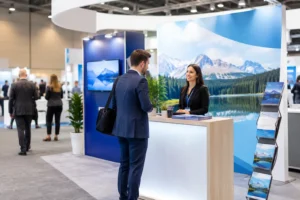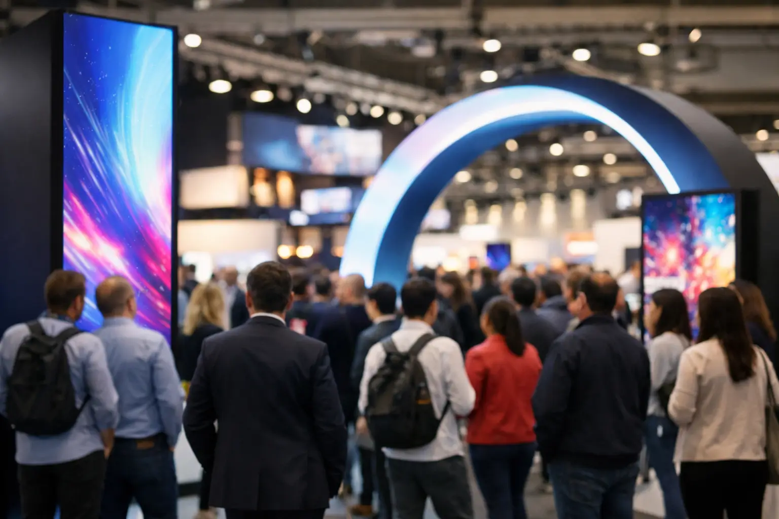
A busy convention floor gives exhibitors only a few seconds to earn a second look. The most effective trade show signage trends are not about adding more graphics to a booth. They are about making the right message visible from the aisle, understandable at a glance, and easy for visitors to act on.
For Las Vegas exhibitors, that standard is even higher. Large shows move fast, booth spaces compete closely, and last-minute changes are common. Signage needs to look polished under venue lighting, travel well, fit the booth plan, and be available when the show schedule leaves little room for error.
Trade Show Signage Trends Built for Faster Decisions
The strongest visual trend is clarity. Exhibitors are moving away from crowded signs that attempt to explain every product, service, and company credential at once. Instead, they are using one clear headline, a focused visual, and a next step that a visitor can understand while walking past.
This does not mean every booth should look minimal. A detailed technical product may require supporting information, diagrams, or comparison charts. The difference is hierarchy. The primary message should work from 10 to 20 feet away. Supporting details should become visible only after someone steps closer.
High-Contrast Graphics With Fewer Words
Large type, confident color contrast, and clean spacing are replacing dense blocks of copy. A well-designed retractable banner or back wall should answer a basic question quickly: What do you offer, and why should a visitor care?
Use a short benefit-led headline rather than a generic company statement. For example, “Reduce Installation Time” is more useful on a booth wall than “Innovative Solutions for Modern Businesses.” Add a product image, customer outcome, or visual proof point, then reserve finer details for brochures, sales conversations, or a display screen.
High contrast matters in convention centers, where lighting can vary by hall and booth location. Dark text on a light background or light text on a dark background usually reads better from a distance than subtle tone-on-tone treatments. Brand colors still matter, but readability should lead the decision.
Modular Displays That Adapt to Different Shows
Exhibitors are investing in signage systems that can be reused across multiple events. Fabric backdrops, pop-up displays, interchangeable graphic panels, and coordinated banner stands make it easier to scale a booth up or down without starting over for every show.
A modular approach can reduce long-term costs, but it requires planning. Keep evergreen brand messaging on the most reusable pieces, such as a main backdrop or counter wrap. Use replaceable panels, posters, tabletop signs, and smaller banners for show-specific promotions, new product launches, or event-only offers.
This approach is especially practical for businesses that exhibit at both major Las Vegas conventions and smaller regional events. The same core display can work in a 10-by-10 booth, then expand with side banners and floor graphics for a larger footprint.
Branded Environments, Not Just Back Walls
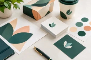
A booth no longer begins and ends at the back wall. Floor decals, counter wraps, window clings, directional signs, product pedestal graphics, and hanging elements can create a more complete brand environment.
The goal is not to print every available surface. Too many competing elements can make a small booth feel cramped. Instead, choose the surfaces that help direct attention. A branded floor graphic can lead visitors toward a product demonstration. A counter wrap can reinforce the campaign message after someone enters the space. A tall banner placed at an open aisle corner can improve visibility before visitors reach the booth.
Digital Touchpoints Still Need Printed Signage
QR codes remain useful, but only when they lead to something worth scanning. A code that opens a general homepage creates friction. A code that delivers a show offer, product demo, appointment form, downloadable catalog, or giveaway entry gives visitors a reason to use it.
Printed signage gives the QR code context. Include a brief instruction such as “Scan for a 2-minute demo” or “Scan to schedule a post-show quote.” Place the code where it can be scanned without blocking traffic, and leave enough clear space around it for phone cameras to recognize it quickly.
Digital screens are also showing up in more booths, especially for product loops, testimonials, and demonstrations. They can add movement and help explain complex services, but they are not a substitute for printed messaging. Screens require power, setup time, and content that looks good in a bright, active environment. If a screen fails or a video is hard to hear, the printed backdrop still needs to communicate the value of the booth.
Use Signage to Support the Sales Conversation
The best booth graphics help staff start better conversations. A product comparison board can guide visitors to the right option. A timeline graphic can explain a service process. A simple “Choose Your Goal” sign can help sales teams identify whether someone is looking for speed, cost savings, compliance, customization, or another outcome.
This is where signage design becomes a sales tool rather than decoration. If staff repeatedly answer the same introductory question, that answer may belong on a sign. If visitors struggle to understand the difference between two offerings, a clear side-by-side graphic may save valuable time during a crowded show.
Materials and Finishes That Match the Job
Fabric displays continue to be popular because they create a clean, modern look with reduced glare. They are often a strong choice for large backdrops and photo-ready environments. Vinyl banners remain a practical option for durability, strong color, and quick production, especially for oversized graphics, outdoor use, or temporary event signage.
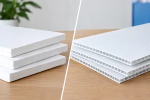
Rigid signs have their place as well. Foam board, PVC, acrylic, and other mounted materials can work well for easel signs, wayfinding, product features, pricing, or tabletop displays. The right choice depends on where the sign will be used, how long it needs to last, and how it will travel.
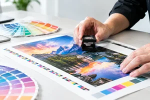
Finish choices should be functional, not just decorative. Matte finishes can reduce reflections under intense hall lighting. Gloss can make colors appear more vivid but may create glare in the wrong setting. Lamination can improve durability for signs that will be handled frequently or used across multiple events. A production partner can help match the material and finish to the venue, display hardware, and deadline.
Plan for the Last-Minute Reality of Trade Shows
Even well-organized exhibitors face changes. A product launch shifts, a sponsor logo is updated, a shipment is delayed, or a booth layout changes after move-in. That is why current trade show signage trends also favor flexible, fast-replace pieces over one large, permanent graphic carrying every detail.
Keep editable design files organized and confirm final dimensions before production. If a sign is going into an existing display frame or banner stand, use the exact template and account for bleed, safe areas, and any hardware that may cover part of the image. A beautiful file can still fail if the headline lands in a seam or the logo disappears behind a counter.
For rush situations, prioritize what visitors must see first: the primary booth message, directional signs, key product graphics, and an actionable call to action. Supporting pieces can follow if time allows. Design One Printing works with exhibitors who need that practical production mindset, including fast-turnaround banners, posters, signs, backdrops, and booth graphics near the Las Vegas convention corridor.
Before sending a file to print, view it at full size whenever possible. Check headline readability, logo placement, QR code size, image resolution, and color contrast. It is much easier to adjust a proof than to replace a sign after exhibit hall doors open.
A trade show booth does not need the most graphics on the floor to get noticed. It needs signage that makes the right promise, points visitors toward a clear next step, and arrives ready for show day. Start with the message your best prospect should see from the aisle, then build every printed piece around that moment.