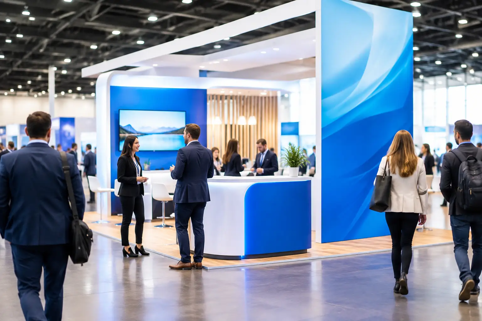
The first few seconds outside your booth decide whether an attendee keeps walking or stops to learn more. Strong convention signage results come from more than printing a logo on a banner. Your graphics need to be visible in a crowded hall, understood at a distance, and built to support a clear business goal.
For Las Vegas exhibitors, that pressure is real. A booth may be surrounded by hundreds of competing brands, bright displays, aisle traffic, and attendees moving quickly toward meetings or sessions. The right signs help your team start more qualified conversations. The wrong ones become expensive background scenery.
What Good Convention Signage Results Look Like
Results should be measured by what the signage helps your business accomplish, not simply whether it looks attractive. For one exhibitor, success may mean increasing walk-up traffic. For another, it may mean making a product category easier to understand, directing visitors to a demo, or reinforcing a brand that prospects have seen online.
Well-planned convention signs should make three things clear quickly: who you are, what you offer, and why someone should stop. That does not require filling every inch with information. In fact, crowded graphics often perform poorly because attendees cannot process them while walking past.
A large-format backdrop with one strong value statement can do more work than a detailed panel of product copy. A retractable banner near the aisle can identify the problem you solve before a staff member says a word. Counter cards, posters, and directional signs can then provide the next layer of information for people who have already paused.
The goal is not to make every sign say everything. It is to give each piece a job.
Start With the Attendee’s Viewing Distance
Signage that reads well from two feet away may fail completely from the aisle. Before choosing sizes, think about where each piece will sit and when attendees need to read it.
Your highest-priority message belongs on the most visible graphics, typically a backwall, hanging sign, or large banner. It should remain legible from across the aisle. Use a short headline, strong contrast, and type large enough to read at a glance. Product details, specifications, and calls to action can appear closer to the booth where visitors have time to engage.
This is where many convention displays lose effectiveness. Teams often approve artwork while viewing it on a laptop screen, where every line seems readable. Once installed at full scale, the text can be too small, the color contrast too weak, or the message too dense.
A practical approach is to separate your graphics by viewing distance. Large backdrops should carry your brand and central benefit. Mid-range signs can feature product categories, applications, or a demonstration schedule. Close-range pieces can include QR codes, contact information, pricing, or technical details.
Keep the Main Message Short
A convention floor is not the place for a paragraph-length mission statement. Attendees should be able to understand your main promise in a few seconds.
Instead of listing every service, lead with the outcome your customer cares about. A logistics company might focus on faster fulfillment. A software provider might emphasize fewer manual tasks. A hospitality supplier might highlight better guest experiences. Supporting copy can explain how you deliver that result after the headline has earned attention.
If your team cannot describe the booth’s main message in one sentence, the signage is likely trying to do too much.
Match the Sign Type to the Job
Not every convention need requires a custom-built exhibit. The right mix depends on your booth size, setup rules, travel needs, budget, and whether you will use the materials again at future events.
Retractable banners are a practical choice for aisle-facing messaging, product highlights, and meeting areas. They travel well, set up quickly, and work especially well when each banner has a focused message. Vinyl banners offer flexible sizing for booth walls, sponsorship areas, and temporary displays. Mounted signs and foam board graphics can add structure to product displays, registration points, and presentations.
For larger spaces, fabric backdrops, step-and-repeat walls, floor graphics, window graphics, and custom wide-format panels may create a more finished environment. They can make a standard booth feel more intentional, but they also require careful measurement and coordination with the event’s installation rules.
The trade-off is simple: reusable, portable pieces can reduce future event costs, while custom large-format graphics can create greater visual impact for a major show. A good production partner will help you decide where a premium display matters and where a practical banner is the smarter choice.
Design for the Convention Floor, Not the Office
Brand consistency matters, but a convention environment places different demands on a design than a brochure or website. Fine lines, light text, subtle gradients, and low-contrast color combinations may look polished on screen but disappear under exhibit hall lighting.
Use high-resolution images sized for final output. Avoid pulling small web images into a large backdrop file. Pixelation is highly visible on wide-format graphics and can make an otherwise professional booth look unprepared.
Color also deserves attention. If a specific brand color is essential, communicate that early in the production process. Material, ink, lighting, and finish can affect how a color appears. For most exhibitors, high contrast and clear hierarchy will make a bigger impact than trying to reproduce every subtle color variation from a digital brand guide.
Your logo should be prominent, but it should not be the only thing people see. Pair it with a clear statement of value. A recognizable logo helps returning customers find you; a benefit-led message gives new prospects a reason to approach.
Build a Signage Plan Around Traffic Flow
The strongest convention signage results often come from placement, not additional print pieces. Consider where people enter the booth, where they naturally stop, and where your staff will begin conversations.
Place your primary message toward the aisle rather than deep inside the space. Use secondary graphics to guide visitors toward a demo station, consultation table, product display, or lead-capture area. If you have multiple offerings, organize them so attendees can identify the category most relevant to them without asking for directions.
Directional signs are especially valuable for larger booths, sponsored areas, and multi-part demonstrations. They reduce confusion and keep staff focused on conversations instead of repeatedly explaining where visitors should go.
Do not overlook practical signage either. Meeting schedules, pickup instructions, giveaway rules, product availability, and scan-to-register prompts can prevent friction during a busy show. These materials may not be the visual centerpiece, but they improve the attendee experience and make your booth easier to operate.
Plan for Production and Last-Minute Changes
Convention timelines are rarely as orderly as anyone hopes. A product launch shifts, a sponsor logo changes, a shipping delay creates a gap in the display, or an exhibitor discovers a damaged banner after arriving in Las Vegas. Fast production matters, but it works best when the print files, sizes, and priorities are clear.
Before submitting artwork, confirm the finished size, bleed requirements, material, finishing, and installation method. A banner that needs grommets has different production requirements than a poster going into a frame. A floor graphic needs a material designed for foot traffic. A sign intended for an easel needs rigidity that a lightweight paper poster cannot provide.
For rush orders, prioritize the pieces attendees will see first. If time is limited, a clear backwall, two well-designed banners, and essential counter signage will usually create more impact than a collection of smaller pieces with mixed messages.
Design One Printing helps exhibitors and event teams produce convention graphics quickly while keeping the details of size, materials, finishing, and presentation in view. That local support can be especially useful when an on-site change cannot wait for a shipment.
A Pre-Print Convention Signage Check
Before files go into production, review four essentials:
- Is the main message readable from the aisle?
- Does each sign have one clear purpose?
- Are logos, QR codes, and key text positioned away from trim edges and hardware?
- Have you confirmed the event’s booth dimensions, sign restrictions, and installation rules?
These checks take minutes and can prevent costly reprints or a display that does not fit the assigned space.
Turn Attention Into a Next Step
A sign that draws a crowd is useful. A sign that gives visitors a reason to continue the conversation is better. Include a clear next step that matches your event objective, whether that is watching a demo, scheduling a meeting, scanning for a resource, requesting a quote, or speaking with a specialist.
QR codes can be effective, but only when they lead to something worthwhile and are large enough to scan quickly. Pair them with a direct reason to scan, such as accessing a show offer, product guide, appointment calendar, or giveaway entry. A code by itself is not a call to action.
After the event, evaluate which messages generated the most questions, where people stopped, and which display pieces your staff found most useful. Those observations are often more actionable than a general impression that the booth looked good.
When your opening time is fixed and the exhibit hall is full of competitors, clear, professionally produced signs give your team a better starting point. Plan the message first, print the right pieces for the space, and leave enough time to make every graphic earn its place on the floor.