
If your flyer has three seconds to do its job, every design choice has to earn its place. That is the real challenge in how to design event flyers: you are not just making something look good, you are building a fast, clear piece of marketing that has to stop people, deliver key details, and hold up in print.
For event organizers, exhibitors, restaurants, retailers, and local businesses in Las Vegas, that pressure is even higher. Timelines are tight, venues are busy, and people are surrounded by promotions. A flyer that feels cluttered, hard to read, or off-brand gets ignored. A flyer that is sharp, direct, and built for print gives people a reason to show up.
How to design event flyers with a clear goal
Before choosing colors, fonts, or images, decide what the flyer needs to accomplish. That sounds obvious, but many flyer problems start here. A design gets overloaded because the goal was never narrow enough.
Some flyers are meant to drive foot traffic to a grand opening. Others promote a nightclub event, a nonprofit fundraiser, a convention giveaway, or a limited-time in-store promotion. Those are not the same job, and they should not be designed the same way.
If the flyer is posted in a lobby or handed out near a venue, the message needs to be readable almost instantly. If it is included in a welcome bag or left at a counter, people may give it a few more seconds. That difference affects how much copy you can use and how aggressively you need to simplify the layout.
A good working question is this: what should someone do after reading it? Attend, scan, call, register, visit, or remember the brand. Once that action is clear, the rest of the design decisions get easier.
Start with the information hierarchy
The strongest event flyers are easy to scan because the information is prioritized. Most people will not read top to bottom. They will glance, pick out a few visual cues, and decide whether the flyer is worth more attention.
That means your headline should carry the event hook, not just the company name. The event name, offer, or main attraction usually deserves the biggest placement. After that, the next level is the practical information: date, time, location, and any registration detail. Supporting text comes after.
Too many flyers give equal visual weight to everything. When every block is bold, nothing stands out. When every line is large, the eye has nowhere to land.
A simple hierarchy often works best. Lead with the main event message. Follow with the when and where. Add one short section that explains why it matters. Then include a clear call to action.
What absolutely needs to be on the flyer
At minimum, most event flyers should include the event name or headline, date, time, location, brand identity, and a next step. Depending on the event, you may also need ticket details, sponsor logos, dress code, featured guests, parking notes, or a QR code.
The trade-off is space. Every added element competes with readability. If a detail is not essential to attendance or response, it may belong somewhere else.
Design for attention first, then for detail
A flyer has to win the first glance before it can explain anything. That is why the visual focal point matters so much.
In some cases, the focal point is a strong event title with bold typography. In others, it is a high-quality image that captures the tone of the event. A corporate networking mixer might rely more on clean type and brand colors. A live entertainment event may need a more dramatic visual. A community fundraiser might benefit from warmth and approachability over visual intensity.
This is where context matters. If your flyer will be posted among many others, contrast is your friend. If it will be handed out in a professional setting, too much visual noise can work against you. The right design is not always the loudest one. It is the one that reads fastest for the audience you are trying to reach.
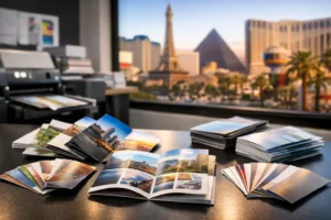
Choose images that support the message
Low-resolution photos and generic stock art can make even a well-planned flyer feel rushed. If you use imagery, it should look intentional and print clearly at size.
Busy backgrounds often create problems because text becomes harder to read. If the image is the star, use overlays or solid text panels so the details stay legible. If the image does not add meaning, skip it and let typography do the work.
Typography is where many flyers fail
If you want to know how to design event flyers that perform better, start by tightening the typography. This is one of the most common weak points in event marketing materials.
Use fonts with a purpose. A headline font can carry personality, but the body text still needs to be easy to read. In most cases, two fonts are enough. One for emphasis, one for clarity. More than that can make the flyer feel disorganized.
Size matters just as much as style. The date and location should never be buried in tiny text. If people have to search for the practical details, the flyer is not working hard enough.
Spacing also does heavy lifting. A flyer with decent margins, clear separation between sections, and room around the headline feels more professional immediately. Crowding every inch of space does not make a flyer more informative. It makes it harder to use.
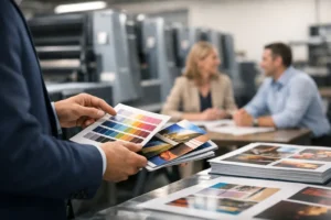
Use color to reinforce the event, not distract from it
Color should guide attention and support brand recognition. It should not create confusion.
A strong flyer often relies on a limited palette. One or two main colors, one supporting neutral, and a clear contrast between text and background is usually enough. If your event already has branded colors, use them consistently. If not, choose colors that match the tone of the event and print reliably.
Some digital designs look great on screen but lose impact in print. Neon tones, low-contrast combinations, and fine color transitions can be unpredictable depending on paper stock and production method. That does not mean avoid bold color. It means design with the final printed piece in mind.
Build for print from the beginning
This is where business owners and event organizers can save time and avoid rework. A flyer is not finished when it looks good in a design file. It is finished when it prints cleanly, trims correctly, and still reads well in someone’s hand.
Start with the actual size you plan to print. A standard flyer size may be perfect for handouts, while a larger format may work better for posting in stores, hotel areas, or event spaces. Paper choice matters too. A glossy stock can make colors pop, while an uncoated stock may feel more approachable for community or local outreach.
Resolution is another practical issue. Blurry logos, pixelated photos, and thin lines become obvious in print. So do alignment mistakes. A flyer that seemed acceptable on a laptop screen can look much less polished once produced at quantity.
If the deadline is tight, simplify before sending the file. Clean layouts usually move through production with fewer problems than overly layered, heavily detailed designs.
Keep the call to action obvious
A surprising number of event flyers explain the event but never clearly tell the reader what to do next. That is a missed opportunity.
Your call to action should be direct and easy to spot. Register now, visit today, scan to RSVP, call for tickets, or stop by booth 214 all work because they are specific. Vague phrases do not create urgency.
If you use a QR code, give it breathing room and make sure it leads to the right place. Test it before printing. Also remember that not every audience will scan immediately, so the flyer should still include the key details in plain view.
Match the flyer to where it will be used
Placement affects design more than many people realize. A flyer taped to a community board needs a stronger headline and fewer words than one handed directly to a prospect. A trade show flyer may need to support a larger booth campaign, using the same colors, message, and offer as your banners or table graphics.
For local promotions, neighborhood handouts and countertop flyers often benefit from a clean, high-contrast approach. For convention marketing, speed and professionalism matter most. Attendees are moving fast, so the flyer has to communicate even faster.
This is also where turnaround becomes part of the design strategy. If an event changes, a sponsor is added, or a venue detail shifts, you need a file setup and print partner that can respond quickly without compromising quality. That is a practical part of flyer design, not a separate issue.
Know when to get design help
There is nothing wrong with using templates for a starting point, especially under time pressure. But templates often create familiar problems: too much text, weak hierarchy, and a design that looks generic once printed.
If the event matters to revenue, turnout, or brand reputation, professional design support can save time and improve results. That is especially true when the flyer needs to coordinate with posters, signage, direct mail pieces, or trade show materials.
Design One Printing works with businesses and event teams that often need exactly that kind of fast, production-ready support, particularly when deadlines are short and the printed piece needs to look polished the first time.
The best event flyer is not the one with the most effects or the busiest layout. It is the one that makes someone understand the offer fast, trust the brand, and take the next step without hesitation.