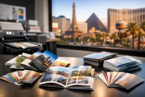

A standard business card can share your contact details. A well-finished card can do a second job at the same time – signal quality before a word is spoken. That is why a premium business card finishes review matters for businesses that sell face-to-face, attend events, or need to look polished in a crowded room.
In Las Vegas, that decision often happens fast. You might be walking into a trade show, meeting venue partners, or handing cards out during a packed networking event where everyone is competing for attention. The finish you choose affects how your card feels in the hand, how your logo catches the light, and whether the piece looks refined or overdone.
Premium business card finishes review: what actually changes
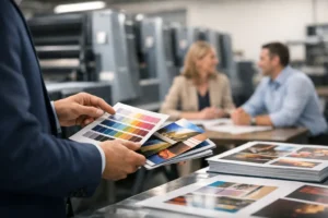
When people ask about premium finishes, they are usually asking one practical question: which upgrade makes the strongest impression for the money? The answer depends on your brand, your artwork, and how the card will be used.
Some finishes change texture. Some change reflectivity. Some add thickness or edge detail. A few look excellent in a sample pack but are less useful in the field, especially if cards will be written on, stacked, or handled heavily at conventions. Premium does not always mean better. It means more specific.
The best place to start is with the effect you want. If you want understated luxury, soft-touch lamination or a thick stock with painted edges may fit. If you want immediate visual impact, foil or spot UV usually gets attention faster. If you want durability first, laminated cards tend to hold up better than uncoated options.
Soft-touch lamination
Soft-touch is one of the most popular upgrades for a reason. It gives the card a smooth, almost velvety surface that feels noticeably different from standard coated stock. For consultants, real estate professionals, hospitality brands, and creative service firms, it can make a card feel more expensive without looking loud.
The main advantage is tactile. People often notice the feel before they notice the design details. That makes it effective in one-to-one networking, client meetings, and sales conversations where the card is handed directly to someone.
The trade-off is that soft-touch tends to mute some of the natural brightness of printed color. It also is not ideal if you need to write notes on the card. If your design relies on vivid shine or a very glossy look, this may not be the right fit.
Spot UV
Spot UV adds a high-gloss coating to selected areas, usually a logo, pattern, or headline, while the rest of the card stays matte. Done well, it creates contrast and gives the design a sharper, more dimensional look.
This finish works best when the artwork is simple enough to let the contrast stand out. A bold logo on a dark matte background is a classic example. It is especially effective for industries that want a sleek, modern look, such as tech, nightlife, luxury services, and premium retail.
The limitation is restraint. Too much spot UV can make a card look busy. Fine details also need careful setup to reproduce cleanly. On a rushed project, the file has to be prepared correctly or the effect can miss the mark.
Foil stamping
Foil is built for attention. Metallic gold, silver, rose gold, and other foil colors reflect light in a way standard ink cannot. If you want your logo or brand name to stand out instantly, foil does that job well.
This is a strong choice for upscale brands, event professionals, beauty services, attorneys, and businesses where first impressions carry weight. It can make a simple layout feel elevated very quickly.
That said, foil works best with clean design. Small type and overly detailed graphics can lose clarity. It also tends to push the card into a more formal visual category. If your brand is casual, approachable, or heavily color-driven, foil may feel too polished unless it is used sparingly.
Painted edges and colored seams
Painted edges add color to the side of a thicker card stock, creating a distinct profile when the card is viewed from the edge. This finish is subtle from a distance but memorable up close. It is one of the best options for businesses that want a refined custom look without relying on gloss or metallic effects.
The strongest use case is branding. If your company has a signature color, matching that tone on the edge can make the card feel intentional and custom-built. It also pairs well with minimalist layouts.
The catch is that edge treatments usually require thicker stock to look right. If budget or speed is the top priority, this may not be the first upgrade to choose. It is more about presentation than utility.
Extra-thick stock
Sometimes the finish is not a coating at all. A heavier card stock changes the perceived value of the piece as soon as someone picks it up. Thicker cards feel more substantial, resist bending better, and often support other premium finishes well.
For professionals who want a serious, established look, this can be the safest premium upgrade. It does not depend on trendy visual effects. It simply feels solid.
The downside is practical. Very thick cards can be less convenient in wallets or badge holders, and they may cost more to produce and ship. Still, if you want a premium result that remains versatile across industries, thickness is one of the strongest upgrades available.
Gloss and high-shine finishes
Gloss finishes can make colors pop and photos appear more vibrant. For entertainment, food, nightlife, and consumer-facing promotional cards, that can be a strong advantage. If your card design is image-heavy or uses saturated brand colors, gloss often helps those elements stand out.
The concern is balance. High shine can sometimes read as promotional instead of premium, depending on the design. It also shows fingerprints more easily than matte finishes. If your goal is polished and professional rather than bright and energetic, matte or soft-touch may be a better choice.
How to choose the right finish for the way you actually use cards
A premium business card finishes review is only useful if it connects finishes to real business conditions. A card handed out at a luxury client meeting has a different job than one being distributed rapidly from a booth at a convention hall.
If you attend trade shows, durability matters more than many people expect. Cards get handled, packed, unpacked, and passed around quickly. Laminated finishes, heavier stocks, and simpler premium effects usually perform better than delicate designs that only look good in controlled conditions.
If you rely on referral networking, tactile finishes can carry more weight. A soft-touch card or thick stock leaves a physical impression that helps people remember the interaction. In those cases, feel may matter as much as shine.
If brand image is tightly managed, consistency matters most. Your card should match the rest of your print materials, signage, and booth graphics. A high-end finish can look disconnected if the rest of the brand system uses a different tone.
What tends to work best by business type
Professional services often benefit from soft-touch, thick stock, or subtle foil. These choices communicate polish without feeling flashy. Hospitality, entertainment, and luxury brands can often support bolder effects like metallic foil, gloss accents, or painted edges because the environment already leans visual.
For exhibitors and event vendors, the safest high-impact approach is usually a durable stock with one premium enhancement instead of three. That keeps the design clean, protects legibility, and avoids production complexity on tight timelines.
For startups and creative brands, spot UV can be especially effective if the logo and layout are minimal. It feels current, sharp, and intentional when used with restraint.
The real trade-off: speed, cost, and complexity
Premium finishes can elevate a card, but they also add production variables. Specialty coatings, foil applications, and edge painting usually require more precise file setup and may affect turnaround. If you need cards fast for an event, that should be part of the decision from the start.
This is where working with an experienced print partner matters. A finish that looks excellent on screen may not be the best fit for your deadline, your artwork, or your budget. In many cases, a well-printed card on quality stock with one smart finish will outperform a more complicated card that tries to do everything.
At Design One Printing, that practical approach matters because many orders come with real deadlines attached – meetings, conventions, pop-up events, and last-minute networking needs. The right finish is not just about appearance. It is about getting a professional result that is realistic for the timeline.
If you are choosing between options, start with the brand impression you want to leave after the handshake. Then pick the finish that supports that impression clearly, not the one with the most effects. The best business card is the one people keep.