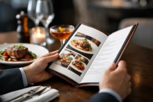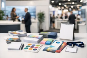

A blank front window is wasted selling space. If your storefront has foot traffic, parked traffic, or even a steady stream of people passing between nearby businesses, your glass should be doing more than letting light in. Well-planned window graphics for storefronts can promote offers, reinforce your brand, create privacy where needed, and make the business look established before a customer ever reaches the door.
For retail shops, restaurants, salons, offices, and pop-up spaces, storefront windows often have to do several jobs at once. They need to catch attention, stay readable from a distance, and still feel consistent with the brand inside. That is why the best results usually come from thinking beyond a logo sticker on the door. A storefront window can work as signage, advertising, wayfinding, and design all at the same time.
What window graphics for storefronts actually need to do
A good storefront graphic is not just decorative. It should support a business goal. Sometimes that goal is direct and immediate, like promoting a sale, announcing an opening date, or highlighting a seasonal item. Other times it is more foundational, such as helping a new location look finished and credible from day one.
This is where many businesses make the wrong call. They focus on filling glass instead of communicating clearly. A crowded window with too much text, too many colors, or several competing messages can be less effective than a simple layout with one strong offer and a clean brand presentation.
Start with the basic question: what should someone understand in three seconds? If the answer is not clear, the graphic probably needs to be simplified. Most people are seeing your storefront in motion, from a car, across a parking lot, or while walking by with their attention split. Clarity matters more than quantity.
Choosing the right type of storefront window graphic
Different materials solve different problems. The right choice depends on visibility, privacy, budget, and how long the message needs to stay up.
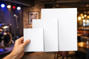
Full-color vinyl graphics are often the best fit when you want a bold visual impact. They are useful for large promotions, branded imagery, food photography, beauty visuals, or a strong retail presentation. Partial coverage can keep the window open and bright while still giving you enough printable area to market the business.
Perforated window film is a strong option when you want graphics on the outside but still need visibility from the inside. This is especially useful for businesses that want exterior advertising without making the space feel closed off. It works well, but results depend on lighting conditions. Bright exterior light and a darker interior usually produce the best one-way effect.
Frosted or etched-look vinyl is more understated. It is commonly used for office storefronts, conference rooms, salons, clinics, and service businesses that want privacy without blocking all natural light. It also gives the space a more polished, permanent look.
Cut vinyl lettering is a practical choice when the message is simple. Store hours, phone numbers, logos, suite numbers, and short service lists are often cleaner in cut vinyl than in a printed panel. It does not try to do too much, and that is often the reason it works.
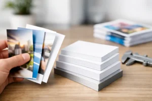
Temporary promotional graphics have their place too. Grand openings, holiday campaigns, limited-time offers, and convention-related activations often need fast production and a short installation window. In those cases, speed and readability matter more than designing something meant to stay up for years.
Design choices that help storefront graphics perform better
The most effective storefront windows are designed for distance first and detail second. Large shapes, strong contrast, and concise wording usually outperform fine detail and dense copy. If a customer has to stop and study the glass to understand what you offer, the message is working too hard.
Brand consistency matters here. Your window graphics should match the tone and visual language of your other printed materials, signage, and in-store experience. A polished storefront that does not match the menu, flyer, brochure, or interior signage can make the business feel pieced together.
Color choice also affects performance. High contrast improves readability, especially in bright sun. Light colors on clear glass may disappear during parts of the day, while darker text and solid backgrounds often remain easier to read. In a place like Las Vegas, sunlight is not a small detail. Glare, reflection, and heat can all change how graphics appear from the curb.
There is also a practical balance between visibility and coverage. Too much coverage can make the business feel closed, dark, or unavailable. Too little can make the storefront look unfinished. The right percentage depends on the kind of business. A boutique may benefit from more openness to show merchandise inside, while a service office may prefer more privacy and stronger branded coverage.
Common use cases by business type
Retail stores often use storefront windows to showcase promotions, seasonal campaigns, or product categories. This works best when the message rotates often enough to stay current. A faded holiday promotion in February sends the wrong signal.
Restaurants and cafes usually need a mix of branding and function. Window graphics can highlight signature items, limited offers, ordering information, or pickup instructions. Privacy film can also help direct attention away from back-of-house areas while keeping the space bright.
Salons, med spas, and fitness studios often benefit from a more polished visual approach. Frosted sections, branded panels, and clean logo placement can make the storefront feel more premium while still giving passersby a clear sense of the business.
Professional offices and service providers tend to prioritize trust and privacy. For these businesses, overly promotional graphics can feel off-brand. A restrained design with logo placement, service identifiers, and privacy elements is often the better move.
Pop-ups, event spaces, and convention-driven businesses have different timing needs. They may need graphics printed fast, installed quickly, and removed just as fast after the event. In those cases, planning for speed, removability, and accurate sizing matters as much as the design itself.
What businesses should plan before printing
Good production starts with accurate measurements and a clear installation plan. Storefront windows are rarely as simple as they look. Door handles, mullions, uneven panes, opening hours decals, and existing signage all affect layout.
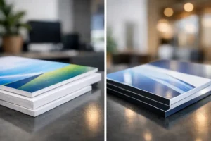
It is also smart to think about the life span of the message. If the graphic is evergreen, durability becomes a bigger factor. If it is tied to a short promotion or event, you may want a more cost-conscious material that still looks professional but is easier to replace.
Artwork setup matters too. Low-resolution files, mismatched brand colors, or designs built without considering final scale can slow down production. When deadlines are tight, clean files and quick approvals make a real difference.
Installation should not be treated as an afterthought. Even a strong design can look poor if alignment is off or bubbles and wrinkles are visible. For businesses opening on a deadline or preparing for a promotion, coordinated production and installation help avoid last-minute issues.
Speed matters, but so does getting it right
Many storefront projects happen on a short timeline. A tenant improvement is finally done. An opening date gets moved up. A promotion needs to launch this week, not next month. That urgency is real, especially in Las Vegas where events, tourism, and convention traffic can create sudden opportunities.
Fast turnaround is valuable, but not if it leads to preventable mistakes. The better approach is to work with a print partner that can move quickly while still checking the essentials – measurements, file quality, material fit, and installation needs. That balance is what keeps a rush order from becoming a reprint.
For businesses near the Strip, convention centers, and high-traffic retail corridors, timing often affects revenue directly. If your storefront needs to be market-ready before an event, a launch, or a peak weekend, delays cost more than convenience. This is one reason local production support matters. Design One Printing works with businesses that need professional output on compressed timelines, especially when storefront graphics are part of a larger push that may also include banners, posters, handouts, or event materials.
When to update your storefront windows
If your branding has changed, your hours are outdated, or your current graphics are peeling, faded, or no longer relevant, it is time. Customers notice more than most businesses think. Worn graphics can make the business feel neglected, even if the product or service is excellent.
You should also revisit your windows when your business model changes. If you now offer delivery, appointments, walk-ins, online ordering, or a new product line, your glass should reflect that. Storefront messaging should match how people actually buy from you today.
A useful storefront does not need to say everything. It needs to say the right things, at the right size, with the right finish, in a way that supports the business instead of cluttering it. When that balance is right, your windows stop being empty space and start doing real work every day.