
A print deadline usually gets blown long before the press starts. It happens when a brochure is built in RGB, a banner file is too low resolution, or a business card lands without bleed and has to be rebuilt at the last minute. If you’re wondering how to prepare print files the right way, the goal is simple: give your printer a file that is accurate, press-ready, and fast to produce.
That matters even more when you’re ordering on a tight timeline for a trade show, grand opening, direct mail drop, or sales meeting. A clean file moves straight into production. A sloppy one creates questions, proofing delays, color surprises, and sometimes a full reprint.
How to prepare print files for clean production
The best print files are built for the final piece from the start. That means the file size matches the finished dimensions, images are high enough resolution, colors are set for print, and all trim-related details are accounted for before export.
A common mistake is designing for the screen first and trying to “convert” it for print later. That approach can work for some simple jobs, but it often causes layout shifts, fuzzy graphics, and inconsistent color. If the piece is going to print, build it as a print file from the beginning.
Start with the finished size of the product. A postcard, brochure panel, poster, retractable banner, and trade show sign all have different production requirements. Setting the document correctly on day one reduces the chance of resizing errors later.
Set the correct document size and bleed
Trim size and bleed are not the same thing. The trim size is the final cut size. Bleed is the extra image area that extends beyond the cut line so you do not get white edges after trimming.
For most commercial print pieces, a bleed of 0.125 inch on all sides is standard. If your background color, photo, or graphic touches the edge of the page, it should extend into the bleed area. Keep text and logos safely inside the trim line as well. A good rule is to leave at least 0.125 inch of safe space, though some larger pieces may need more.
This sounds minor until you are reprinting 5,000 flyers because a border trimmed unevenly. Tight borders and text placed too close to the edge can turn a small cutting variation into a visible problem.
Use high-resolution images
For most printed materials, 300 DPI at final size is the standard target. If an image is only 72 DPI, it may look acceptable on a monitor but print soft or pixelated.
The phrase “at final size” is where people get tripped up. If you place a small image in a layout and enlarge it to 300 percent, its effective resolution drops. A product photo that looked sharp online may not hold up on a brochure cover or foam board sign.
Large-format graphics are a little different. A banner viewed from several feet away may not require a full 300 DPI at final size, but the file still needs enough resolution to appear crisp at its intended viewing distance. The larger the piece, the more context matters. A tabletop sign and a convention backdrop are not judged from the same distance.
Color settings can make or break the final result
One of the biggest gaps between screen design and printed output is color. Screens display color in RGB. Commercial printing typically uses CMYK. Those systems do not reproduce color the same way.
If you leave a file in RGB, some colors may shift when converted for press. Bright neon-style blues, greens, and oranges are especially likely to lose intensity. That does not mean the piece will look bad. It means expectations need to match the printing process.
Work in CMYK when possible
If the piece is intended for commercial printing, build it in CMYK from the start. That gives you a more realistic view of how colors will reproduce. It also reduces surprises during proofing.
Brand colors deserve extra attention. If a company depends on a very specific look, ask whether that color should be handled as a standard process build or a specialty ink, depending on the job. For most everyday marketing materials, CMYK is the practical route. For exact brand matching, there may be trade-offs in cost, speed, and method.
Rich black is another detail worth getting right. Large black areas often print better with a rich black build instead of 100 percent black alone, while small text usually should remain simple 100 percent black for clean readability. Using the wrong black mix can affect sharpness and consistency.
Expect material to affect color
A coated postcard, an uncoated brochure, a vinyl banner, and a paper poster will not all display color the same way. Stock, finish, and print method influence the final appearance.
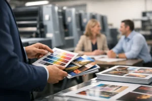
That is why proofs matter, especially for customer-facing materials or event graphics where brand presentation is critical. The file can be technically correct and still need adjustment based on the substrate.
Fonts, graphics, and file packaging
A file is not truly press-ready if it depends on missing assets. Fonts that do not travel with the document can substitute unexpectedly. Linked images can break. Transparent effects can output differently depending on how the file is exported.
The safest approach is to package files carefully or export a clean production PDF with all assets embedded correctly.
Outline fonts or embed them properly
When fonts are missing, your layout can reflow, line breaks can change, and the finished piece can look completely different. That is a serious issue on business cards, menus, brochures, and signage where spacing is tight.
If your workflow allows it, outline fonts before final delivery or make sure they are embedded in the exported PDF. Outlining adds stability, but it also means the text is no longer editable as live type. If you expect changes later, save an editable version separately.
Check linked images and transparency effects
Placed logos, PSD files, Illustrator graphics, and clipped images should all be reviewed before export. Missing links are easy to miss until output time.
Transparency effects, drop shadows, overprints, and layered objects can also cause trouble if the export settings are wrong. In many cases, a print-ready PDF using the printer’s preferred settings is the cleanest handoff. It keeps the file consistent and limits last-minute surprises.
Match the file to the product
Not every print item should be prepared the same way. A business card is detail-sensitive. A banner is scale-sensitive. A folded brochure adds panel alignment and fold positioning. A direct mail piece may need addressing space, postal layout requirements, and barcode clearance.
This is where generic advice stops being enough. The file needs to match the real production use.
Small-format jobs need precision
Business cards, postcards, rack cards, and flyers often look simple, but they are less forgiving than people expect. Small shifts in trim, text placement, or image quality stand out quickly. Fine lines should be thick enough to reproduce consistently, and small type should not be built from multiple CMYK values if readability matters.
For brochures, panel sizing matters too. Folded pieces are not always divided into perfectly equal widths. Depending on the fold style, one panel may need to be slightly narrower so the brochure closes properly.
Large-format files need scale awareness
Posters, banners, signs, wall graphics, and trade show displays often use scaled artwork. That is normal, but the scaling must be intentional. A banner built at half size should keep the same proportions, bleed allowances, and effective resolution needed for output.
Large-format jobs also require attention to finishing. Grommets, hems, pole pockets, stands, and mounting areas should be considered during file setup, not after the artwork is approved. Critical logos or text should never sit where hardware or finishing could interfere.
Before you send the file, run a real preflight check
Most file problems are catchable in five minutes if someone checks the basics. Confirm the size, bleed, safe area, color mode, image resolution, spelling, and export settings. Zoom in on logos. Review phone numbers, dates, booth numbers, and addresses. Practical errors are often more costly than technical ones.
It is also smart to name files clearly. “Final” is not enough when there are six versions floating around. Use a filename that identifies the project, size, revision, and date. That makes production faster and reduces the chance of the wrong version hitting the press.
If you are ordering under pressure, ask your printer early what file format they prefer. That one step can save hours. A dependable production partner can often flag issues before they become expensive, but the closer your file is to press-ready, the faster the job moves.
When time is tight, good file prep is not just a design detail. It is part of the production schedule. At Design One Printing, that is often the difference between making the deadline and trying to explain why the booth graphics are still being fixed. Send a file that is built for print, and everything after that gets easier.