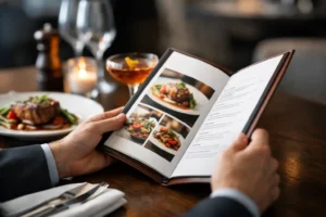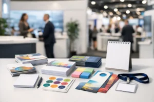

A step and repeat banner usually gets judged in photos long after the event ends. If the layout feels crowded, the logos are hard to read, or the branding looks off, that backdrop keeps advertising those mistakes. The best step and repeat banner ideas are built for visibility, photography, and fast setup – not just for looking good on a screen.
In Las Vegas, where conventions, openings, media events, and sponsor activations move quickly, your backdrop has to do more than fill space. It needs to present your brand clearly under event lighting, from multiple camera angles, and in a room where people may only notice it for a few seconds. That changes how the design should be approached.
What makes step and repeat banner ideas work
A strong step and repeat design is not just a logo tiled across a banner. It has to balance repetition with readability. If logos are too large, the backdrop can feel clumsy and overbearing in photos. If they are too small, they disappear once guests stand in front of them.
Spacing matters just as much as logo size. Tight spacing can make the banner feel busy, especially when more than one sponsor is included. Too much open space creates dead areas in photos where the branding is missing. The best layouts keep branding visible in both close-up shots and full-body photos.
Color also needs practical thinking. White backgrounds are common because they photograph cleanly and keep logos crisp, but they are not always the right fit. A darker background can look more upscale for evening events, although some logo colors may need adjustment to stay readable. This is where production experience makes a difference. A design that looks balanced on a monitor may print and photograph very differently under venue lighting.
12 step and repeat banner ideas for business events
1. The classic white background with full-color logos
This is the most familiar format because it works. A white background keeps the banner bright, clean, and easy to photograph. Full-color logos stand out well, especially for brand activations, ribbon cuttings, grand openings, and networking events.
It is a strong choice when multiple brands need equal visibility. The trade-off is that every logo file has to be high quality. On a white background, weak artwork and inconsistent color profiles are easier to spot.
2. A black background for upscale events
For galas, hospitality events, nightlife promotions, and media walls, a black background can create a more premium look. It gives photos a sharper contrast and can help metallic, white, or brightly colored logos pop.
This option requires extra care with logo versions. Not every brand mark translates well onto a dark background. Some logos need white outlines or alternate color treatments to stay legible.
3. A two-brand alternating pattern
When two businesses are co-hosting an event, a balanced alternating layout keeps the partnership clear without making one side look secondary. This works well for joint promotions, sponsored mixers, and vendor collaborations.
The key is consistency. If one logo is much larger or more detailed than the other, the overall banner can feel uneven. In those cases, scale should be adjusted by visual weight, not just by exact dimensions.
4. A sponsor wall with tiered logo placement
Not every sponsor belongs at the same size. For fundraising events, conferences, and community programs, a tiered structure can reflect sponsorship levels while still looking organized. Headline sponsors can appear larger, while supporting sponsors repeat in a secondary pattern.
This approach works best when it is designed intentionally from the start. Trying to force too many sponsor sizes into one backdrop often creates confusion. Clean hierarchy is what keeps it professional.
5. A branded pattern instead of logos only
Some of the strongest step and repeat banner ideas use a brand element beyond the logo. This might be an icon, monogram, subtle pattern, or product silhouette repeated between logos. It gives the backdrop more personality while keeping the main branding visible.
This works especially well for product launches, fashion events, and hospitality brands that want a more custom look. The caution is restraint. The background element should support the brand, not compete with it.
6. A minimalist single-logo layout
If the event is centered around one company, repeating a single logo with generous spacing can look more polished than filling every inch of the banner. This style is common for press photos, executive appearances, and internal corporate events.
Minimalism only works when the logo itself is strong and the spacing is intentional. Too sparse, and the banner can look unfinished. Too dense, and it loses the clean effect you were aiming for.
7. A hashtag or event name worked into the repeat
For social-friendly events, including a short hashtag or event name in the repeating pattern can increase recognition in shared photos. This is useful for conferences, launches, pop-ups, and influencer-driven events where guests are likely to post images quickly.
Keep the wording short. Long event titles become hard to read from a distance and clutter the layout. Usually, a simple event mark paired with a logo pattern gives the best result.
8. A backdrop built around a product launch
For launch events, the banner can include a repeated product icon, campaign mark, or abbreviated launch graphic instead of relying only on the parent company logo. That keeps the backdrop aligned with the specific promotion rather than feeling generic.
This is a smart option when the campaign has its own visual identity. Just make sure the parent brand still appears often enough to be recognizable in photos.
9. A media wall for red carpet photos
A red carpet backdrop should be designed for full-body and group photography. That usually means a wider layout, larger repeated marks, and spacing that prevents logos from being hidden behind guests.
One common mistake is designing for eye-level viewing only. In event photography, people shift positions constantly. Your branding has to remain visible even when several people are standing in front of it.
10. A textured neutral background
A flat white or black background is not your only choice. Soft gray, cream, or subtle textured tones can help a step and repeat feel more refined while keeping logos easy to read. This can work well for weddings, nonprofit events, awards programs, and luxury retail activations.
The texture should stay subtle. If it shows up too strongly in photos, it can distract from the actual branding.
11. A seasonal or themed variation
For holiday events, annual parties, and themed promotions, a step and repeat can incorporate seasonal accents without becoming gimmicky. A small holiday motif, color shift, or themed event badge can make the banner feel current while preserving brand consistency.
The smartest version of this idea is temporary, not total. Keep the core logo system intact, then add light event-specific details around it.
12. A location-aware backdrop for Las Vegas events
For local events, a subtle nod to Las Vegas can make the banner feel more connected to the setting. This could be a skyline line art element, a convention theme, or a visual cue tied to hospitality or entertainment.
Used carefully, this can help the event feel grounded in place without overpowering the sponsor branding. Used too heavily, it can make the backdrop look like a tourist graphic instead of a professional media wall.
How to choose the right step and repeat banner idea
The right concept depends on where the banner will be used, who will be photographed in front of it, and how long it needs to stay relevant. A sponsor-heavy conference backdrop has very different requirements than a single-brand store opening. So does a red carpet setup compared with a trade show booth photo wall.
Start with the purpose. If the goal is sponsor recognition, hierarchy and repetition matter most. If the goal is brand polish, cleaner spacing and fewer elements often perform better. If the goal is social sharing, readability in smartphone photos becomes a bigger priority.
Then consider the setup. A banner placed in a lobby with controlled lighting gives you more flexibility than one used outdoors or in a ballroom with mixed lighting. Material choice, finish, and stand size all affect how the final piece looks in person and on camera.
Common design mistakes that hurt results
The most common issue is overcrowding. Businesses often try to fit too many logos, too much text, or too many visual ideas into one backdrop. That usually makes every element weaker.
Another problem is using low-resolution files. On a large-format printed backdrop, weak logos become obvious fast. Pixelation, poor edges, and inconsistent brand colors can make an event look less organized than it really is.
There is also the issue of poor scaling. A logo that looks fine in a digital mockup may disappear once people start standing in front of the banner. This is why production review matters. What works on screen is not always what works at event size.
Why production support matters as much as design
A good concept still needs the right output. Banner size, stand hardware, material durability, and finishing all affect the final result. If the event is fast approaching, you also need a printer that can move quickly without introducing errors at the last minute.
For exhibitors, marketers, and event teams working on a short timeline, it helps to work with a local production partner that understands event graphics in real conditions. Design One Printing regularly supports Las Vegas businesses and event teams that need backdrops, signs, and branded materials produced on deadline and ready for use.
The best backdrop is the one that still looks sharp after setup, under venue lighting, and in every photo guests actually keep. When you plan your banner around visibility, scale, and print quality from the start, the design does its job long after the event is over.