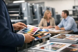
A rushed logo usually shows up in the wrong places first – on business cards that feel generic, on booth graphics that don’t match, or on signage that looks fuzzy when scaled up. That is why logo design for small business is not just a branding exercise. It is a practical business decision that affects how you show up in print, at events, in direct mail, and across every customer touchpoint.
For small businesses, the best logo is not always the most detailed or the most creative on paper. It is the one that stays clear, consistent, and professional whether it appears on a storefront decal, a postcard, a trade show banner, or a quick-run set of flyers needed by tomorrow morning. A logo has to perform, not just impress.
What logo design for small business really needs to do
A small business logo has one job at the surface level – help people recognize your brand. But in actual day-to-day use, it has several jobs happening at once. It needs to look professional, fit your industry, reproduce well in print, and hold up in different sizes and formats.
That last point matters more than many business owners expect. A logo may look fine on a website header, then fall apart when reduced for a business card or enlarged for a retractable banner. Thin lines disappear. Complex gradients print unevenly. Tiny type becomes unreadable. If your logo cannot move easily from digital to physical materials, it creates extra production problems and weakens your presentation.
This is especially true in a fast-moving market like Las Vegas, where businesses often need a logo to work across event materials, convention graphics, promotional handouts, menus, packaging, signs, and same-day print orders. A logo that only works in one setting is not doing enough.
Good logo design is simple, but not generic
Many owners hear that a logo should be simple and assume that means basic. That is not the same thing. Simplicity means the mark is clear and controlled. Generic means it looks like ten other companies in the same category.
A strong small business logo usually uses a focused color palette, readable typography, and a shape or structure that is easy to identify quickly. It does not need a lot of visual effects to feel polished. In fact, the more effects you add, the more likely the logo is to create problems later in printing and reproduction.
There is a trade-off here. A minimal logo can be flexible and easy to use, but if it is too stripped down, it may lose personality. On the other hand, an expressive logo can feel distinctive, but if it relies on fine detail or trendy styling, it may date quickly or become hard to use across materials. The right balance depends on your industry, audience, and where the logo will appear most often.
A contractor, law office, local retailer, restaurant, or trade show exhibitor should not all be using the same visual logic. Customers form judgments fast. Your logo should support the kind of trust your business needs to earn.
Start with use cases, not just style preferences
One of the most practical ways to approach logo design for small business is to think about where the logo will live before choosing how it should look. This keeps the process grounded in business needs instead of personal taste alone.
If your logo will appear mostly on signage and vehicle graphics, it needs strong visibility from a distance. If it will be used heavily on packaging or labels, it needs to remain clear at small sizes. If your business relies on networking events and conventions, the logo needs to work across business cards, table throws, banners, brochures, and promotional pieces without constant redesign.
This is where many businesses lose time and money. They approve a logo based on how it looks in a mockup, then realize they need multiple fixes once production begins. Colors shift. Layouts need adjustment. File types are missing. A smart process considers these realities early.
The most common logo mistakes small businesses make
The biggest mistake is treating the logo as a one-time checkbox instead of a working asset. When that happens, businesses often choose based on speed alone, trend appeal, or a personal favorite rather than long-term usability.
Another common issue is overcomplication. Detailed illustrations, script fonts, shadows, and layered effects may look interesting on a screen, but they can become unreliable in real production. Printing on different materials can expose those weaknesses quickly.
Poor file preparation is another major problem. A logo should exist in clean, usable formats, including vector files that can scale without losing quality. If the only version you have is a small PNG pulled from an old email, every future print job becomes harder than it should be.
Color choice can also create avoidable issues. Bright digital colors do not always translate cleanly to print. That does not mean you need to avoid bold color, but it does mean the palette should be chosen with production in mind. A logo that depends on a very specific screen effect may not reproduce consistently across cards, signs, decals, and apparel.
What to ask before approving a logo
Before you finalize a logo, it helps to pressure-test it like any other business tool. Ask whether it still works in black and white. Ask whether the text is readable at a small size. Ask whether the icon or wordmark still feels clear when printed on uncoated paper, vinyl, or large-format materials.
You should also ask whether the design matches the pace and positioning of your business. A high-end service brand may need a cleaner, more restrained look. A family-friendly business may benefit from more warmth and energy. A convention-focused company may need a mark that feels bold and visible in crowded environments.
Most important, ask whether the logo gives you room to grow. A design that only fits your current storefront may not hold up when you add packaging, event displays, direct mail, or promotional products later.
Why print-ready logo design matters from day one
A logo does not live in isolation. It moves into business cards, brochures, flyers, posters, stickers, signs, and branded displays. If the design is not built for production, your marketing materials can start to feel inconsistent even when the content is solid.
Print-ready design means your logo has clear versions for different uses, reliable color values, proper file formats, and a layout that holds up across sizes. It also means the design team is thinking ahead about how the logo will perform on real materials, not only on a presentation screen.
That practical approach saves time when deadlines are tight. It reduces back-and-forth during ordering, lowers the risk of low-resolution output, and helps your brand look more consistent across every printed piece. For businesses that move fast, that matters.
At Design One Printing, this production-first mindset is often what separates a logo that looks acceptable from one that actually supports day-to-day marketing. When design and print planning happen together, the result is usually cleaner, faster, and easier to scale.
A logo is not your whole brand, but it sets the standard
Some businesses expect a logo to carry the entire brand by itself. That is not realistic. Your reputation, messaging, customer experience, and marketing all matter more over time. But the logo still sets the visual standard. It tells customers whether your business looks established, organized, and ready.
That first impression becomes even more important when customers are comparing several providers quickly, as they often do before an event, campaign, or purchase. If your materials look inconsistent or improvised, people notice. A clear, well-built logo helps everything around it look more intentional.
That does not mean spending endlessly or chasing perfection. It means making a practical decision that supports how your business actually operates. For many small businesses, the right logo is the one that helps every printed piece, display, and promotion feel like it came from the same company.
When it makes sense to update your logo
Not every business needs a full rebrand. Sometimes a logo only needs refinement – cleaner typography, better spacing, stronger file preparation, or a simplified version for print. Other times, the brand has clearly outgrown the original mark.
If your logo feels dated, reproduces poorly, confuses customers, or no longer reflects your current market, it may be time for a redesign. The goal is not change for its own sake. The goal is to give your business a mark that works harder and causes fewer production issues.
A practical logo should help you move faster, look sharper, and stay consistent whether you are ordering a small batch of cards or outfitting a full event presence. When your brand needs to perform under pressure, that kind of clarity is worth getting right.