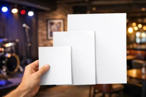

A crowded expo hall gives you only a few seconds to make your booth understandable. That is why every strong trade show booth signage example starts with the same goal – tell people who you are, what you do, and why they should stop. If attendees have to work to figure it out, most will keep walking.
For exhibitors in Las Vegas, that pressure is even higher. Shows move fast, aisles are packed, and your booth has to compete with bright displays, big claims, and constant noise. Good signage is not decoration. It is one of the hardest-working sales tools in your space.
What a good trade show booth signage example actually shows
When people search for a trade show booth signage example, they are usually not looking for a random graphic. They want to know what effective booth messaging looks like in real use. They want a model they can adapt to their own space, budget, and deadline.
A useful example is simple enough to read at a distance and specific enough to qualify the right visitor. Imagine a 10×10 booth for a software company. The back wall does not try to explain every feature. Instead, it leads with a short headline such as, “Field Service Software for Multi-Location Teams.” Under that, a smaller line adds context: “Scheduling, dispatch, and reporting in one dashboard.” A monitor can handle the deeper story. The sign does the job of stopping the right people.
Now consider a food distributor at a hospitality expo. A better trade show booth signage example for that audience might focus less on branding language and more on buyer value: “Custom Beverage Programs for Hotels, Bars, and Casinos.” That message tells prospects exactly who the exhibitor serves. It also helps filter out casual foot traffic that is unlikely to convert.
The common thread is clarity. Booth signs work best when they communicate one primary message quickly. If your signage tries to cover your full company history, product catalog, and sales pitch at once, it weakens every part of the message.
The five parts most booth signs need
The right signage package depends on your booth size, show rules, and goals, but most exhibitors benefit from the same core pieces. These should work together rather than compete for attention.
1. A distance-readable main sign
This is your anchor graphic, usually on a backdrop, fabric display, rigid panel, or large banner. It should be readable from the aisle and clear from several feet away. Your company name matters, but your value proposition matters more. Many exhibitors make the mistake of putting their logo at the center and assuming that brand recognition will do the rest. That only works if the audience already knows you.
2. Secondary signs that explain key offers
Once someone approaches, they need a little more information. This is where counter cards, easel signs, mounted foam boards, or tabletop displays help. These signs can highlight services, pricing models, product categories, or event-only offers. They should support the main message, not repeat it word for word.
3. Directional or functional signage
Not every sign has to sell. Some signs help the booth operate smoothly. Think demo schedule boards, meeting area markers, QR code signs, product comparison charts, or instructions for giveaways. Functional signs reduce confusion and free up staff to focus on conversations.
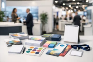
4. Brand reinforcement across smaller materials
Your booth signage should feel consistent with your handouts, business cards, brochures, and table throws. Mismatched colors, low-resolution graphics, or mixed messages create a rushed look, even if the main display is strong. Consistency builds trust fast.
5. A portable backup option
This is the part many exhibitors skip until something goes wrong. A compact banner stand or extra rigid sign can save a setup if a shipment is delayed, a panel is damaged, or booth rules change. In a city with major conventions and tight timelines, having a backup is practical, not excessive.
A practical trade show booth signage example by booth type
The best signage for a 10×10 inline booth is not the same as the best signage for a larger island booth. Layout changes what people see first and how they move through the space.
10×10 booth
In a smaller booth, one message should do most of the work. A branded back wall, retractable banner, fitted table cover, and one or two countertop signs are often enough. If you add too many visual elements, the booth can feel cluttered.
A strong example for this size would be a backdrop with a bold headline, a short supporting line, and one clean product image. Then, a countertop sign can promote a demo, consultation, or featured product. This setup is efficient, affordable, and easier to install under time pressure.
10×20 booth
With more width, you can create a clearer visual hierarchy. One side can attract traffic with a broad brand message while another area supports specific services or product lines. This is where segmented messaging starts to make sense.
For example, a logistics provider might use the center wall for its headline, then use side panels to highlight warehousing, last-mile delivery, and convention freight support. That approach works because each panel has a job. It breaks down when every panel tries to say everything.
Island or larger custom booth
Larger booths need signage visible from multiple angles and distances. Hanging signs, tall structures, freestanding graphics, and demo area signs become more important. At that scale, wayfinding matters almost as much as branding.
Still, bigger does not automatically mean better. Large booths often suffer from diluted messaging. If attendees cannot tell within a few seconds what the company offers, the extra square footage does not help much.
What makes booth signage effective at a live event
Good design on a screen does not always become good signage on a show floor. Trade show graphics have to perform in a real environment with glare, distance, motion, and visual competition.
Readability comes first. That means strong contrast, concise copy, and type sizes that hold up from the aisle. Thin fonts, light colors on light backgrounds, and long paragraphs usually fail in person. If your sign can only be read while standing still three feet away, it is doing too little too late.
Message priority also matters. Most attendees scan in this order: headline, image, brand name, then supporting details. If your layout fights that behavior, people may miss the point. Put the most important information where the eye naturally lands.
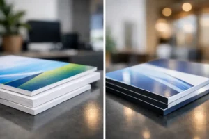
Then there is print quality. A smart design can still look unprofessional if photos are pixelated, colors are off, or material choice does not fit the job. Fabric backdrops, vinyl banners, adhesive graphics, poster prints, and mounted boards all have different strengths. The right option depends on whether you need portability, rigidity, premium appearance, or fast replacement.
Common booth signage mistakes that cost attention
The most common mistake is saying too much. Exhibitors often try to justify the booth investment by loading every inch with text. But crowded signs rarely improve results. They usually reduce them.
Another issue is designing for approval instead of performance. A sign may satisfy everyone in an internal review because it includes every logo, tagline, and message, but that does not mean it will work on the floor. Trade show signs are not brochures. They need focus.
Poor production planning is another expensive problem. Waiting too long to finalize artwork can limit material choices, increase rush costs, and leave no room for proofing or corrections. If a sign is mission-critical, build in enough time to review sizing, bleed, file quality, and hardware requirements.
And sometimes the issue is not the sign itself but the mismatch between signage and staff pitch. If the booth headline says one thing and the team opens with something else, prospects feel friction right away. Your signs and your people should tell the same story.
How to build your own booth signage plan
Start with one sentence that defines what you want a qualified attendee to understand in three seconds. That sentence becomes the basis for your main sign. Then decide what a visitor needs to know next if they stop. That becomes your secondary signage.
After that, match the format to the event. If you are flying in, lightweight displays and roll-up banners may be the practical choice. If you are driving locally or exhibiting often, rigid signage or more custom structures may be worth the investment. It depends on budget, frequency of use, and setup support.
Finally, think beyond the booth wall. Good signage works best when it is part of a coordinated package that includes printed handouts, branded counters, posters, banners, and replacement graphics if needed. For exhibitors on tight schedules near the Strip and convention centers, working with a responsive local production partner like Design One Printing can make the difference between scrambling and showing up ready.
The best booth signs do not try to impress everyone. They make the right people stop, understand, and start a conversation.